Thursday evening, I posted my little survey and told you all on Twitter that I’m considering writing a book. I got a lot of super nice replies from you all – thank you so much! That’s really encouraging (and sometimes encouraging and pressure-increasing).
And SO MANY of you responded to the survey! I got 233 submissions, which made me very excited. Thank you all, again!
Today I read through all the submissions – and I created some ggplot2 plots to better understand what you were telling me. Here are some highlights.
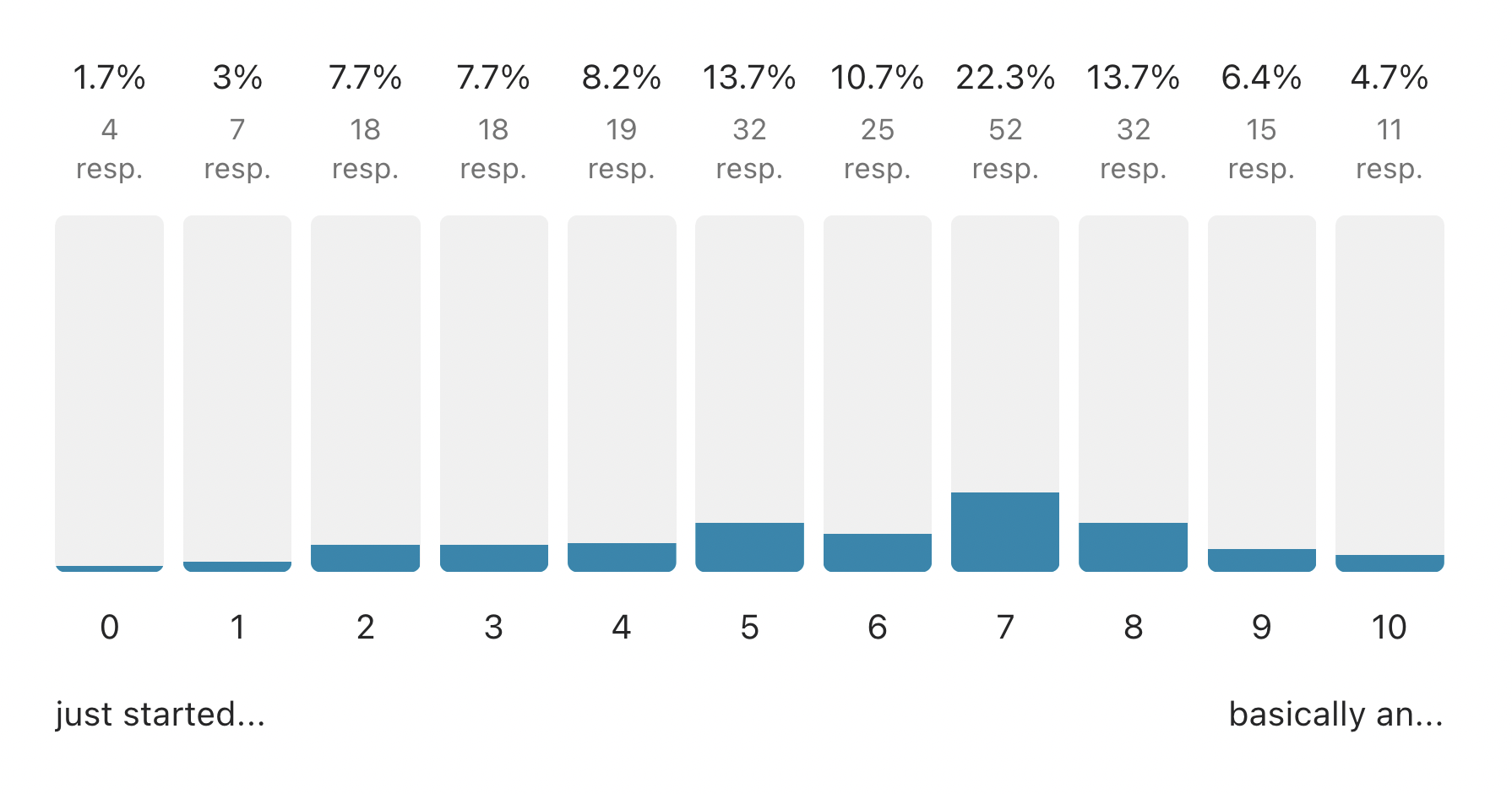
First, the basic stuff. Here’s a nice histogram of how proficient in data vis you all think you are on a scale from 0 (“just started yesterday”) to 10 (“basically an expert”). I was very happy to get >20 replies from people who feel they’re just staring out. (And I got surprised to get replies from 11 people who think of themselves as an expert!)
Over 50% of you create simple charts for articles, reports, presentations, etc.. And few of you are designers or coders; most are writers/journalists, subject experts and data analysts/statisticians.
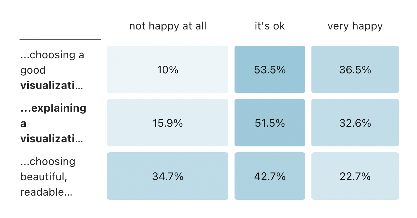
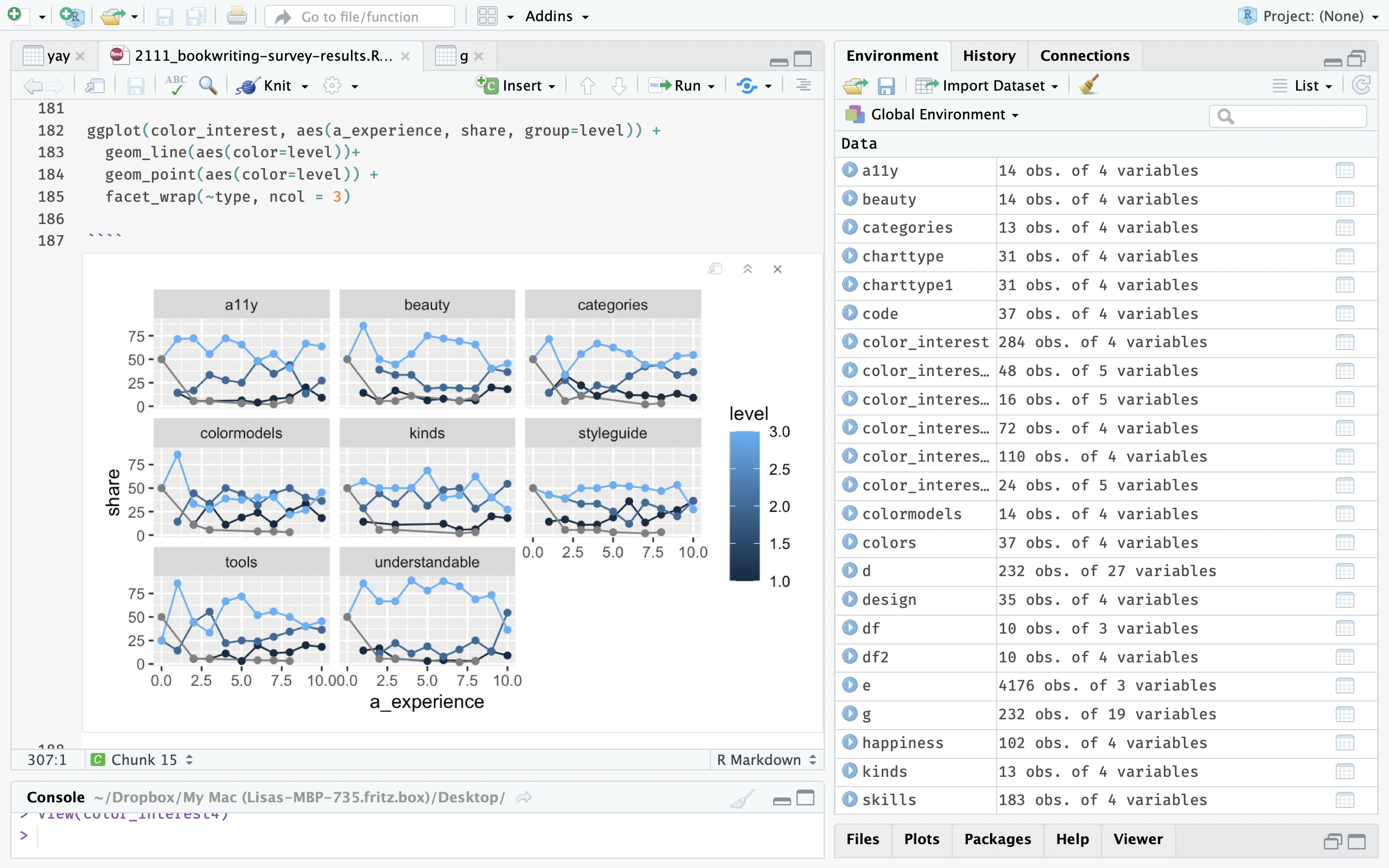
Interesting to me: Only 10% of you are unhappy with your skills to choose a chart type, while more than a third of you are unhappy with your skills to choose colors:
Btw: The more data vis experience you think you have, the happier you are with your skills to choose a good chart type for your data. Or the other way round: You judge your skills in data vis based (among others) if you can choose chart types well.
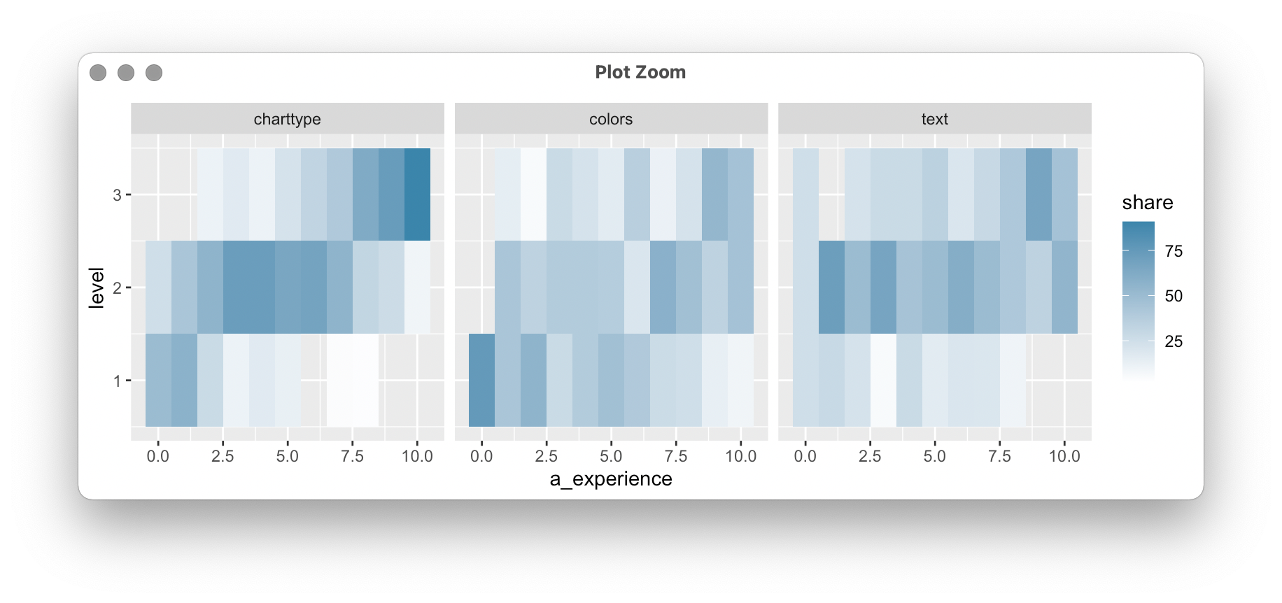
That correlation is less visible when it comes to picking good colors and explaining your charts well with text.
Ok, let’s get to one of the most interesting parts for me: Which chapter in a color book would you like to read?
https://datawrapper.dwcdn.net/Wa6bb/1/
Lots of you wouldn’t mind reading about how to make your data visualizations better-looking and easier to understand with colors. I wonder if I primed you badly there with my Tweet text (“I’m considering writing a book that helps people (like you?) create beautiful, easy-to-read #dataviz.”) 😬 Or if it’s simply too broad of a description to imagine everything in there.
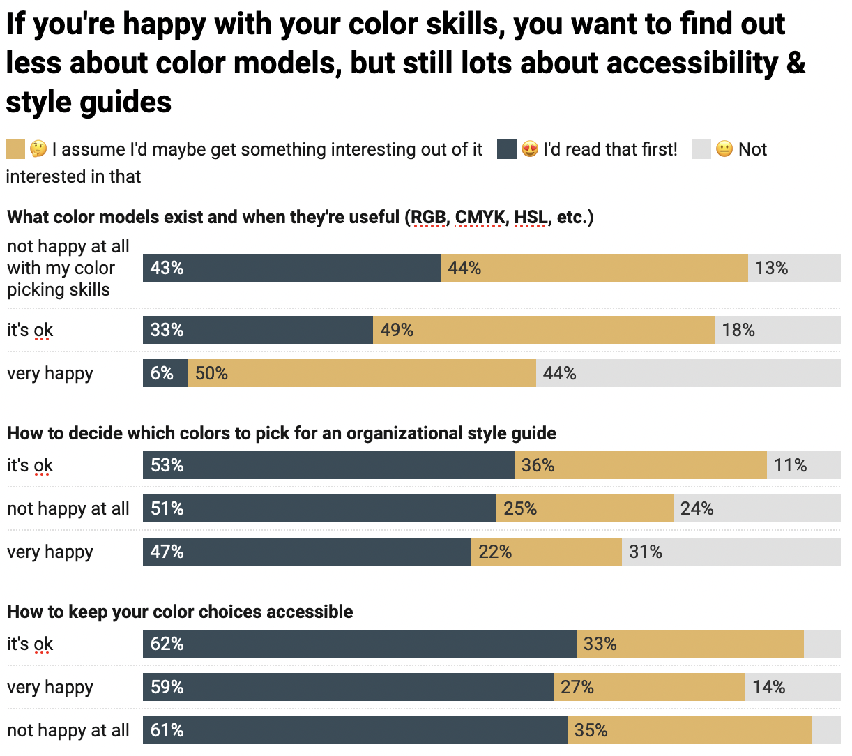
Oh, and you’re not awfully interested in color models and style guide advice.
That said, that also depends on how happy you are with your color skills. The ones of you who are very happy with your color skills are really not interested in color models. But you’re (almost) as interested in the chapters about organizational style guides and accessibility.
The answers to the open questions were super interesting to me, too. Here are a few answers to the question: “What would you like to get out of a book about COLOR in data visualization?”
You have very different ideas and wishes for the book. One of the questions you debated with other respondents (without knowing it) is: Who should this book be aimed for? Here are three answers:
- “Too many books focus either on novice creators or experts creating for experts. What I want is a book helping experts creating dataviz for a naive audience.”
- “It would be great to have a book aimed at intermediate and advanced data vis designers. Too many books rehash beginner topics”
- “Am a total beginner, a bit fed up with how you have to teach yourself everything from YouTube these days. A bit of structure and hand holding would be great!”
And there were some who would not be interested in a color book at all:
- “Not really interested in color, cause it’s not a sophisticated subject in context of data visualization to devote a whole book”
- “Color seems to me to be small part of the possible topics to write about.”
- “I don’t want about Colors only”
- “Please relate colour usage to other things I need to know in making visuals out of data, e.g. shapes? movement? Do you do static or dynamic visuals?”
I won’t write a book about data vis in general (for now), so I’ll disappoint some people here, I’m afraid.
That was a nice day today, though. In general, playing around with dplyr and ggplot2 after a looong time again was…less fun than I thought. I feel like I’m relearning everything again every year or so. Like functions. I felt like I understood R functions when I prepared the data for the corona virus charts in March last year. 1.5 years later, lots of that knowledge is gone.
Quote of the day: “also please include cute animal pictures [in your book], thanks!” – from a respondent to the survey. (Can’t promise that, but thanks for the suggestion! 🐱🐨🐯)
Open questions: People seem to think they’d find it useful to read a system/process that explains to them how to create color palettes. Is this something I want to include? Is this something I can deliver? What would need to happen for that; who would I need to ask?
P.S.: In case you were wondering why I didn’t write anything last Friday: I’m writing that book during my work time at Datawrapper (thanks, Datawrapper!), and I’m only working four days a week (thanks, Datawrapper!).