Today I spent the full morning researching things. I wanted to research how designers pick colors, but first, quickly got into color psychology (reading the Wikipedia article about it is fascinating): Which colors do people prefer? What do people associate with color? How does color influence our behavior or opinions? Fascinating stuff. I’m not sure how important it really is in a book about colors in data vis, but I know I should mention it at least.
I proceeded how I often do: I first read the Wikipedia article for an overview, then get the papers mentioned and see what I can read out of them.
An hour or so later I did the same for the color shaper of the book “Cartography – Thematic mapping” from Dent et al. from 2009. It’s a great book that has helped me writing about colors before – mostly because it mentions so many studies.
And then I progress study by study, noting down interesting claims and explanations and getting the quoted papers that sound relevant.
I’m not done with that yet, but had lots of fun doing that so far.
Close to lunch I also had a look a that original “how to designers pick colors?” question and found a few new and fascinating color tools:
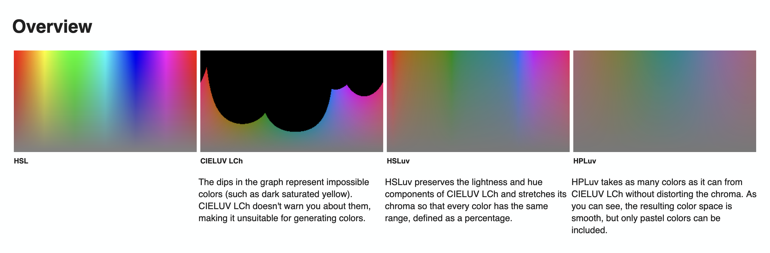
https://www.hsluv.org/comparison/
…and a good explanation of “when you’re making a color darker, increase the saturation”:
https://learnui.design/blog/color-in-ui-design-a-practical-framework.html
The rest of the day was spent preparing the Data Vis Dispatch for tomorrow – Rose is busy with her Weekly Chart this week and asked for help.
Quote of the day: “I cannot pretend to feel impartial about colors. I rejoice with the brilliant ones and am genuinely sorry for the poor browns.” –Sir Winston Churchill
Open questions: Which colors and color combinations do people like? Apparently, there are some studies done on that topic, and some smaller and bigger surveys, and I’m looking forward to dig deeper.