
Today isn’t the 18th of January – I designed that today for our Data Vis Book Club discussion in two weeks, and I kind of like it, like, a lot.
Today was a great day. (So far, every day has been great since I made these updates here public. I should have done that earlier!) First, you all overwhelmed me with loooots of likes and super nice words about the announcement that I’ll write a book. Thank you!
Then I made one of these “happy little discoveries”: Kaspar Manz, team lead of the graphics team at the Neue Zürcher Zeitung (a newspaper from Switzerland), mentioned that he recently redesigned the color scales for their maps. And in that announcement, he also mentioned he’d done so with the OKLab color space.
Well, I’ve never heard of that color space (and I read a lot about color spaces lately).
Apparently, a software engineer from Stockholm called Björn Ottosson developed it roughly a year ago. He wrote about it here. It’s “a new perceptual color space, designed to be simple to use, while doing a good job at predicting perceived lightness, chroma and hue” – and designed to not become purple when interpolating between white and blue, like HSV, CIELAB and CIELUV do:
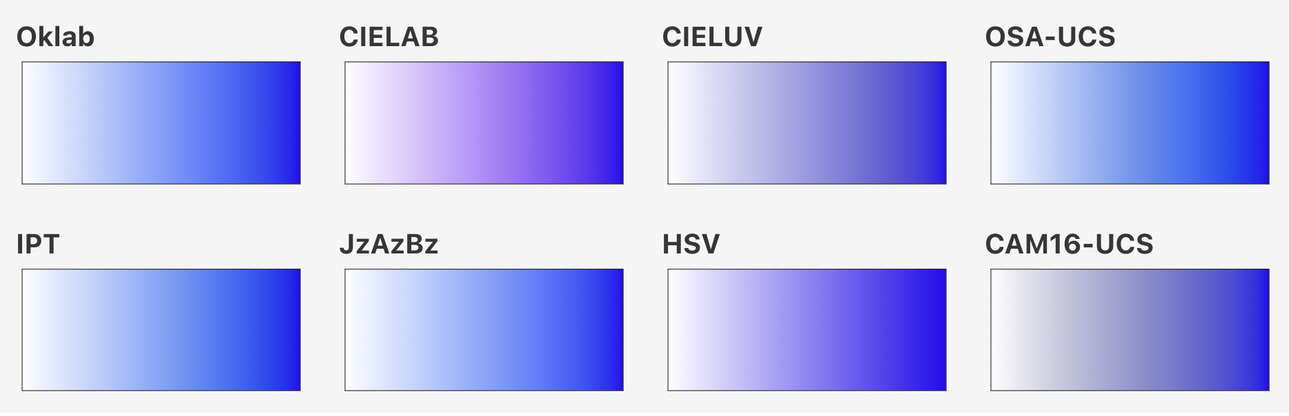
“plots of white blended with a blue color, using the various color spaces tested” published by Björn Ottosson in “A perceptual color space for image processing”
A few months ago, Björn also released Okhsv and Okhsl, aaaand, the best thing: A tool to play around with them.
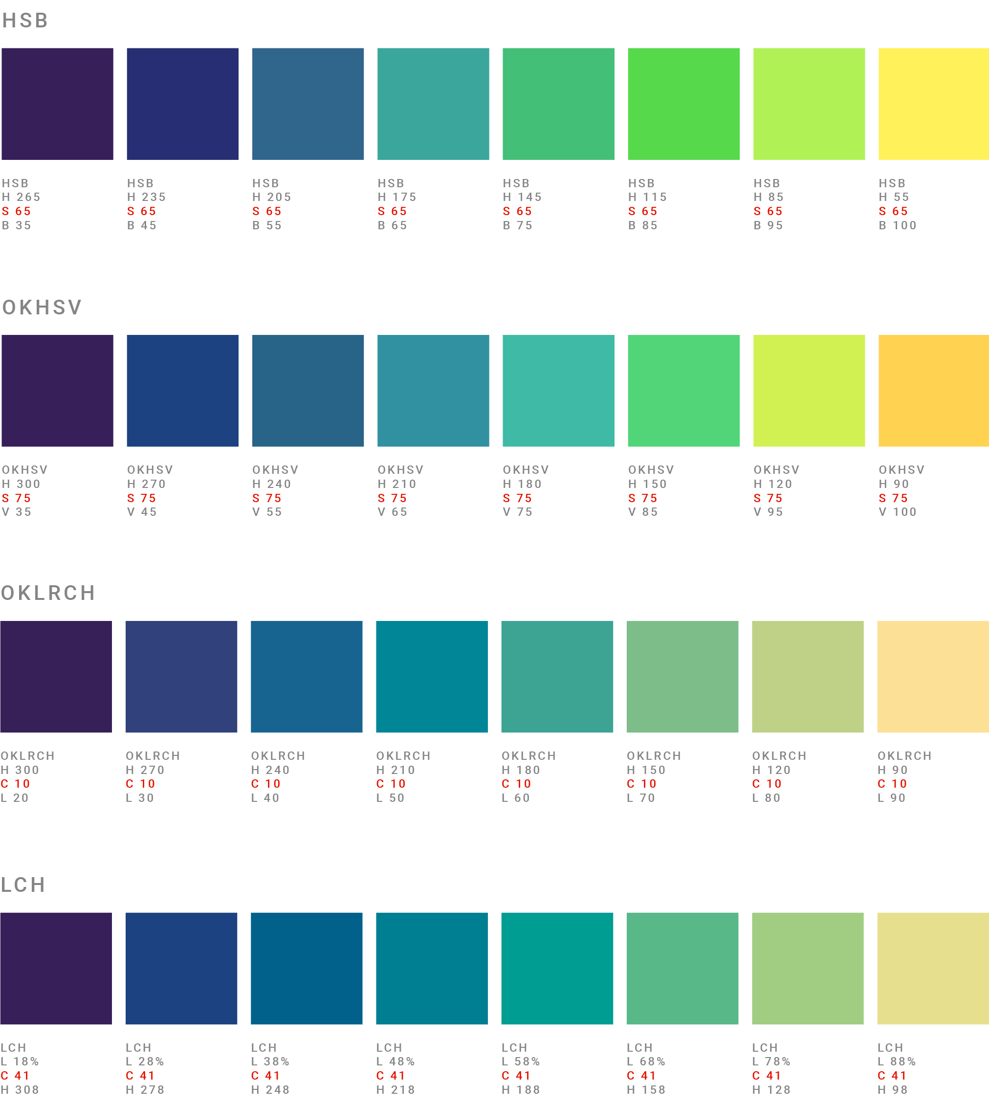
Here’s a GIF showing it (these are not the colors the tool shows, but I really wanted to show you how the OKLrCH space changes; I think it’s marvellous):
In the interview I had yesterday with A, we talked about the data vis problem of “what if you don’t want to emphasize any of your categorical colors?” So I was wondering if I can use Björn’s tool to find different hues with different lightness that have the same colorfulness and that look great. (I’m always interested in finding automated ways of doing stuff.)
So here are some colors with the same difference between hues and the same difference between brightness, in different color spaces:
You can see that the LCH (and OKrLCH) colors really have more of the same colorfulness than the HSB colors – but that the brighter colors in the HSB color space are more vibrant. Too vibrant? I asked y’all on Twitter and you gave me a lot of good reasons why you all prefer the 2nd palette more than the first. (In the poll I put out, only one in four of the 500 people who replied preferred the first set.) So no: not too vibrant.
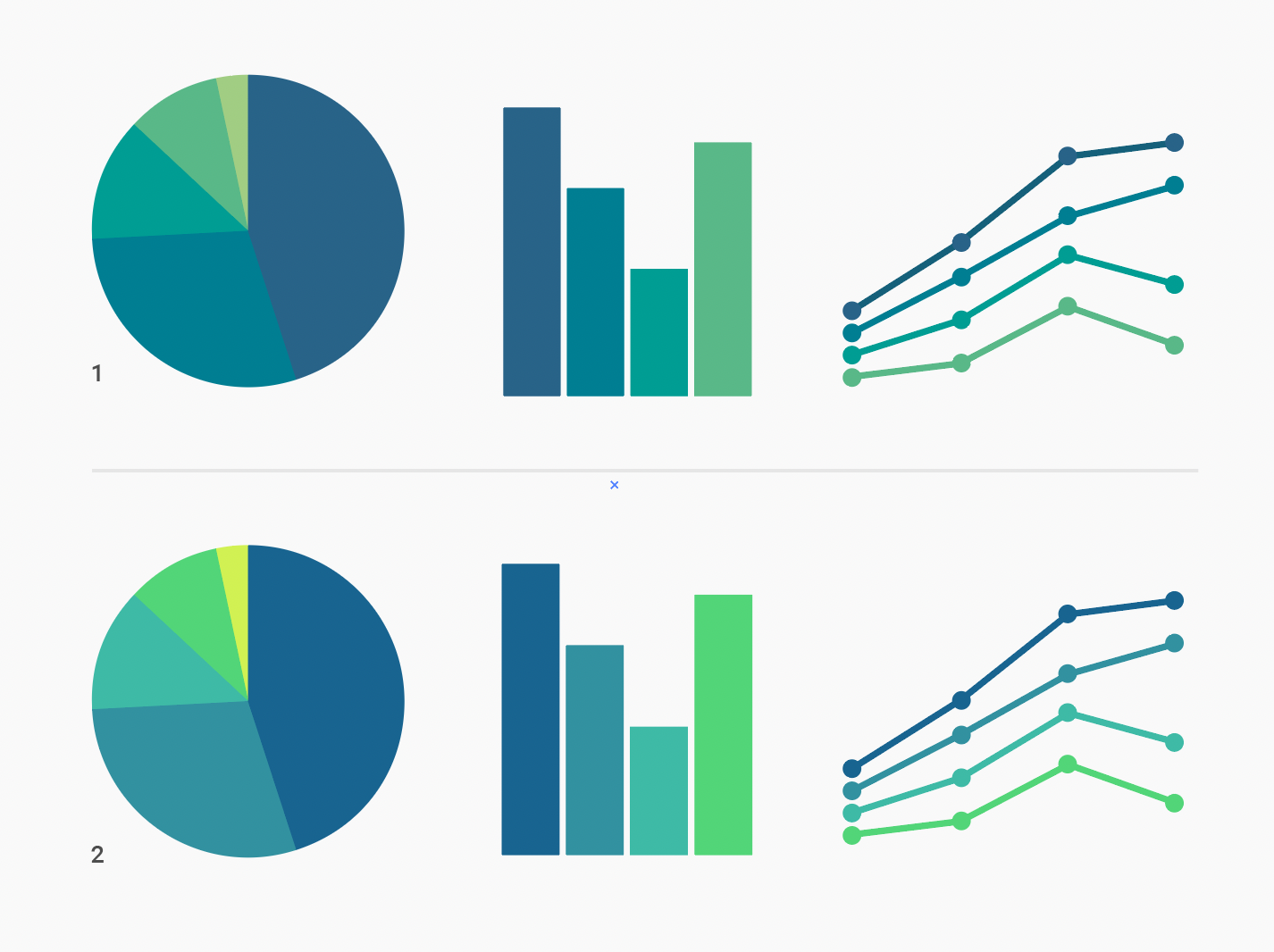
But as many of you pointed out, both palettes are flawed. The brightness of the 2nd and 3rd value in the first set are hard to distinguish. The bright green in the second set is…too saturated; too bright, compared with the rest.
Beth Elzer even redesigned the palette:
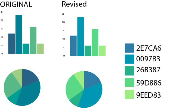
Yep, that’s better.
The automatic approach failed once again, sigh. I wish more people would build tools like Colorgorical.
Anyway – the day was concluded by a great interview with somebody who redesigned a color palette for the data vis style guide of their organization. Fascinating to hear about all the considerations they made.
It’s off to the weekend for me!
Quote of the day: “You need color maps because they’re an interface between your data and your brain.” – Nathaniel Smith in a highly recommend talk in which he introduces viridis, a now omnipresent color palette.