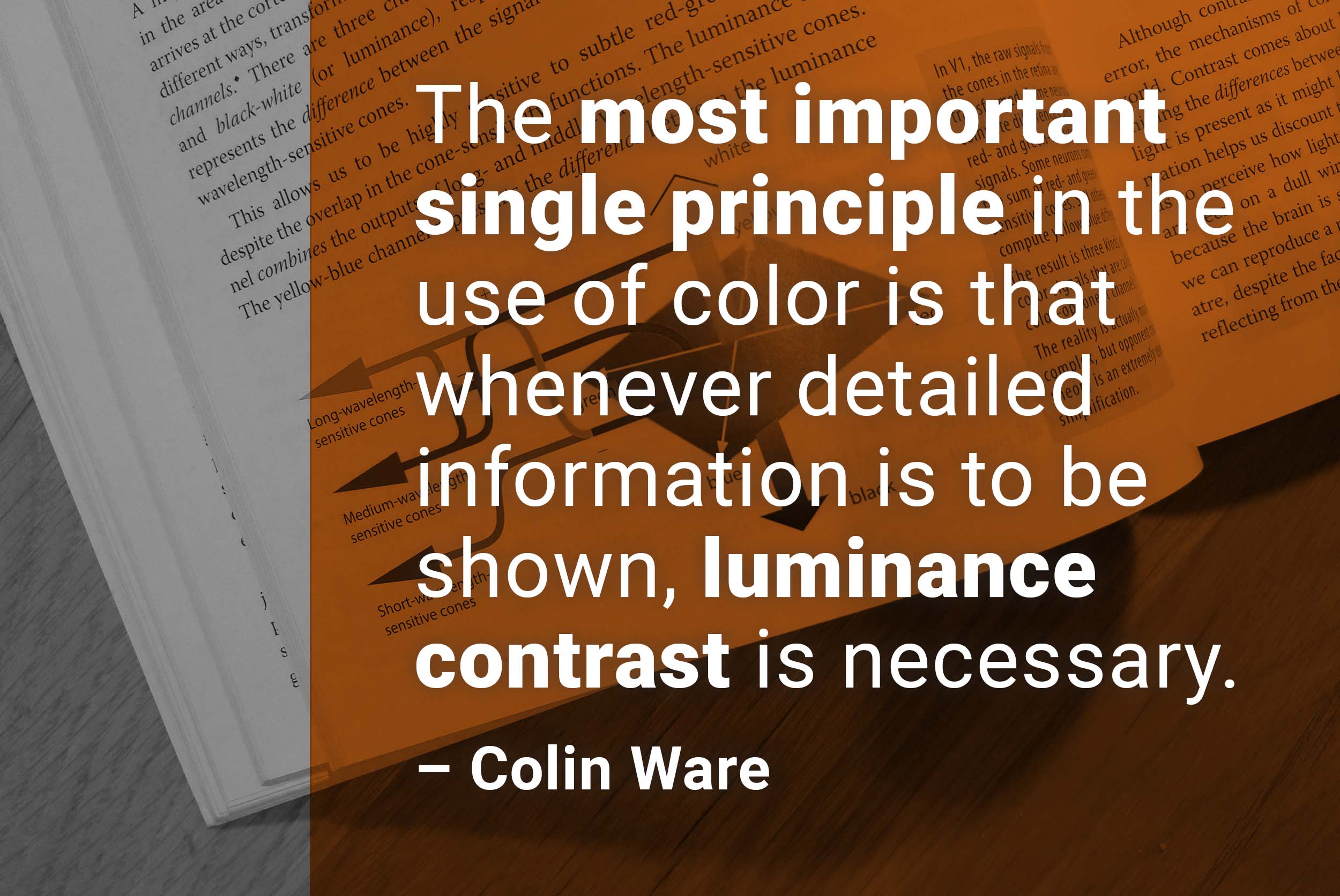
I started a Twitter thread about each chapter from Colin Ware’s “Visual Thinking” book. Here: Chapter 4, on color.
Today I went on a quest. I’m planning on publishing a blog post about color contrast and APCA on Wednesday (I wrote about that before here somewhere). I sent the draft to Andrew Somers, the inventor of APCA, and asked him if he could have a look and tell me if I got anything wrong.
Turns out: I did. I told the readers: “the brighter the colors, the more contrast we see in them.” Instead, it’s the other way round (I’m so glad I let it fact-check by Andy!): “Human vision is much more sensitive to small changes in light perception under low light conditions than we are of the same change under higher light conditions.”, as this nicely antique-looking website tells us. I was completely wrong.
But according to Andy, that rule doesn’t apply to small symbols.
So today I read a lot of things to figure out how good or bad we are at distinguishing between bright and dark colors. I started reading this giant article here and general articles on luminance, etc., and it was all more confusing than I liked it to be. “Well, I know who writes accessible,” I thought, and so I read what Colin Ware and Tamara Munzner had to say about the topic. Ware mentioned the super interesting Contact Crispening effect, and well, that’s crazy, and it confused me even more.
, in case you ever want to really dig deep into the topic but don’t want to pay for a text book.](January%2010/Screenshot_2022-01-10_at_18.04.57.png)
Color science, yay! This is a very detailed article, in case you ever want to really dig deep into the topic but don’t want to pay for a text book.
Long story short: I haven’t figured it all out. But, on the bright side: I started a list on all the questions I have about color science, and lists are always great, and so my next quest will be to find somebody who can explain it all to me.
I also had three great 30min-interviews with three more people who replied to the survey! I get lots of good thoughts through them.
One person mentioned that one of his problems with colors is that screens show them so differently. When he designed a visualization, the client called: “I can’t see it,” they said, referring to what was supposed to be a light grey element. So the designer went in to see for himself, and the client had this really old monitor standing there, and, sure enough: The light grey element wasn’t visible.
Open question: How exhaustive should my explanations be of the color principles I present? There seem to be several levels of possible explanation: “because it’s more readable.” would be the most shallow one (the one I’ve used so far); “because [in-depth explanation of neurons/rods/cones/brain/eye/physiology]” would be the more exhaustive one (the one I didn’t know about so far).