Blog post day! 🎉 Today I worked on and then published “It’s time for a more sophisticated color contrast check for data visualizations”.
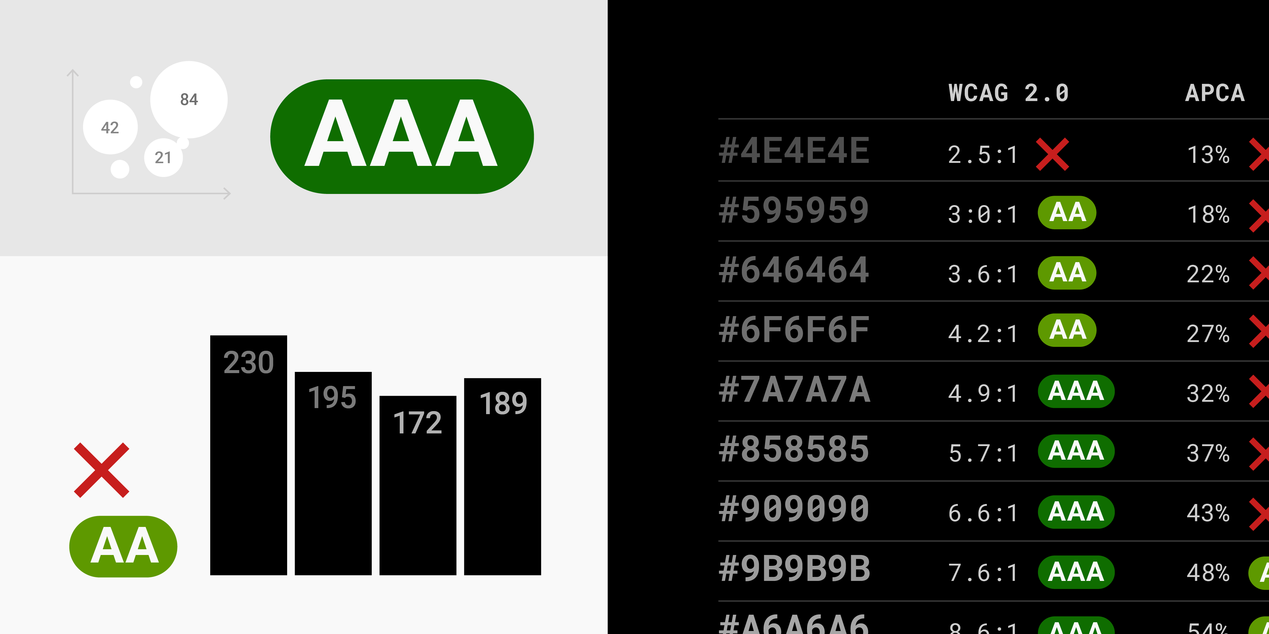
It’s an article I wrote I drafted in the beginning of December already and refined today (it’s nice to have some distance between the draft and the publication date). “Refining” means: I took out the faulty chart, and redid most illustrations to make them easier to understand. For example, I went from this illustration:
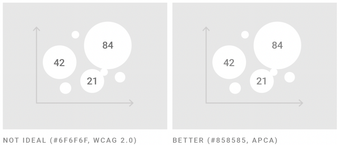
to this one:
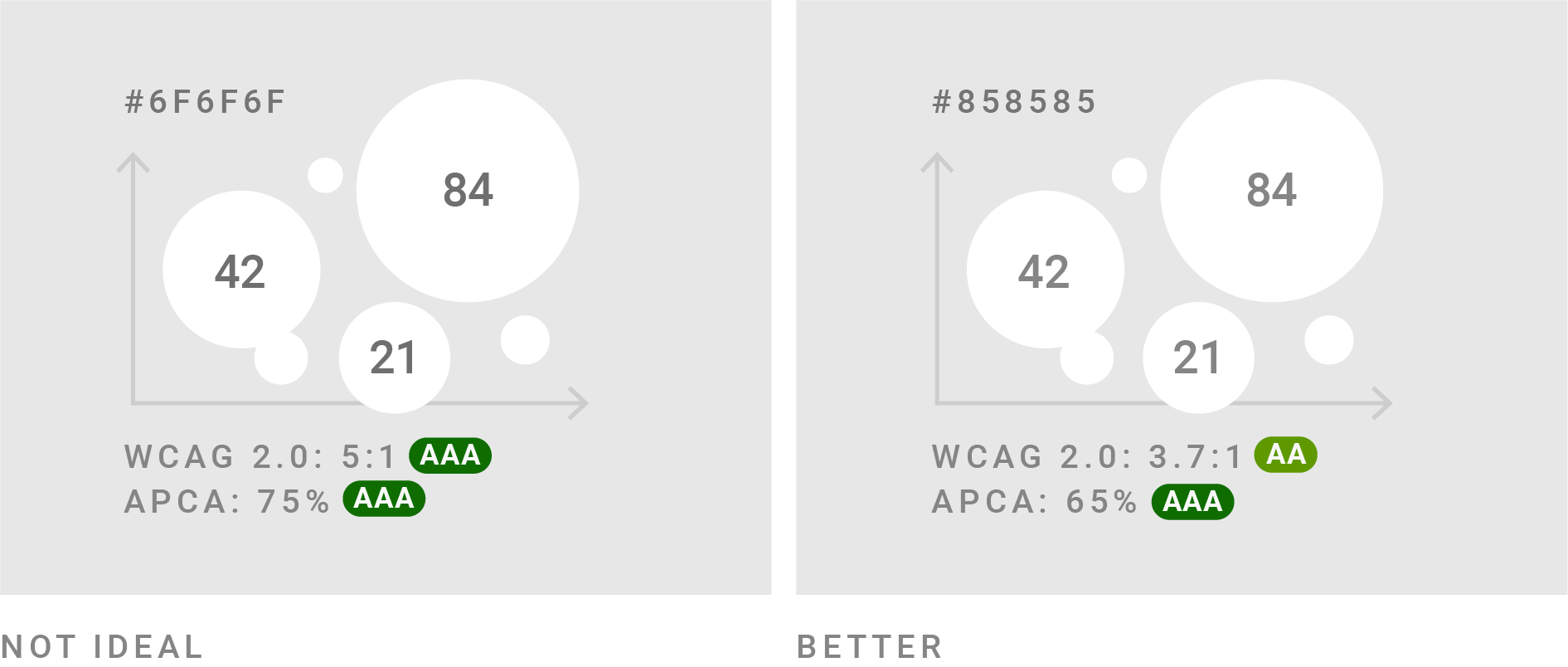
The AAA and AA labels are information that a table above the illustration already shows – but I added it anyway, so that the reader doesn’t need to search it in the table.
Also, my coworker Rose spent time with the article, proofreading it and looking out for things that are hard to understand. (Rose always makes my articles better.)
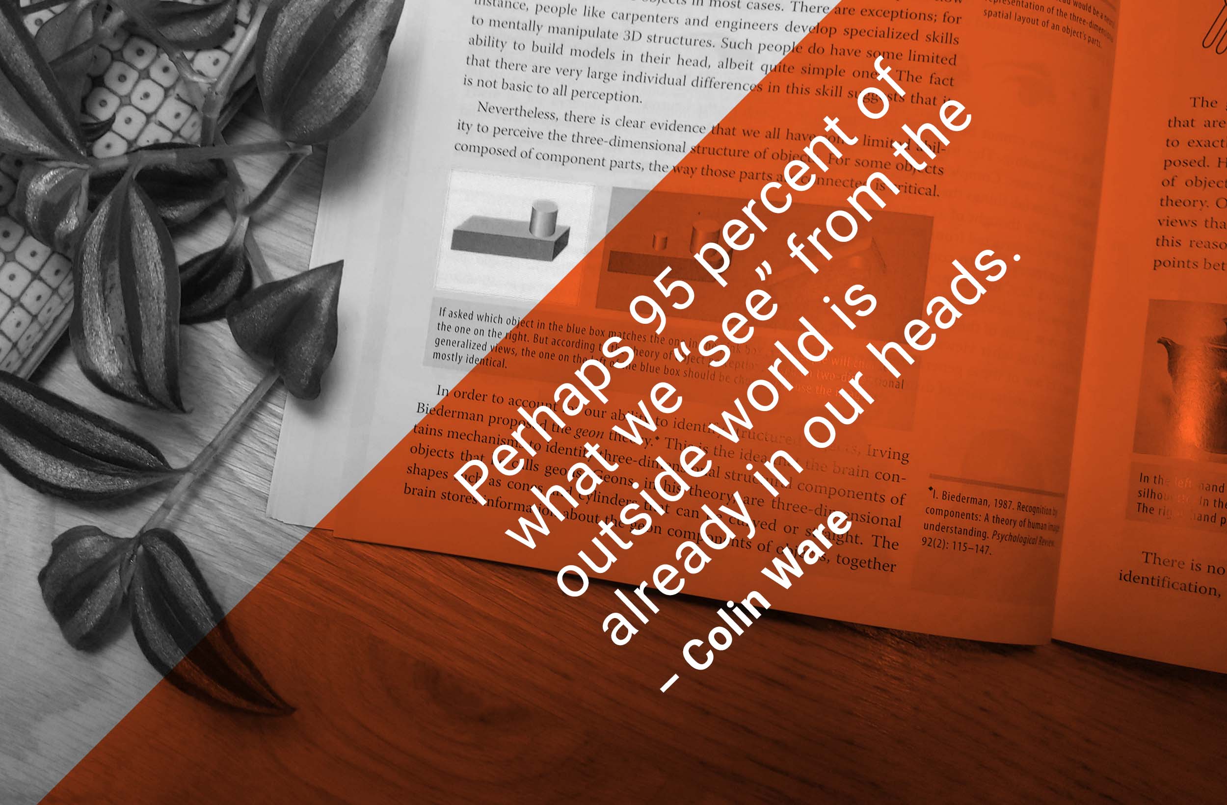
In other news, the data vis book club is in less than a week! I’m excited to discuss Colin Ware’s “Visual Thinking” with everyone who wants to join – and, well, Colin Ware.
Every day, I’m reading a chapter and sharing it over here. That’s a plant of mine I took a picture of for today’s tweet:
No interviews today, but I have one tomorrow and am looking forward to that one.
See you then!