news-infographics-analytics-maps.media
Today NIAM happened – a small, free, German conference about maps, infographics, data journalism and data vis in general. It’s wonderful. It was also virtual, sadly, but understandably. Watching the talks made me remember its 2020 edition, for which I visited Hamburg and gave a talk about “the underrated role of text in journalistic data visualizations” (find the German slides here.
I still think that text is the most underrated element of data visualizations. Because we don’t notice it much when we’re bad at it. Many of us know when the colors of our visualizations look awful. But fewer of us know that more or better labels, descriptions, titles, annotations are needed for our data visualizations to be better understandable…because we, the creators, understand it just fine. Of the 240 people who attended my little color survey in December, only 17% said they’re unhappy with their skills to choose good text for their visualizations. (34% said they’re unhappy with their color-picking skills.) If I’ll ever write a next book, it’ll be on text in data vis, I hope.
Anyway, color!
I get so much input these days that I can barely catch up with sorting it and implementing it in the book: NIAM gave me new ideas; another interview I had today gave me new ideas…and I started reading a new book, “A Field Guide to Digital Color”, by Maureen Stone. Tamara Munzner recommended it in her “Visualisation analysis and design”, and it really is the most accessible explanation of color vision I’ve read so far. I’m a big fan already. I tried to recreate some of Stone’s examples today and apply to them data vis – here’s one:
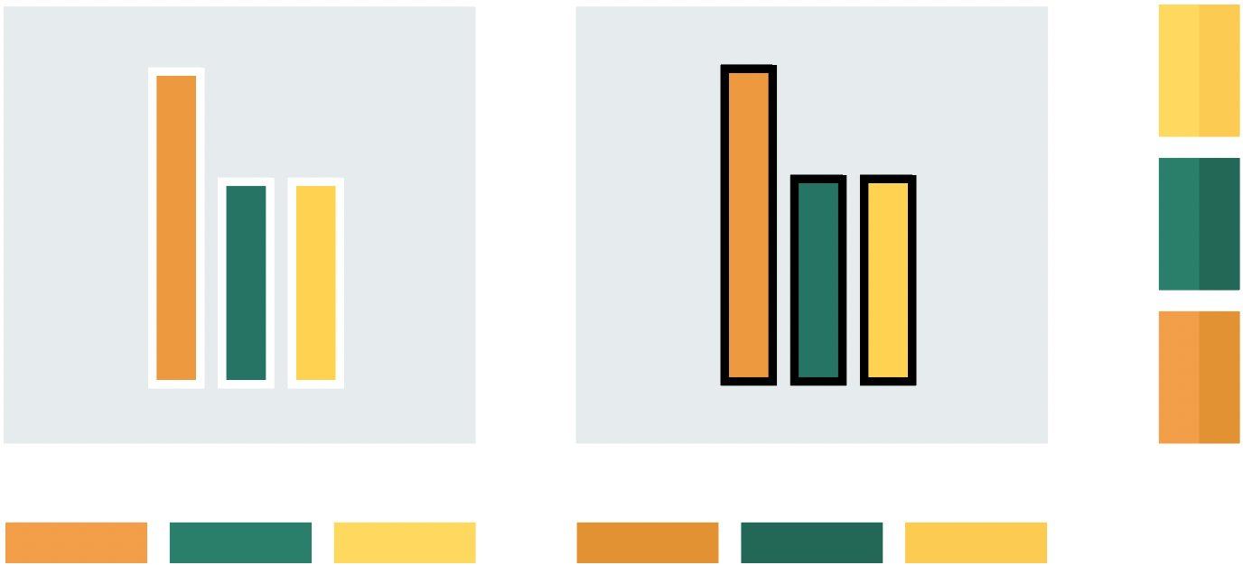
Let’s see how much of that I’ll include in the book.
Open question: What’s spatial frequency, really? Steve Haroz tried to explain it to me here, but I didn’t get it. Haven’t found a good YouTube video on it yet, either. Stone explains it – but in an abstract way.
Well, I’m out for the weekend. Stay tuned for “Lisa tries to figure out stuff” – I’ll be back on Monday!