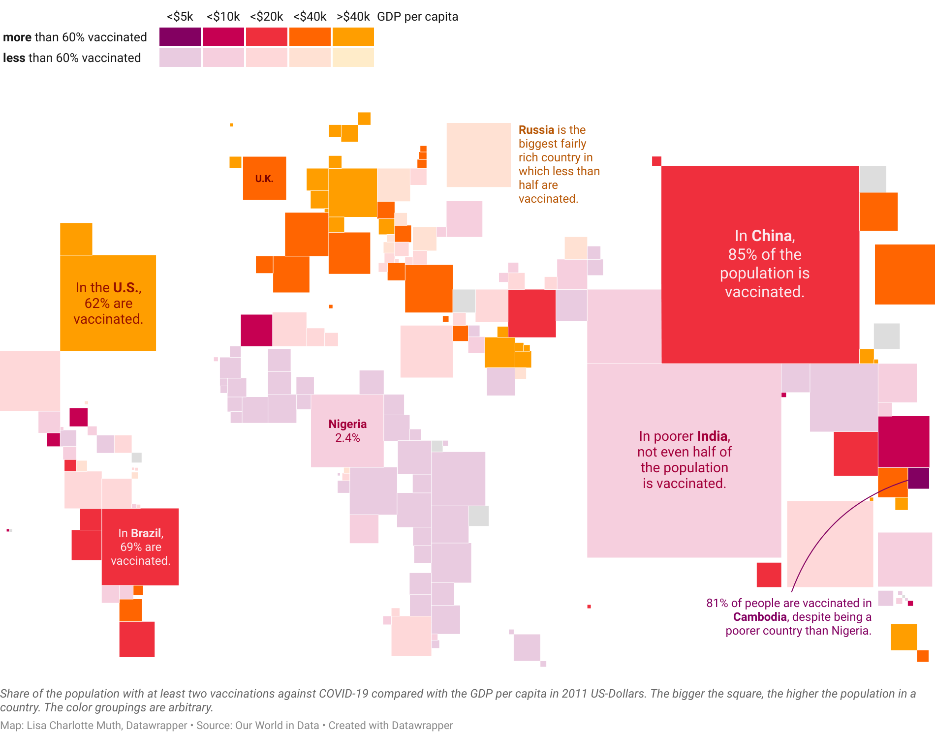
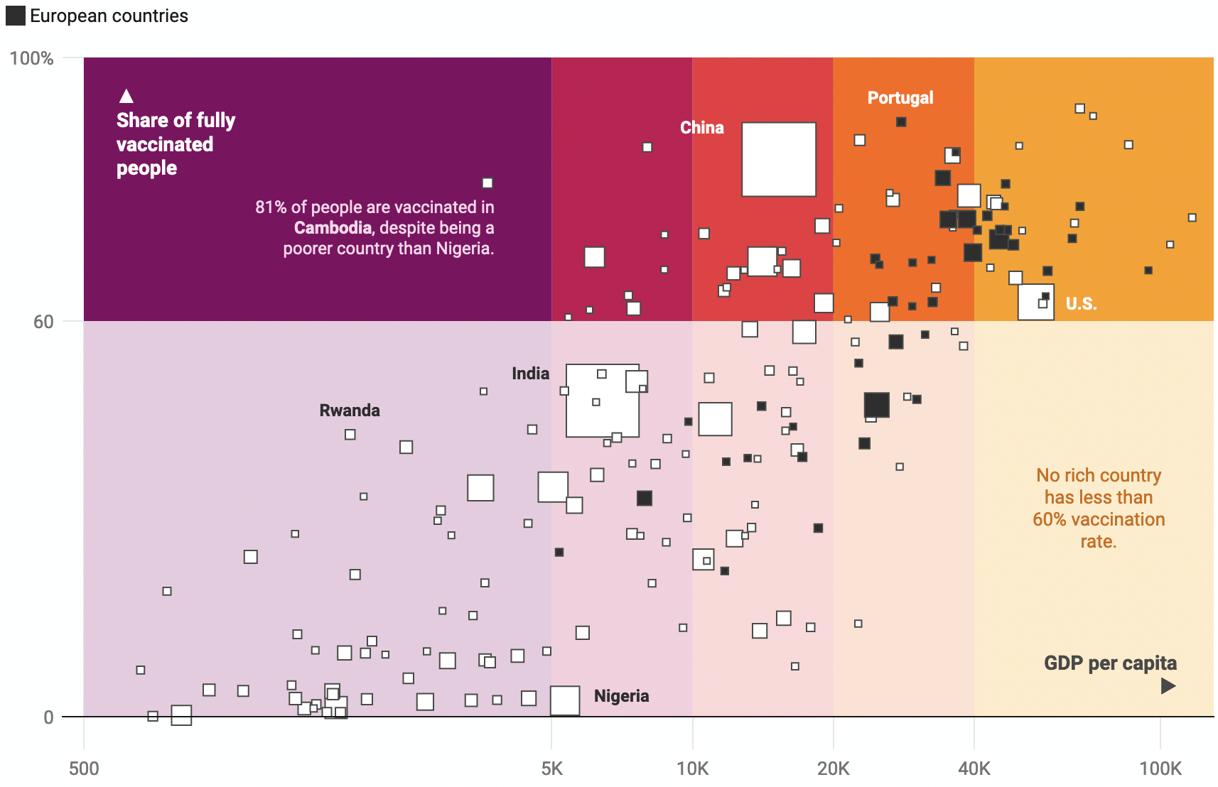
It’s Thursday, so it’s Weekly Chart time! It was my turn this week, and I decided to got with a semi-bivariate map after all. In the blog post, I described my color finding process, and write:
Creating that map was one big color riddle. Do I think I solved it completely? Not really. Do I think it looks better than when I started out? Oh yes.
and
I’d love to see your solution to this colorful challenge. My chosen palette is a bit too “friendly-looking” for the topic. I tried using blue/green/grey tones, but couldn’t find a good combination that worked. Maybe you can?
I still fumbled around with the colors today…
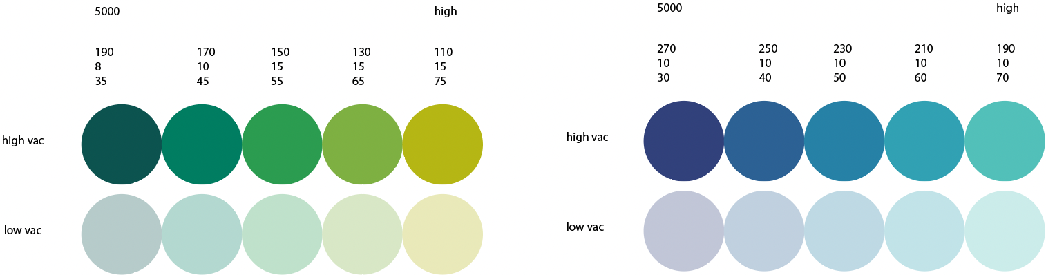
…but they didn’t make me happy. So I kept the fun-looking purple-to-yellow gradient.
Today I also had two excellent calls with people who deal with colors in data visualizations (”color calls”, as I came to call them for brevity). The second person took more than an hour of his time to walk me through how he redesigned a color palette for his organization, and there were lots of great insights in them. It makes me happy to think about writing them up.
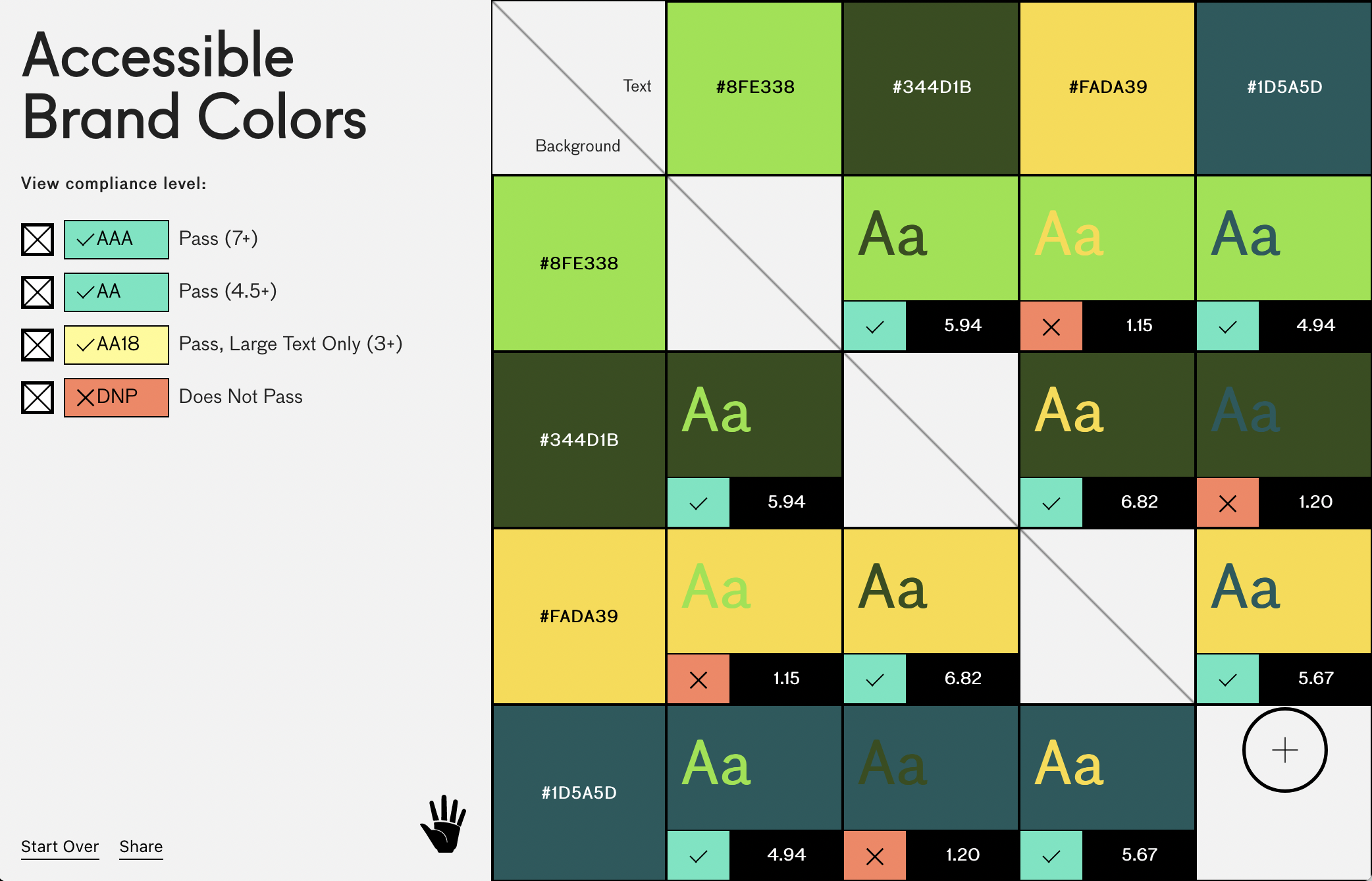
And I stumbled across two more color tools:
Accessible Brand Colors lets you check the contrast ratio between all the colors in a color palette:
Color Spark doesn’t do anything but generate random colors. Not even multiple ones. Just one at a time. Sometimes it shows surprisingly nice colors.
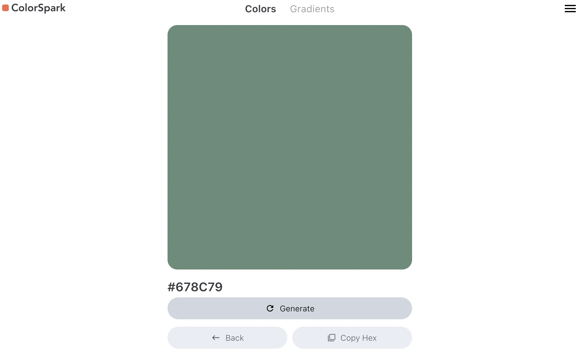
It’s fun to keep clicking that “Generate” button, I find, and to think “…not nice…not nice…oof, absolutely not….not nice…uh! hm! That’s actually really nice. Let me copy that. Ok…not nice…not nice…”
Have a great few days, everyone. I’ll see you on Monday. 👋