Today I continued and finished skimming and reading “A field guide to digital color” by Maureen Stone – a very nice book indeed. In its last chapter on “Color in Information Display”, she categorizes the use of color in visualizations as Edward Tufte does in “Envisioning Information”:
- Color as labels (colors in categorical color scales, where e.g. “Europe” is shown by red and “Asia” is shown by blue)
- Color to measure (colors in continious color scales, where e.g. bright is little and dark is more)
- Color to represent shapes (that’s mostly for 3D modeling)
- Color to decorate (colors to make a visualization beautiful)
I definitely need to read this color chapter by Tufte again – it’s been years since I read “Envisioning Information”. I get the hunch that writing about a topic that’s covered in so many data vis books, part of my job is to read all these color chapters just to check I’m not missing anything essential.
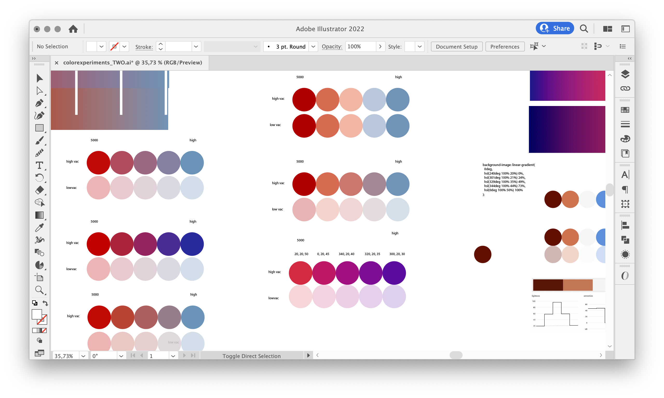
Most of my day was spent working on my Weekly Chart for tomorrow, and finding colors for a bivariate map I prepared for it. Stay tuned!