I did feel better today – and besides helping to get a Datawrapper feature ready to launch, I did a bit of thinking about considerations one makes when choosing colors, and how they contradict or agree. I feel like what contradicts with most considerations (like accessibility; or how well you can print it) is aesthetics.
I spoke to a data vis designer the other day who told me that he really didn’t like the current color palette his company uses because the colors are so bad to refer to. He gives a lot of presentations and needs to say stuff like “and this orange bar here…”. But in the color palette of the style guide, there isn’t an orange. There’s only “greenish pale orange” and “olive-blueish” and “dark blueish purple”.
So some designers in his company tried to do better. They created a new color palette – one that used more “pure” colors like red and blue and green and orange. Better referable colors. A more saturated palette.
But not everybody liked it. “It was too colorful; too vibrant. That’s why people didn’t adopt it,” he told me.
“But Lisa,” I hear you thinking, “there’s a way to create red and blue and orange colors that are still nicely referable, but not saturated.” And you’re right. The desaturated colors on the right might be a bit more pleasing to the eye:
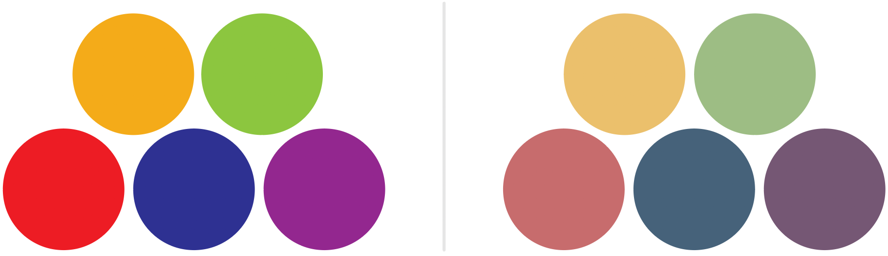
But the less saturated colors are, the harder it becomes to distinguish between them when they’re very small (like in a scatterplot) and have a similar lightness. The left two dots are the saturated blue and purple from above; the right two dots are the less saturated blue and purple:

Hm.
I’m thinking about doing one big diagram for all the conflicts and compromises…