Today I didn’t do much for the color book – but on the weekend, I prepared a workshop about color I’ll give on Thursday, and that was quite some fun. I created a lot of new illustrations (explanatory graphics? Figures? I never know how to call these things.)
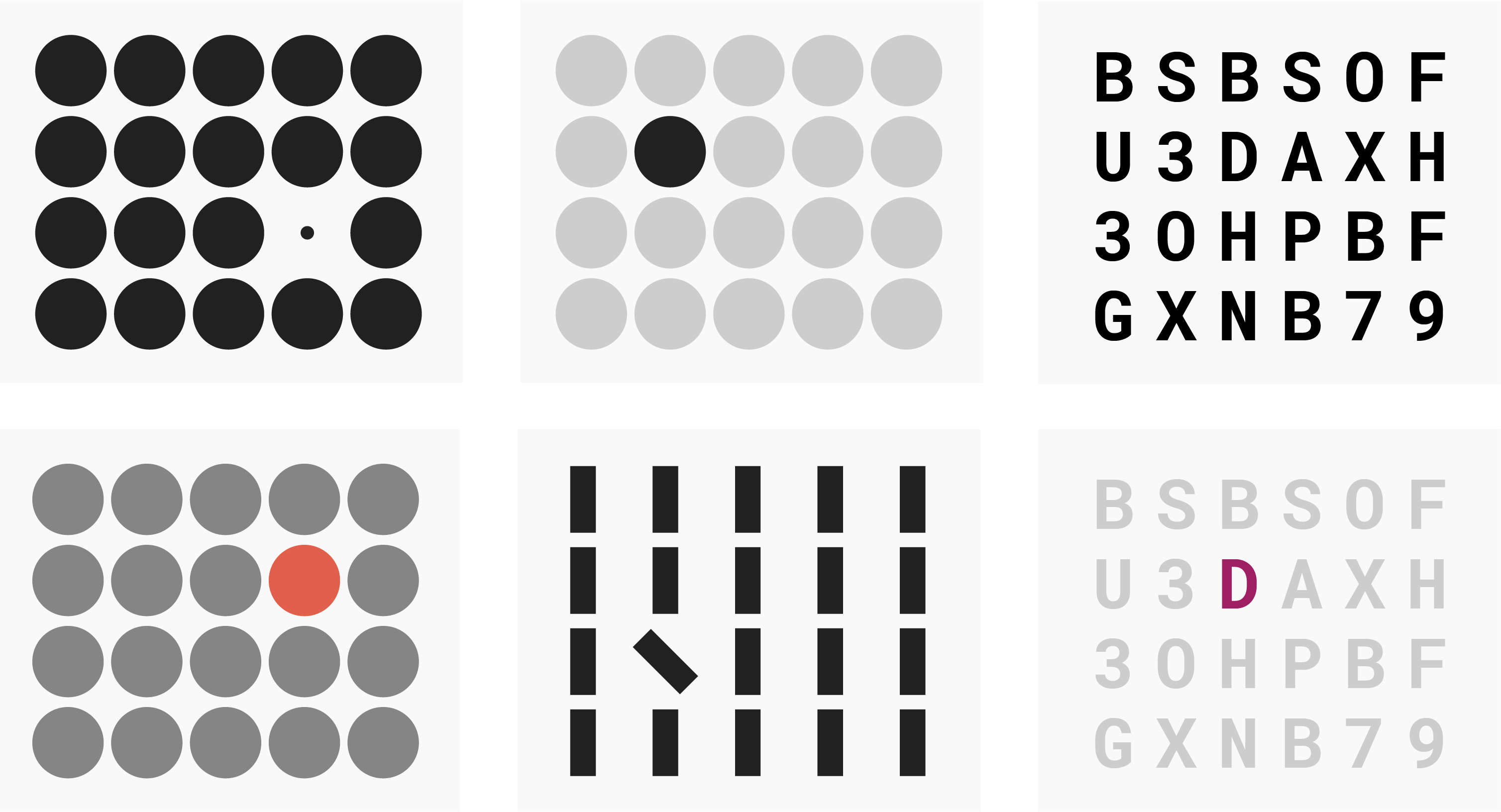
For example, about the phenomenon that the smaller the size of elements, the harder it is to tell them apart based on color:

Or the phenomenon that it’s easier to distinguish between elements of similar lightness if their lightness is roughly the same as the background color:
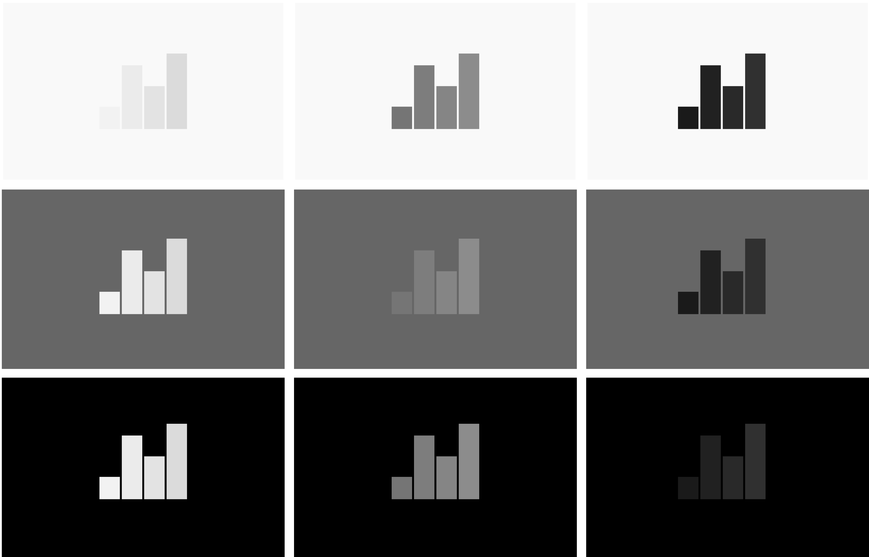
That’s maybe my favorite little illustration from the last few days. It’s super interesting to see that the eyes have a hard time seeing differences between the bars when the contrast to the background is high.
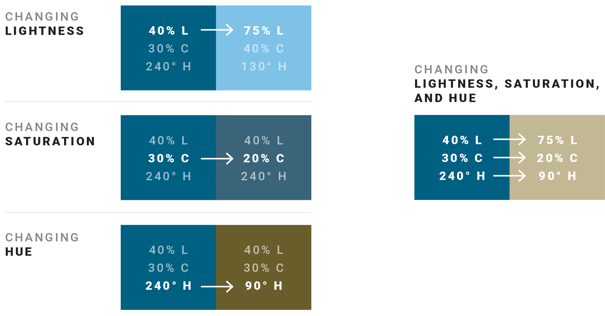
And for the reminder to change not just the lightness, but also the saturation and hue of colors, I created this one:
Open question: What’s the best structure to talk about colors? I’m pondering about that again and again. A the workshop, I’ll try a slightly different structure than in the book – and am curious to see if that one will work.