Finally, the days of a grey and rainy January are behind us. Let’s welcome a grey and rainy February! (Berlin didn’t disappoint today 🌧️)
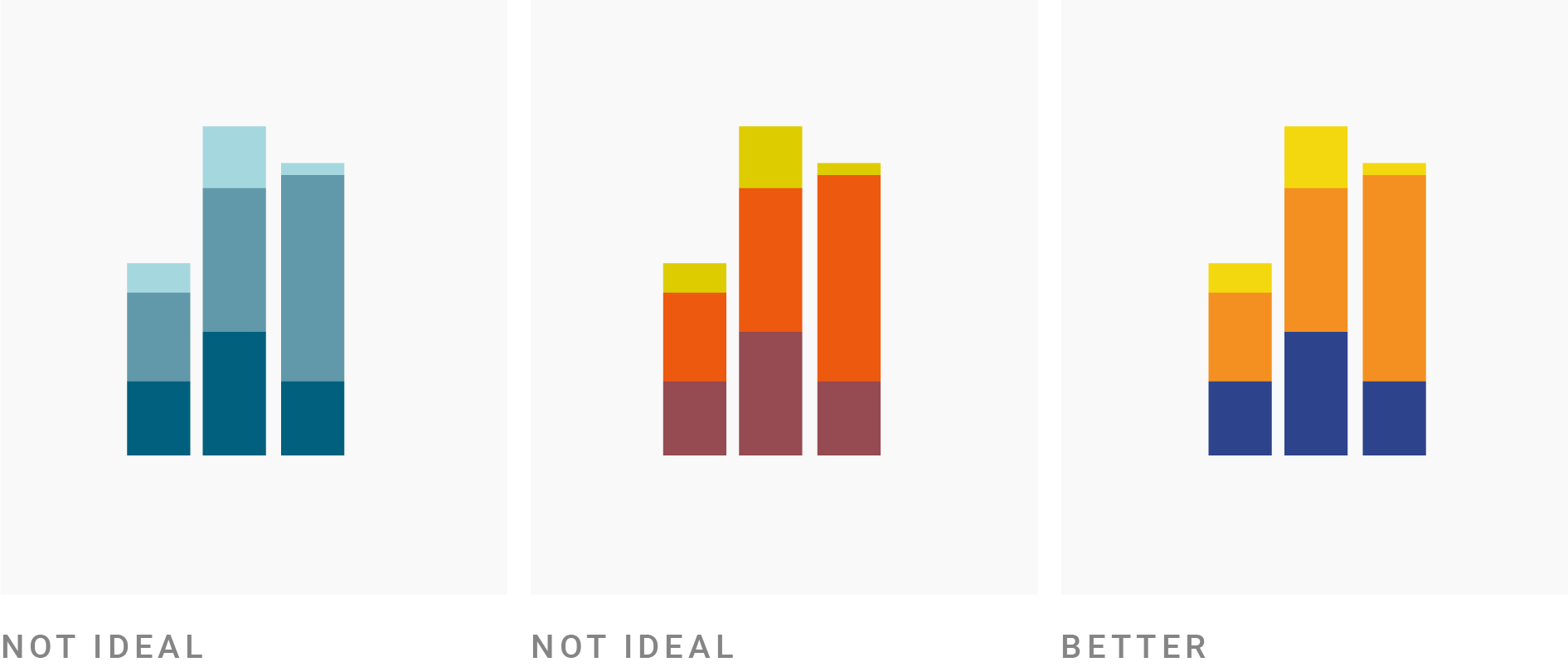
Today I created more “explanatory figures” for the blog post on “how to create a color palette for style guides.”

That article in the process of becoming a monster. I don’t know how I could write short blog posts a few years ago – my blog posts these days need a “tl;dr”. Or a summary post. They’re more like mini-ebooks. I get the feeling this one, again, is one I should probably split up into multiple parts.
(In case you’re wondering why in the image on the top, the third chart is better than the other two: That figure is supposed to illustrate that “refer-ability” of colors is something to consider. Appearance-wise, I actually prefer the second chart!)