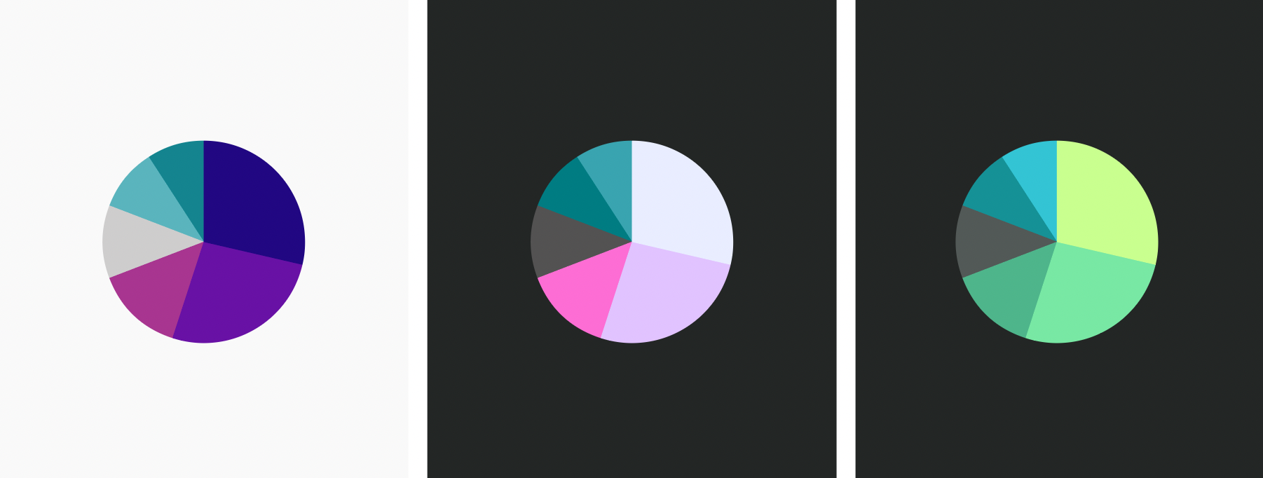
Today I was pondering about dark mode. I was trying to find out what the perfect colors in dark mode would look like. If you’re using very dark, saturated colors in “light” mode and increase the lightness of them in dark mode to get them to the same contrast ratio in both modes, then you’ll get bright, very desaturated colors in dark mode.
That’s because different colors can be differently saturated depending on their lightness.


As this view on the LCH color space in the Chromaticity tool shows:
- If you want bright and saturated colors, go for green, yellow and orange – and maybe green-blue and pink.
- If you want dark and saturated colors, go for blue, red, purple.
- A compromise between the two seems to be green and pink/purple. They might work both dark and bright, but I haven’t tested that yet with an actual data visualization.
And maybe using less saturated colors is a solution.
I’ll keep pondering (and experimenting).