Woah, stuff is happening. On Friday morning until noon, I attended the data vis conference Outlier…and also held a very unprepared unconference session there about color palettes in data vis style guides. It was fun! People asked questions, and recommend lots of color tools in the chat.
One of them is the CIE2000 Calculator – to calculate Delta-E. It’s a measure of the difference of colors. The higher Delta-E, the bigger the difference between colors. Here’s a whole article about it that I still need to read.
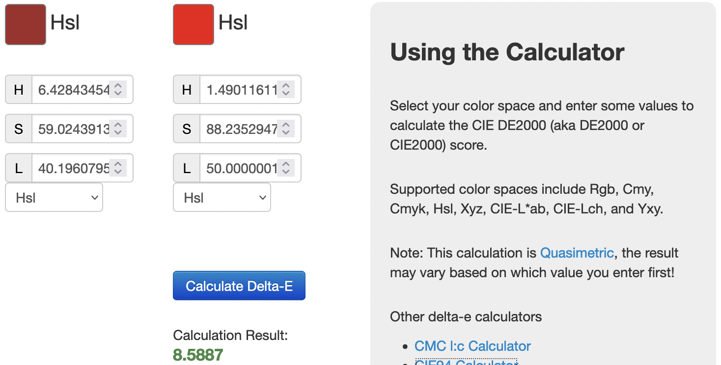
If Delta-E (also sometimes written CIE ∆E) is 2-10 like in the screenshot above, the difference in colors is “perceptible at a glance.” 11-49 means that the colors are “more similar than opposite”, and if Delta-E is 100, the colors can’t be further away from each other.
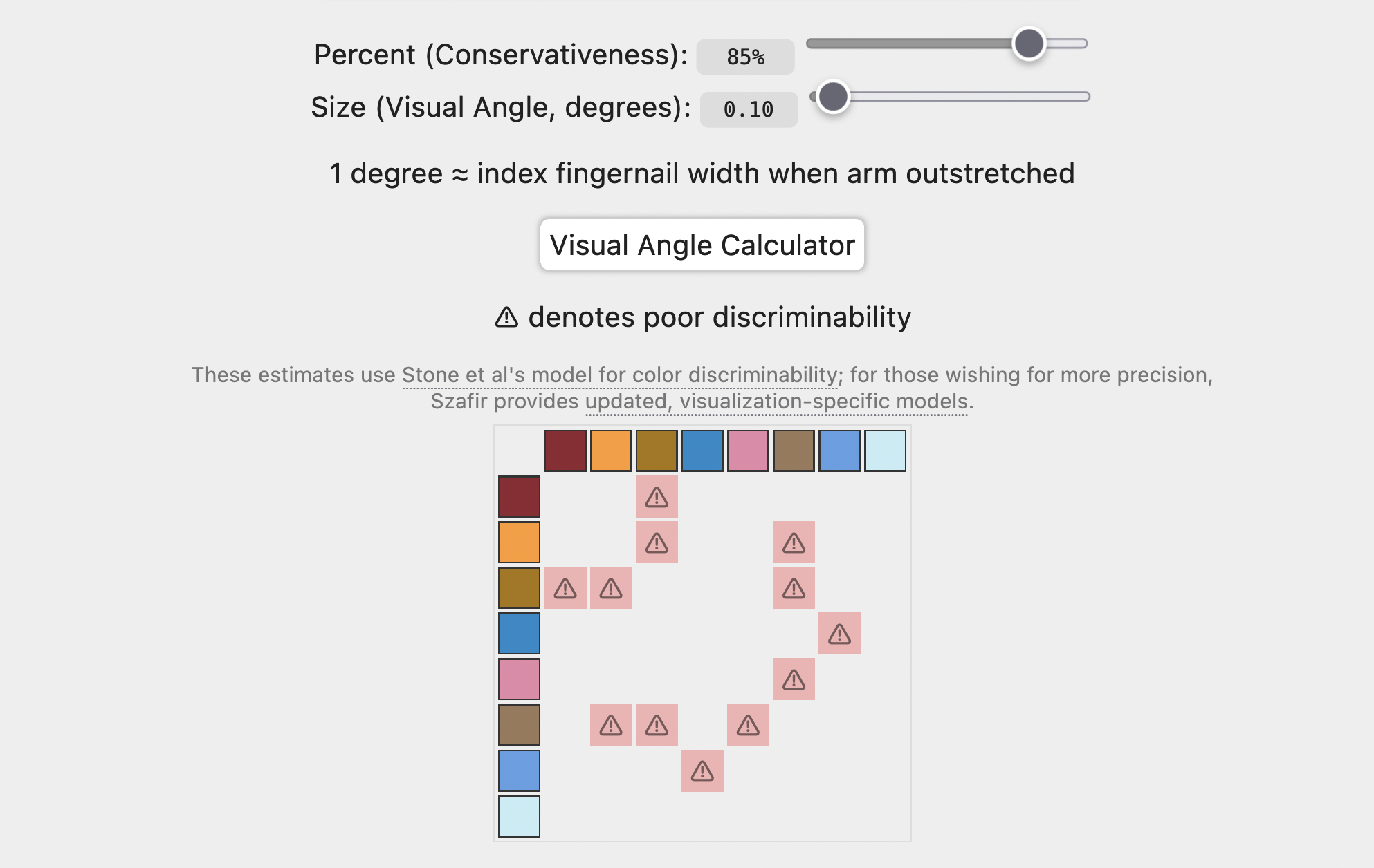
But how much Delta-E is enough for our data visualizations? Maureen Stone, Danielle Albers Szafir, and Vidya Setlure tried to answer that 2014 in their paper “An Engineering Model for Color Difference as a Function of Size”. It showed “a way to estimate how much separation (measured in CIE ∆E units) colors must have to be robustly distinct at different sizes.”
You can check their estimates with your colors in tools like Chromaticity (picture below) or Viz Palette.
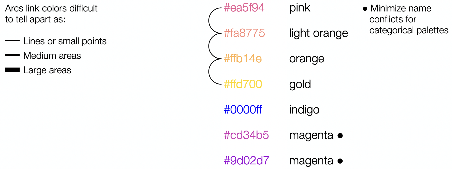
I also listened to a few of the Outlier sessions today that I missed on Friday and Saturday. One of them was an unconference session by Justin Lind called “NAMEABLE Categorical Colors”. While he was sharing his screen, I spotted two tools in his browser:
First, the Color Palette Analyzer that checks similarities in color names (similar to what Viz Palette offers):
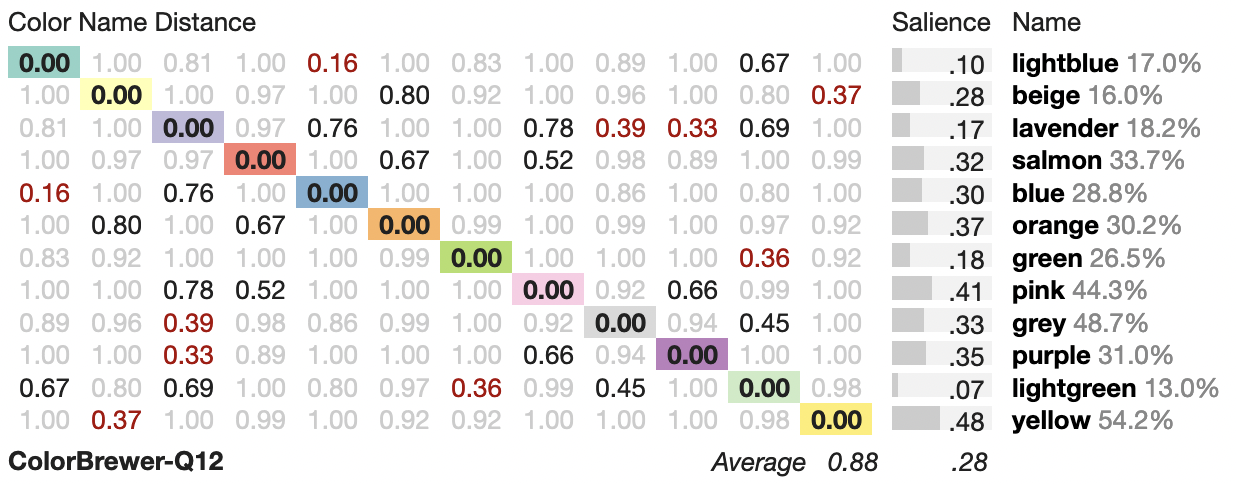
And second, the absolutely crazy looking CCC tool:
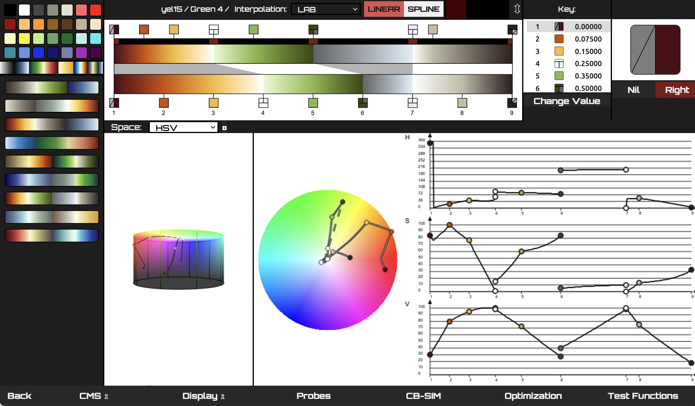
Wow. What a tool. I’m not sure I should get into it.
Today I also had another great interview with somebody who’s currently working on a color palette for her organization. I keep getting so much out of these conversations (thanks to everyone who took the time to speak with me so far!).