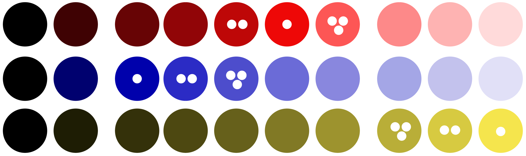
Some quick playing around with colors. The three color columns at the right are too bright to follow accessibility guidelines (contrast ratio < 3:1). The color with the white dot is the most saturated color of each row; the color with two dots the 2nd most saturated color.
That was a nice day. I wrote a bit and got some nice input. And I tried a few nice color tools, which is always fun.
First, the writing: I got a better idea of where I want to split my giant style guide post. Getting a better idea of a structure of a post always motivates me (”hey, look Lisa, you’re basically done!”). I’ll structure it probably in these parts: Kinds of style guides, which colors to choose, and what to consider while doing so. I also have a long part on “how many colors do you need?” which might become its own article…or I’ll dissolve it into the other parts 🤔 It has interesting quotes, but it’s a little bit dry and not very visual on its own.
Anyway – I had some fun explaining how to create sequential color scales out of brand colors today. Grasping things while writing about them makes for the most satisfying writing experience.
I also listened to a talk by Chris Lilley (technical director at the W3C and co-author of colorjs.io) that makes the point for OKLab – in a way that even I understood it! That was nice.
](February%208/Screenshot_2022-02-08_at_17.52.32.png)
“Lissner and Urban plotted shapes of constant deltaE 2000 in CIE Lab If it was totally perceptually uniform, these would all be identically-sized circles completely evenly spaced.” – Chris Lilly
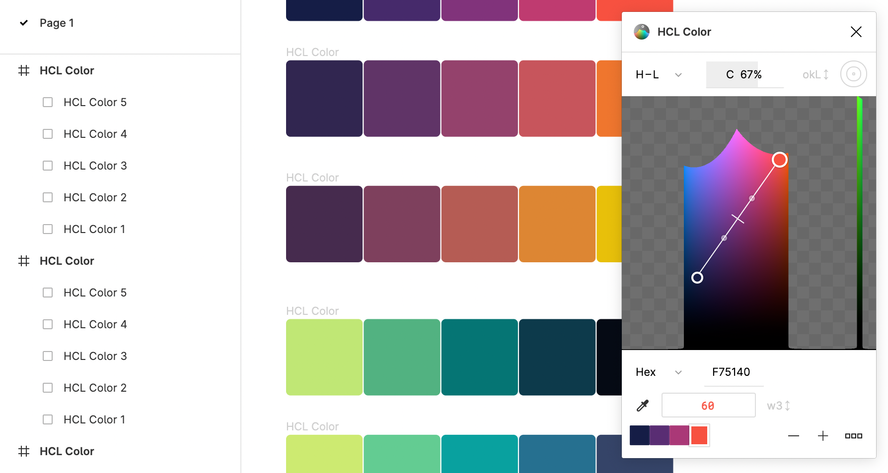
And I tried some color tools for Figma! That graphics editor lets users install plugins, and people built quite a few color plugins. Here’s e.g. the HCL Color plugin, that lets you create gradients in the Lab, LCH and OkLab space:
See you tomorrow! 👋