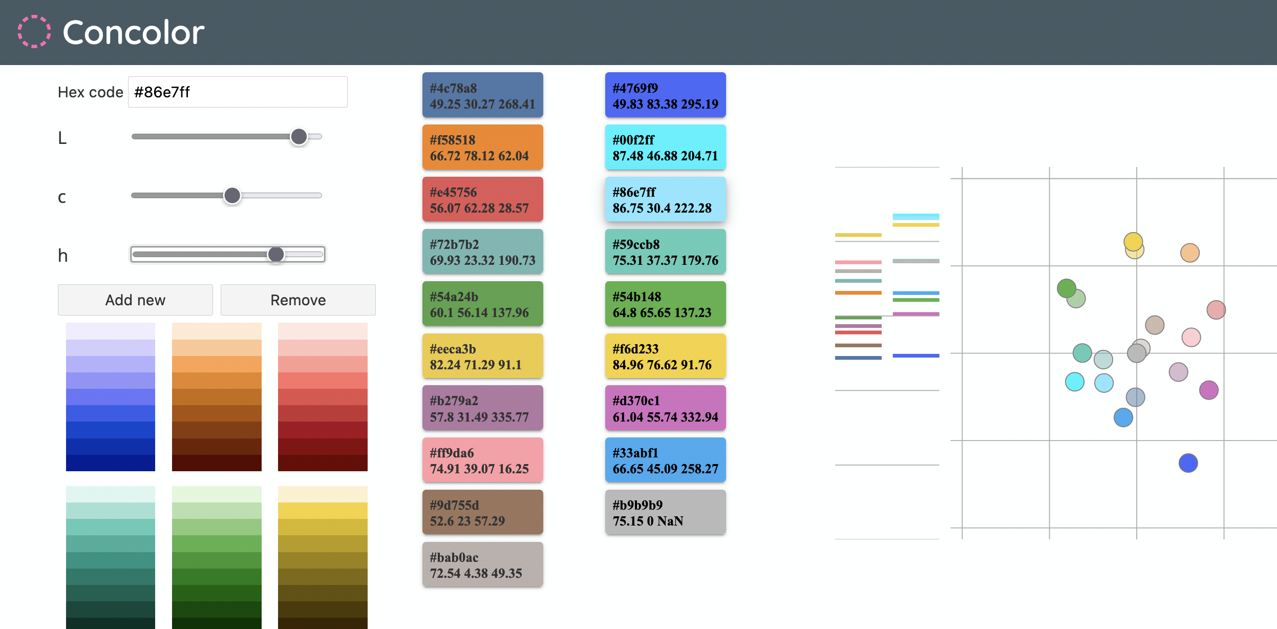
The Concolor tool by István Korompai
Today I had a call with István Korompai, a Hungarian data vis expert, who told me about a color tool he built a while ago. It lets you create categorical colors. István got inspired by a tool that the Tableau Research team built to update their color palette. They wrote about it here and even showed a screenshot, but never put it online. So István started to rebuild it. The idea is that people can get inspired by Tableau’s 10-color palette, and then shift them for their brand colors.
The thing I like the most about it is the LAB visualization at the right. The x & y axes show the a* (green-red) and b* (blue-yellow) part of the Lab* space, and the little chart to the left shows the lightness. Seeing both is super great.
If you know of other simple color tools that show your colors in the LAB space, let me know on Twitter! (@lisacmuth)
I also had nicely much time to work on the style guide blog post. Today I thought quite a bit about how not to overwhelm people with all this information. That, in turn, made me restructure the information (once again)(but only a bit).
I also added a part at the beginning saying: “Hey, if you’re just starting out, there’s no need to consider all that what you’re about to read – just throw some colors together; DONE. Also, stop reading.” I hope it helps.