I’m back from a week of vacation! Today I caught up, replied to a few emails, a few Notion comments, a few Slack messages. Then I asked all of you Hebrew and Arabic-reading people if you’d rather read a chart in your language from left to right or from right to left, which has nothing to do with colors – but might have something to do with other Datawrapper-related things.
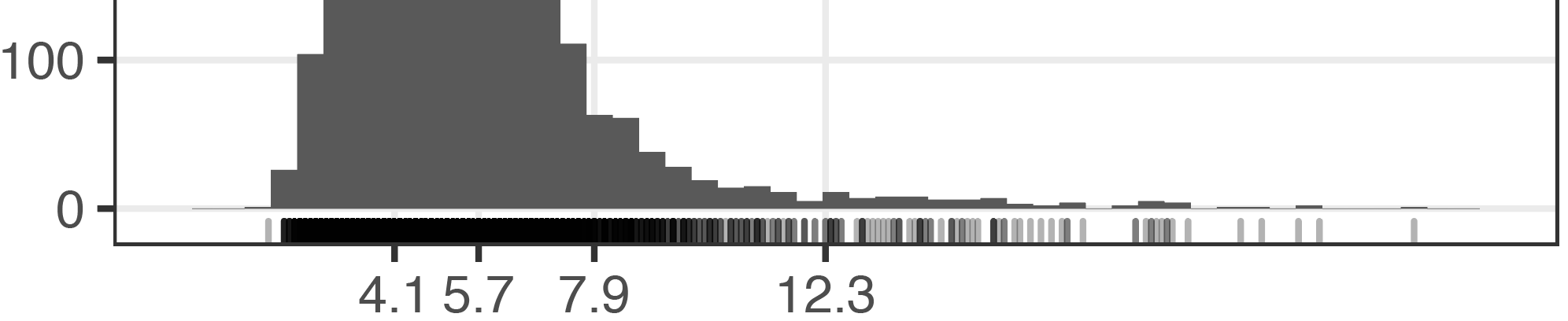
And for a few hours I returned to interpolations! I slowly figured out how to best bring histograms and barcode plots (also called strip plots, I learned today, and created with a geom_rug() in ggplot2. They are these lines at the bottom of the chart) into Adobe Illustrator, to then style them further: The solution is to not create them with Illustrator, although possible.
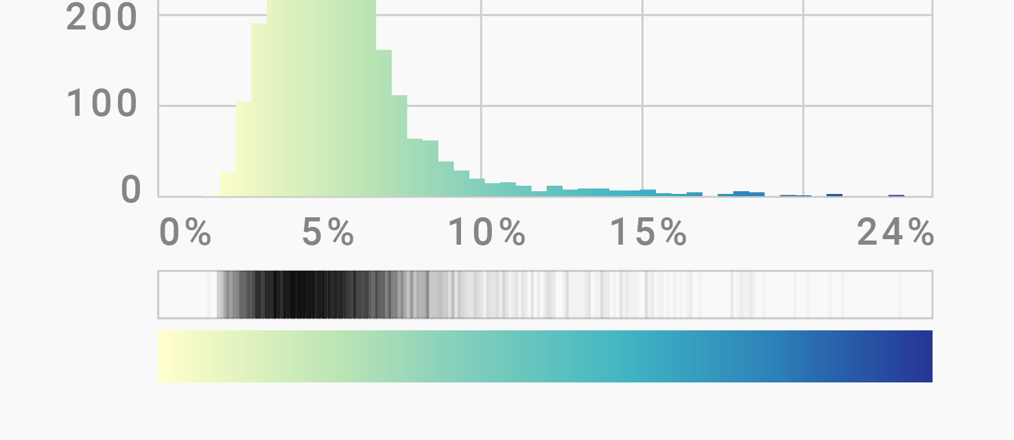
Histogram and strip plot created & styled in Adobe Illustrator
It’s more precise to create both plots in R (and of course I love a good opportunity to use R!), then export them as PDFs and import them into Illustrator. As most ggplot2 codes, it’s a simple one:
ggplot(d, aes(x=value)) + geom_histogram(binwidth=0.5) +
    geom_rug(alpha=0.3) +
    scale_x_continuous(limits=c(0, 25), breaks=c(4.1,5.7,7.9,12.3)) +
    scale_y_continuous(limits=c(0, 500)) +
    theme_bw() + theme(panel.grid.minor = element_blank())
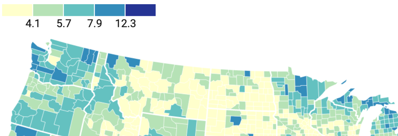
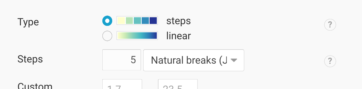
The defined breaks are the same that Datawrapper gives me when using its “steps” feature in the map tool:
I hope to make more progress on that tomorrow than I did today – let’s see.