Happy new week! Today I mostly worked on the Dispatch, that I’ll prepare this week, since Rose will be busy with her Weekly Chart (and I’m excited about that one!). So I looked at a looot of data visualizations today, decided which ones are worthy to be included in the Dispatch, took screenshots of the ones that are and pasted lots of links into our blog system.
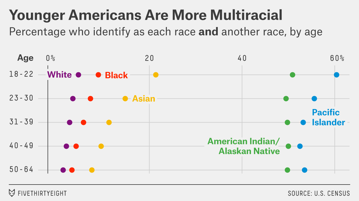
And I also picked lots of colors. At the end of last week I gathered 50 data visualizations that showed data about races and ethnicities, like this one:
Today I put all the colors of these visualizations into one big overview. Here are for example the colors of the 10 Pew Research charts I gathered:
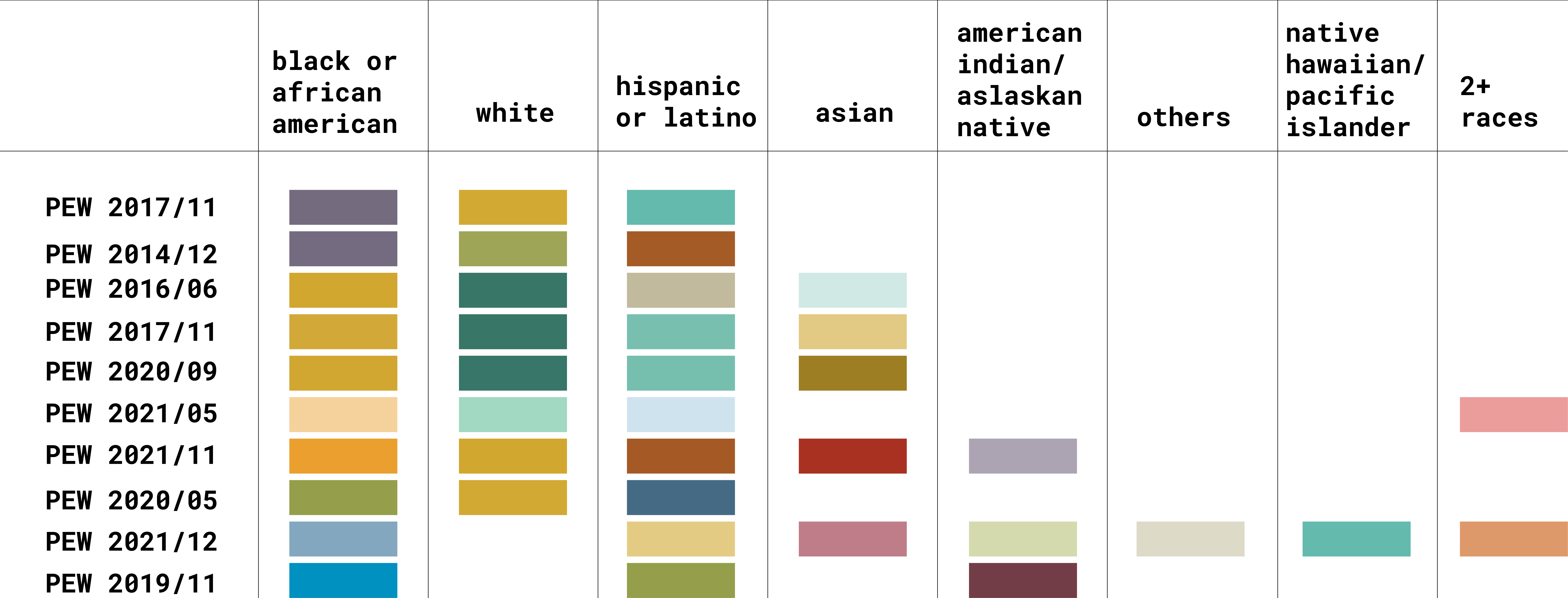
It’s interesting to see that Pew uses colors fairly diverse for different ethnicities. But that’s fairly common. We can see that the Washington Post seems to have some kind of system in place since August 2021 (or maybe I just found visualizations by the same data vis designer? I’ll need to to check that.)
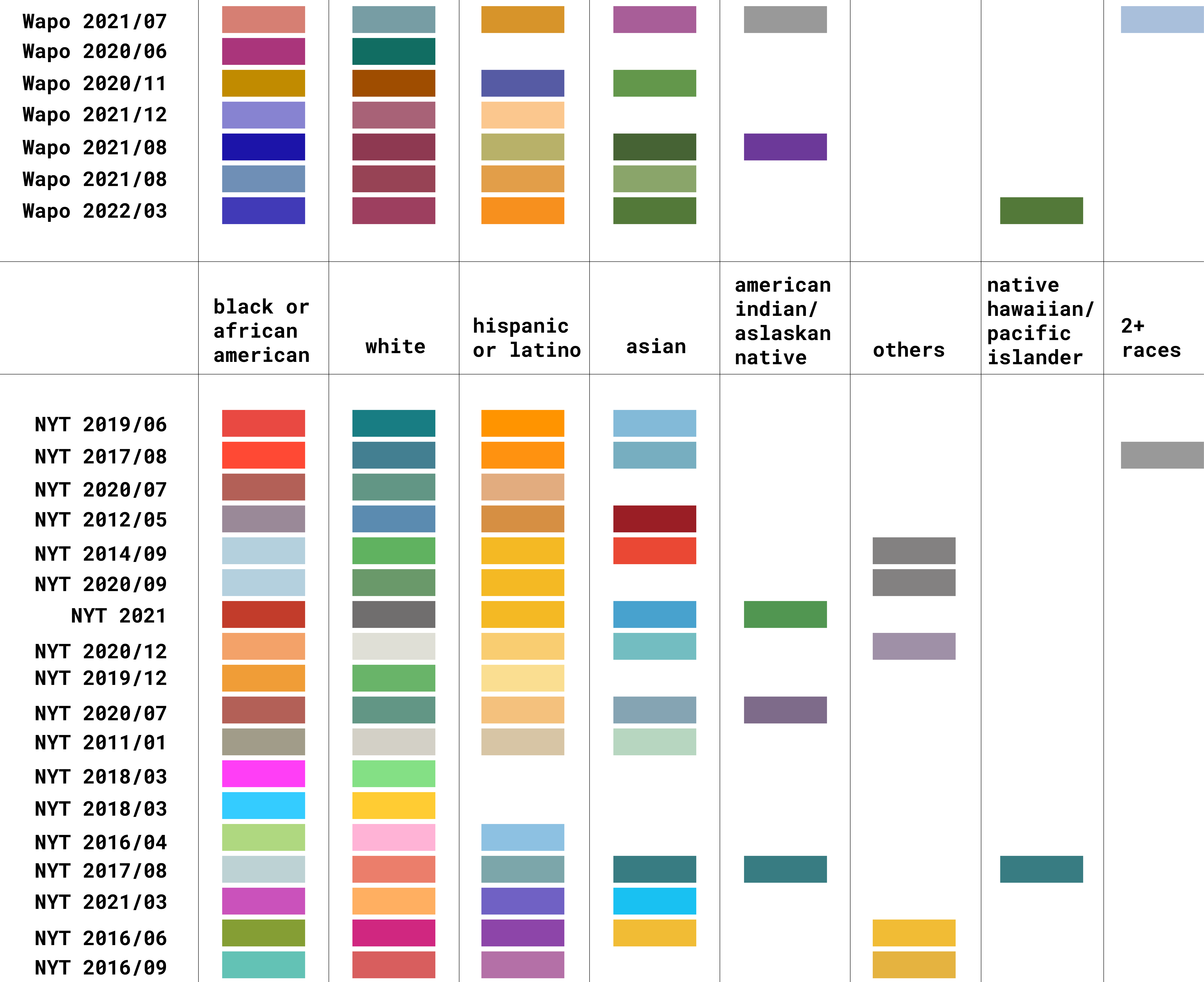
And the New York Times seems to have a preference for yellow/orange colors for hispanic or latino people.
Besides that: Lots of heterogeneity. I hope I’ll find some time after sending the Dispatch out tomorrow to dig a bit deeper.