Today felt like I got quite a few things done, but looking back, not much got done. I did work quite a bit on that other project I hinted at yesterday.
And I did more research than actually writing and creating figures. (I only wrote 3 pages.) But that’s ok. In the end, it hopefully makes for a better book. I don’t want to give bad advice.
For example, I researched how high the contrast between text and background should be. Lots of people say: Don’t use pure white on pure black or the other way around:
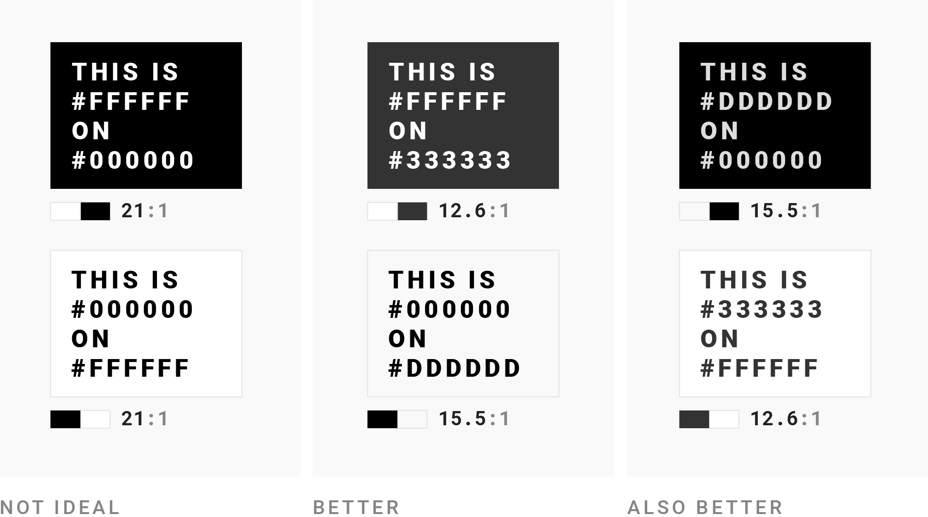
But then I thought: “Let’s see if people actually really don’t do that.”
- Turns out, lots of newsrooms actually use pure black for both body text in their articles and for e.g. data vis titles (e.g. Politico and Bloomberg).
- Some newsrooms don’t use the maximum contrast for neither article text nor data vis elements (e.g. Financial Times)
- Most curious, though: The newsrooms that use a non-pure black for the article text, but a pure #000000 black for data vis titles (Pew, ZEIT Online, The Economist).
What’s up with that? Is this something they consciously decided (”our article text black looks too faded for data vis, let’s go with a pure black”)? I’ll ask a few people to find out. In the best case, it makes my advice better.