And it’s June! That was quick. I was very busy replying to the many messages I got from you who were interested in the two new jobs we posted yesterday (find them here!). And we already got some first applications! Exciting.
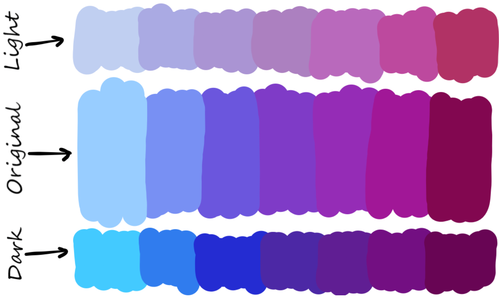
Image from Andrada Olteanu’s blog post “🎨How to create a Color Scheme for your Notebook”.
I didn’t work on the book today, but I do want to talk about a color topic here today: Information designer and speaker Evelina Judeikyte attended a workshop I gave at the Israeli data vis conference ISVIS a few weeks ago about colors in data vis – and she wrote up some of the advice I gave in her newsletter (😍)! Find it here.
She summed up three ways to choose colours for your data vis designs. Which got me thinking: How many ways are there? With how many can I come up with? So here’s a list I started today, and I’ll think I’ll explain all of these ways a bit better in the book:
- Pick from photos of landscapes → good for desaturated, natural-looking colors
- Pick from well-designed multi-hue gradients like Viridis and its friends (especially good to get colors with different lightness)
- Use pre-created color palettes, e.g. from Wes Anderson movies
- Pick from a color wheel → good if you have a base color to work with and need to adjust the other colors
- Use the Greg Gunn method → good if you have a base color to work with AND to choose colors with different lightness
- Use a “create hues for data vis” tool like Colorgorical or Leonardo → good to choose colors that are easy to distinguish
- Copy from other data visualizations (and maybe adjust them a bit) → good to quickly get beautiful colors that work for data vis
I don’t think this is the full list of options, and I’ll extend it a bit in the coming weeks and months. Also, these options are vastly different and should be sorted by “how much time does it need?”, or “how easily will you come up with beautiful colors even if you have no eye for design?” 🤔