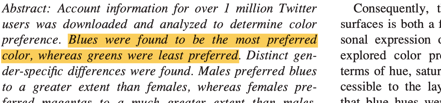
Screenshot from Hue, Saturation, and Brightness on Color Preference in Social Networks
Today I worked a lot on the book, but wrote very few words. Instead, I did a lot of research, reading papers called Effects of Hue, Saturation, and Brightness on Color Preference in Social Networks: Gender-Based Color Preference on the Social Networking Site Twitter or Most and Least Preferred Colours Differ According to Object Context: New Insights from an Unrestricted Colour Range.
That was fun, and I got a lot of interesting new input from them.
Like that people really, really like blue & yellow, orange and red. And that they really don’t like purple and green (also not so much in combination, as Karen Schloss pointed out in a study I read a few weeks ago).
Here’s a histogram of the hues that are used in user-created color themes on https://color.adobe.com/explore and https://www.colourlovers.com/, that Peter O’Donovan et. al. had a look at in 2011 for their paper Color Compatibility From Large Datasets:
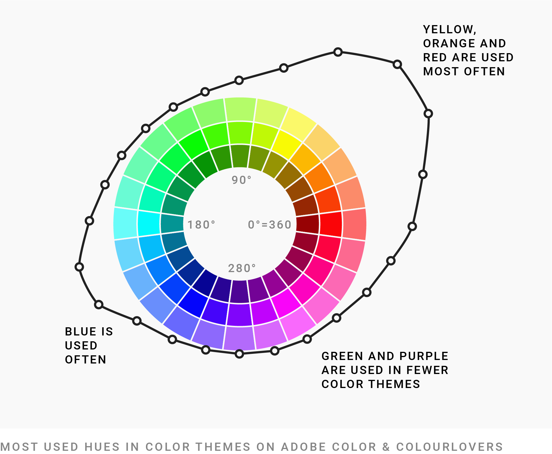
Most of these colors are really blue or these typical warm colors. It’s doesn’t show that people follow the advice “choose a complementary color scheme”. People really just one complementary color scheme, blue and orange.
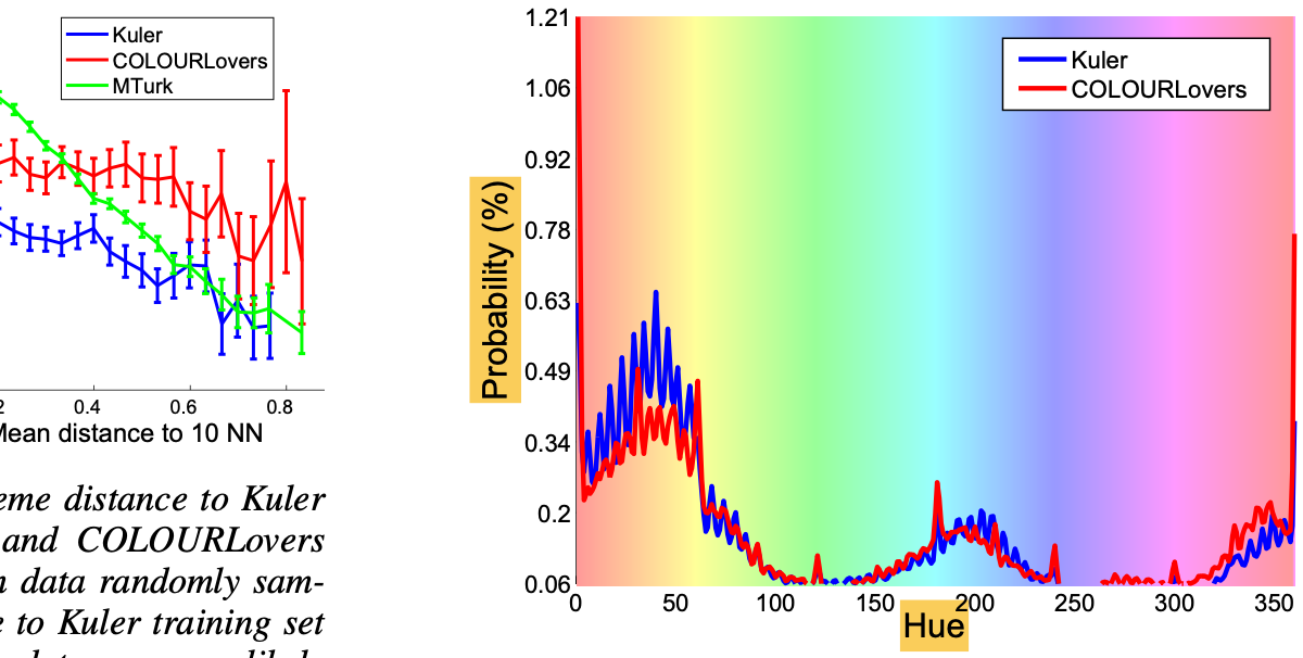
By the way, this is a simplified version. This is how the chart actually looks like in the paper:
I already put all that new information as bullet points into my book draft – tomorrow, I’ll write it up.