Today, while working on the chapter about background colors, I stumbled upon a curious quote I pasted in that chapter probably many months ago. The quote goes like this:
“Generally, warm colors (reds, oranges, and yellows) tend to take on figural qualities better than cool colors (greens, blues, and purples), which tend to make good grounds. This may be partially explained by the tendency of the warm colors to advance and the cool colors to recede.”
The quote is from the great book Cartography – Thematic Map Design by Dent et.al, p.260.
On world (and islands) maps, we’re used to seeing blue as the “background color” around the continents (or islands) – and the authors are writing about maps after all. But is the same true for data visualizations?
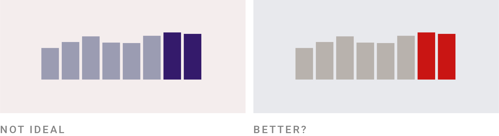
I don’t have an answer to that. The newspapers DeTijd and The Financial Times both use a warm color in the background of their data visualizations and they work really well. The economist uses a cool color, which I often found too saturated and distracting from the data.
For dark backgrounds, the advice could be applied to data vis, though. But the explanation might be more vision theory related: We perceive more good-looking saturated AND bright warm colors (yellow, orange) than saturated AND bright cool colors (bright green, bright blue). And the other way round: Dark red, dark orange and dark yellow don’t look very pleasing, while dark green and dark blue do – and they can be more saturated while being dark, too.

Not sure if I should include this in the book, though – I feel like there are lots of color combinations that go against that rule. It’s possible to create beautiful chart-background combinations where the chart is in cool colors and the background is in warm and dark colors. And it’s possible to do the opposite and create ugly dark, cool backgrounds with warm, bright chart elements on top.