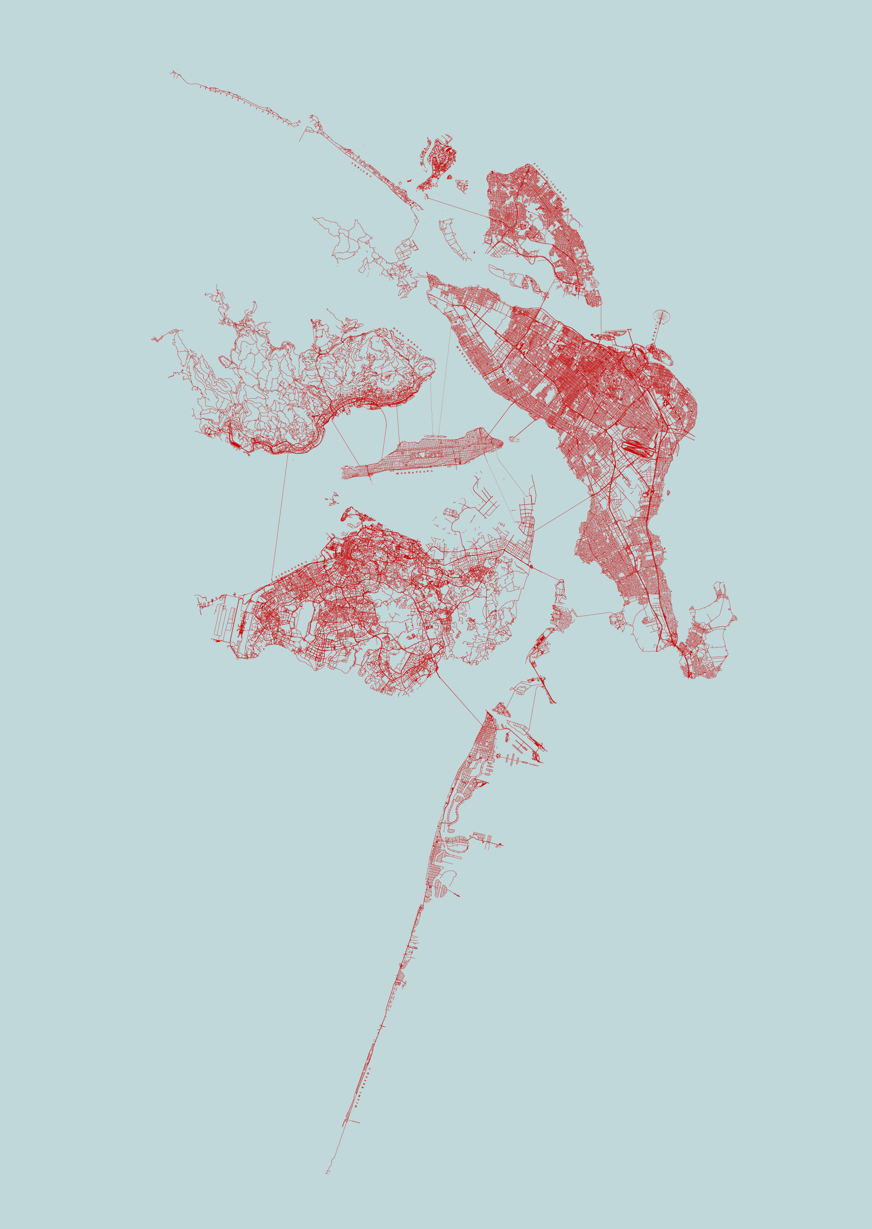
A few months ago, I released a map from the cage of my computer to the outer world (aka the Internet), in form of a good old-fashioned tweet:
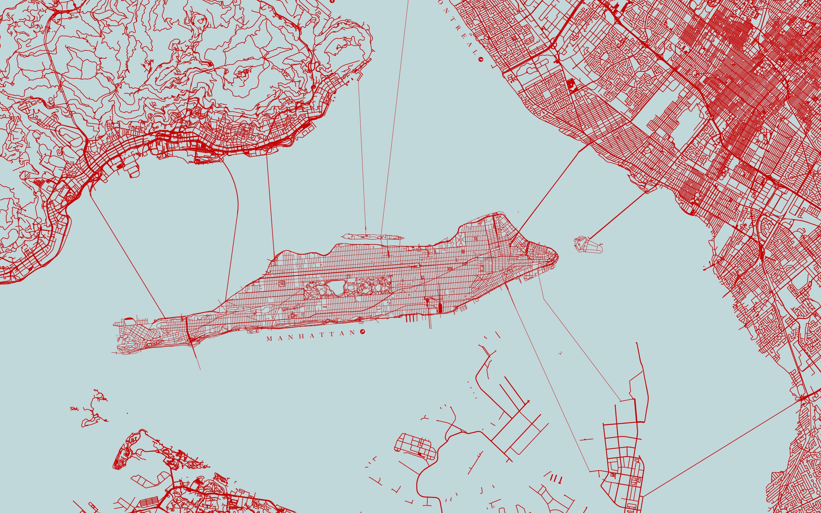
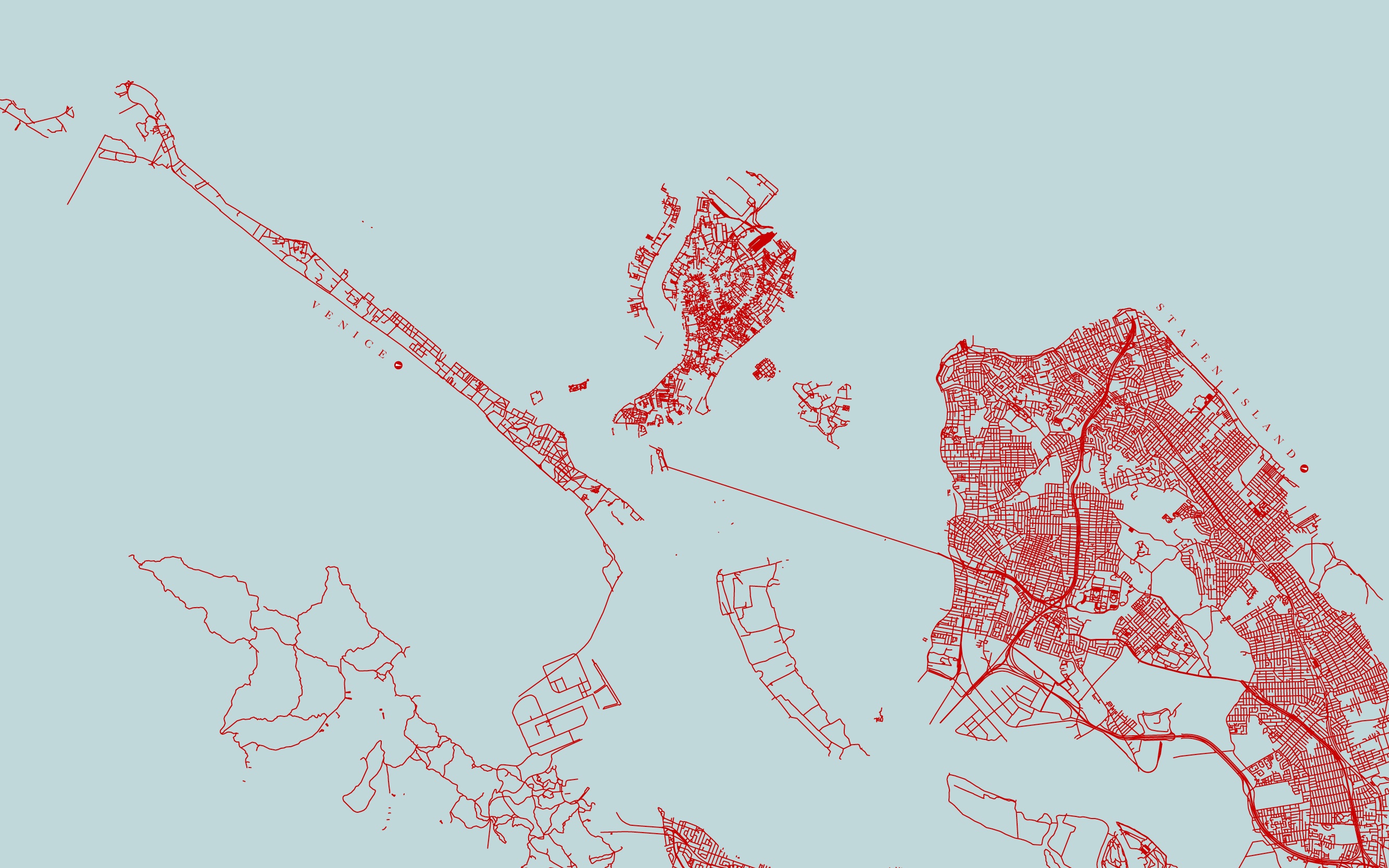
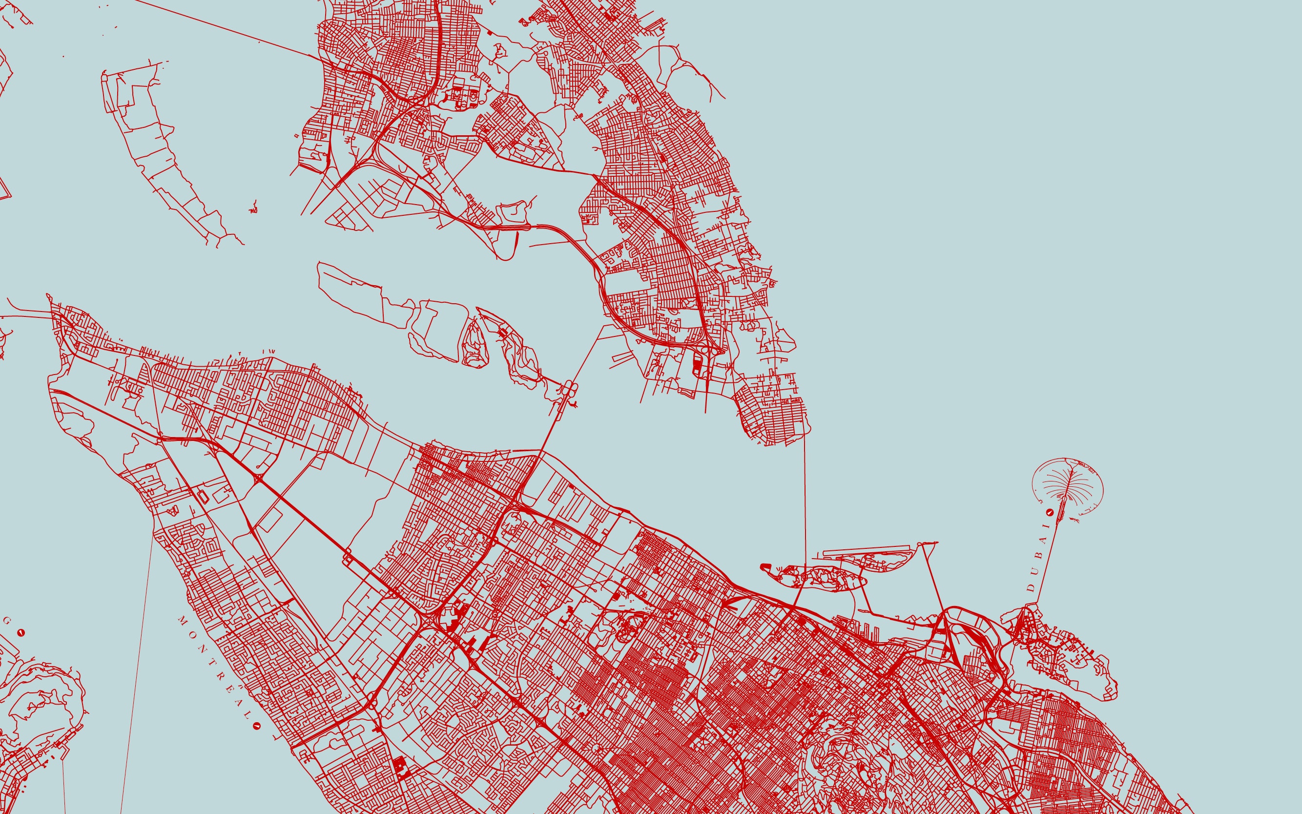
I stole some metropolitan islands from all over the world and brought them together in a new archipelago. pic.twitter.com/gmA53GzGel
— Lisa Charlotte Rost (@lisacrost) 27. Januar 2015In the end, it let to me being in New York currently, waiting for the State of the Map US conference (aka the OpenStreetMap conference for the US) to start tomorrow. I’ll give a lightning talk on exactly this map.
I’ll also go up the ladder of abstraction a little bit, to show that fictional maps combine two important things: Education in form of comparison and imagination.
1. Comparison
Comparison is extremly important for data vis: One number isn’t of much use. One number in comparison with the years before, the situation in other countries or with the number of similar elements sets it in a context with something familiar that makes it easier to understand.
Of course you can compare map data, too. On the following map I show all buildings in Manhattan (well, at least the ones that OpenStreetMap mapped). And then I bring the Tiananmen Square from Bejing close to the Central Park and the Champ de Mars with the Eiffel Tower from Paris somehwere in Midtown.
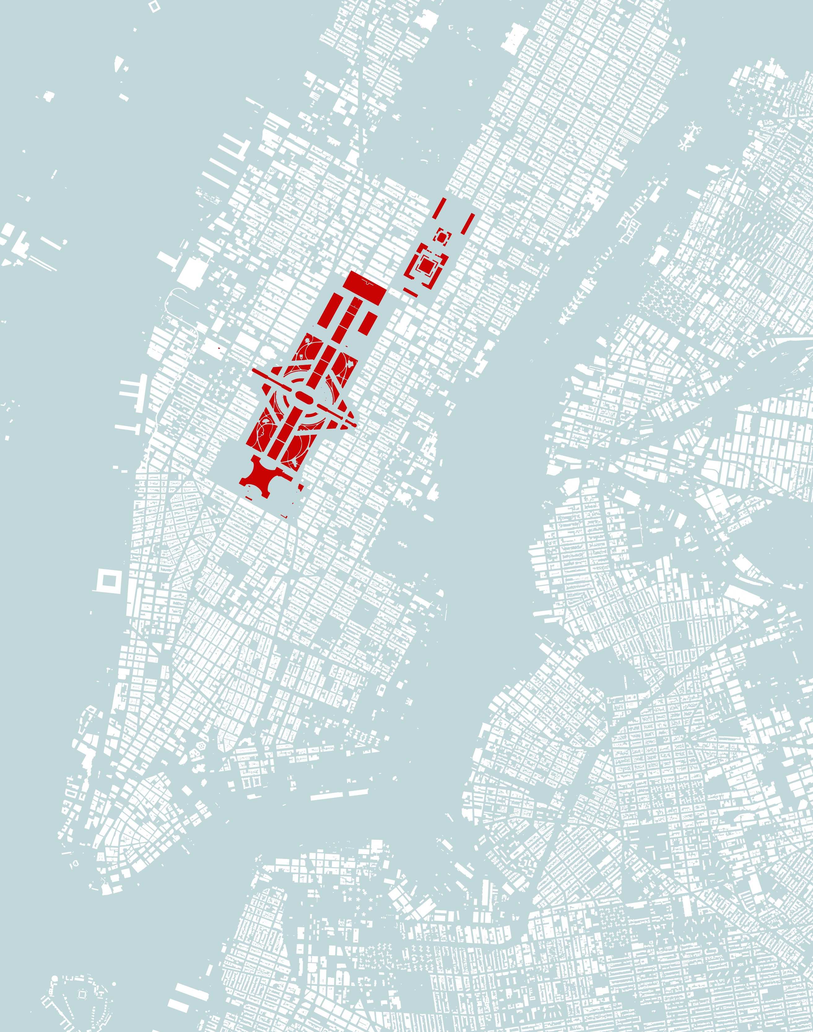
You can immediately compare the landmarks with each other: Champ the Mars is smaller than Central Park and the Tiananmen Square seems tiny for being one of the biggest squares on the world.
2. Imagination
But you also start to imagine: The Eiffel Tower in New York? Nice, I don’t have to go to Paris anymore! Then again, isn’t the Eiffel Tower only 300m (980ft) tall? Will I even have a view up there?
Maps – especially of famous places like big metropoles, continents or country borders – can function as Lego bricks: You build a new world, and while you’re doing so, your mind gets creative. Just imagine: The Chinese Wall in Greenland? All cities of the US on the continent of Australia? Europe and Africa switching places? These ideas automatically trigger ideas about history, culture, socities, politics; about differences and similarities and consequences. As if you are a 4-year-old, putting Lego bricks together to build first a world and then a story around it.
The Lego bricks and maps are supposed to give a representation of the world. When you change the representation, you change the thoughts we have about the world.
Can we use numbers as Lego bricks, too? Well, let’s see. You have a pretty good picture of the shape of Cuba in your head – but no, not the number for its population. If I tell you that 11 million people are living in Cuba, you have to trust me with that. But when I tell you: “This is Manhattan” and I show you a map of Bangalore, you know better. Fictional data vis is hard. It is more responsible to fake maps than data.
Here are some more images from the city archipelago:
Edit 21st of June 2015: And here’s the video that shows me giving the lightning talk. I had lots of fun at the State of the Map US conference; thanks again to everybody who made it possible that I could be there!
