I updated this blog post with a rough transcript of a talk I gave at the GeoNYC Meetup at the 14th of November, 2016. Please note that most of the displayed data are FiveThirtyEight forecasts from three weeks before the election, NOT the final election results.
Before I start, I want to give a big shout-out to all graphics reporter, visual journalists, data vis designer, news developer and however the call themselves, who have worked on election graphics and maps in the last weeks and months. They barely slept, and it was all worth it. These people did an amazing, innovative job, and seeing their work made me very happy. Thank you to all of you.
Election maps. So many blog posts have been written about the challenges that come with displaying election results on a map of a country with extreme different population density, by the Financial Times, The Washington Post, The New York Times and The National Geographic. They mostly discuss the different ways to display the electoral votes: Cartogram? Physical map? 3D?
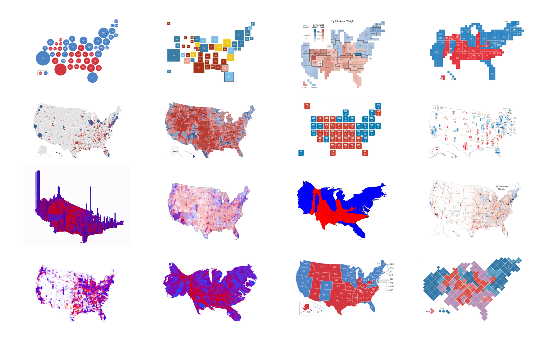
But I think we should go one step up. Instead of asking “HOW do we want to display the electoral votes?”, we should first ask “WHAT do we want to map, and WHY?” The electoral college votes and the chance of winning got lots of love in this election. Today I want to argue in favor of mapping the popular vote.
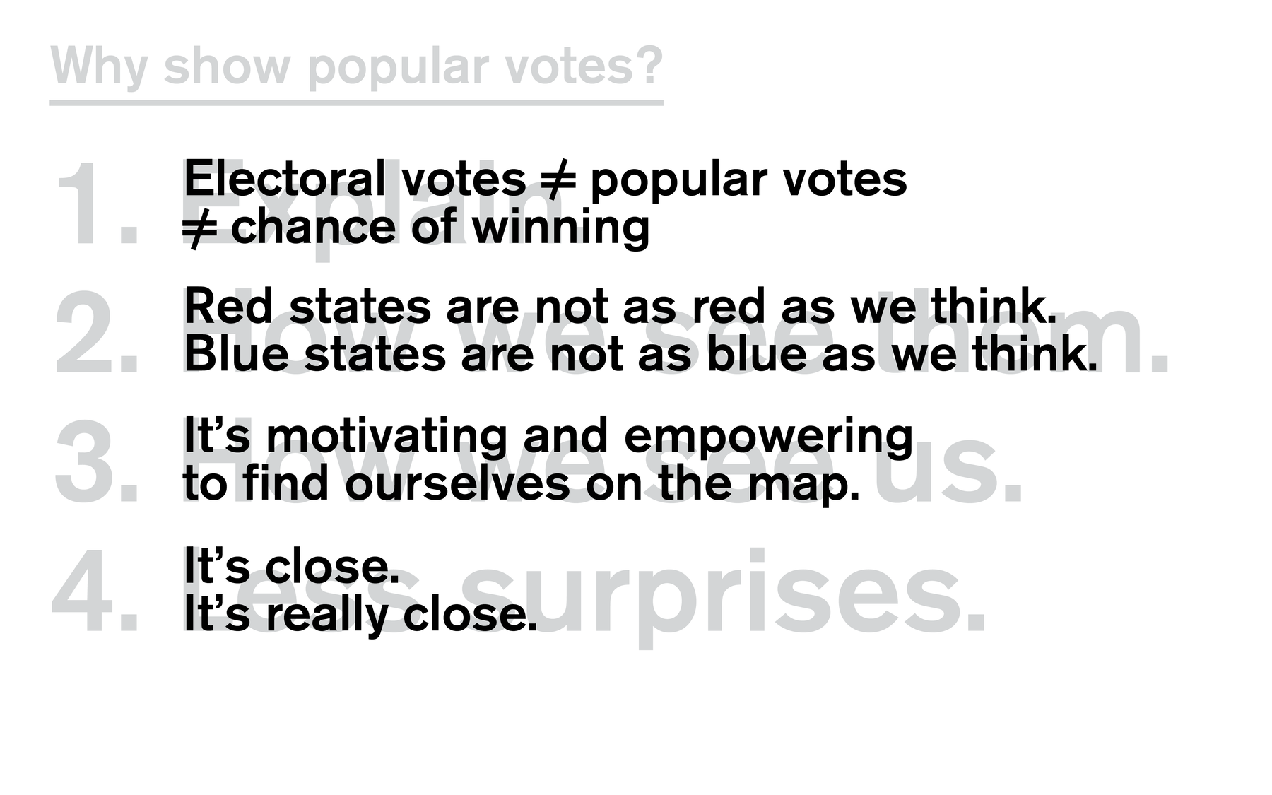
I have four compelling reasons for doing so! Let me start the first one with an embarrassing confession.
1. Explanation
Until a month ago, I didn’t understand the US election system. I was hugely invested, sure: I got the NYT Election Forecast newsletter and, like most of you, was on FiveThirtyEight multiple times a day. But I didn’t really understand what I saw there. I would look at the “chance of winning” bar or the cartograms and saw at least three quarter of the space colored in blue. But then I’d scroll down to the popular vote and would be confronted with a really, REALLY close forecast.
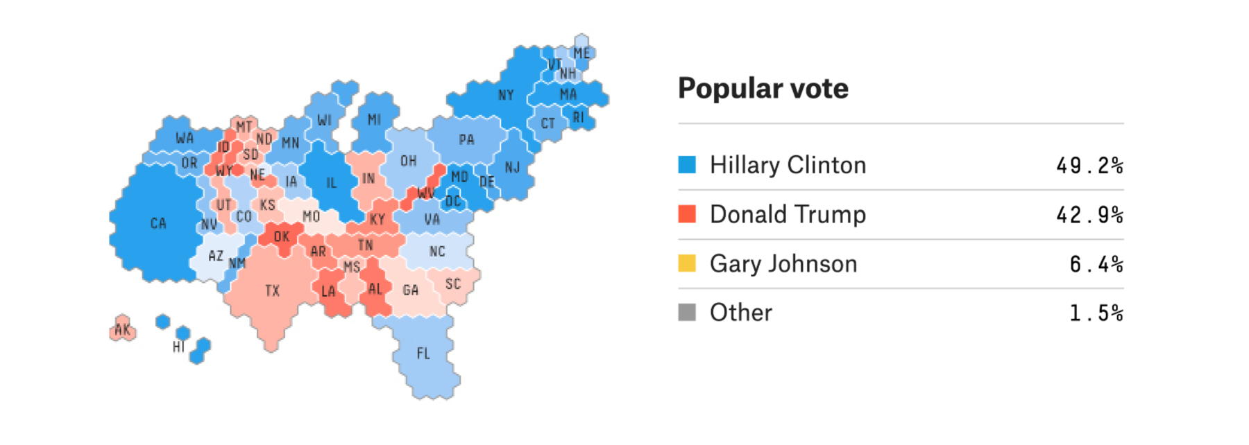
So I started to get into it. In fact, I wanted to understand it so well that I build myself an explainer. I learned the following:
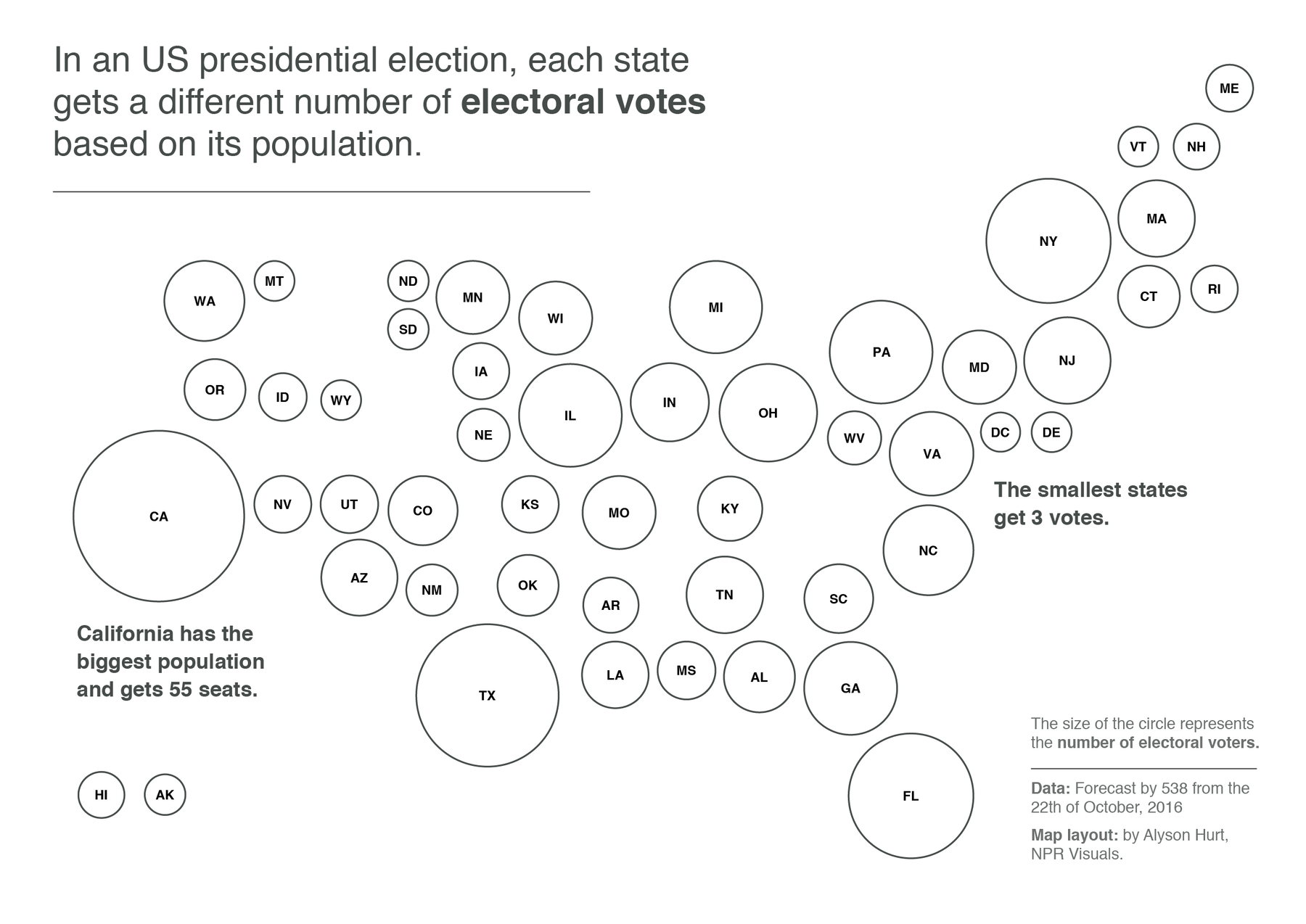
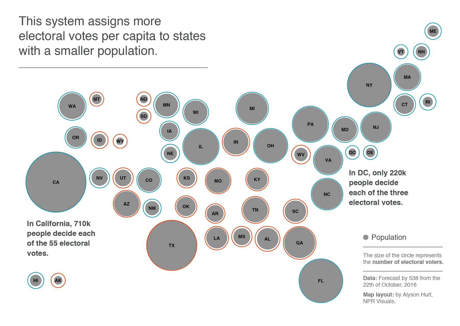
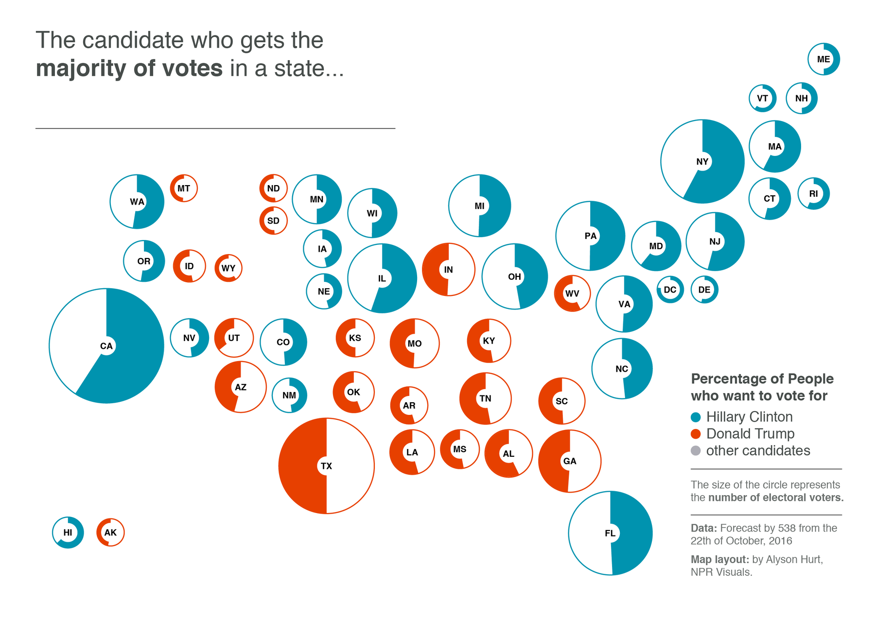
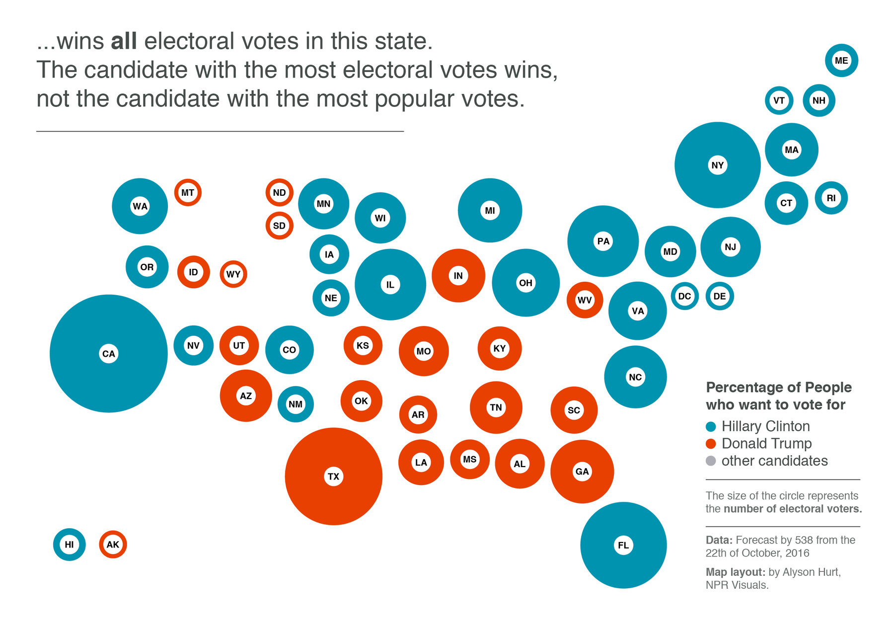
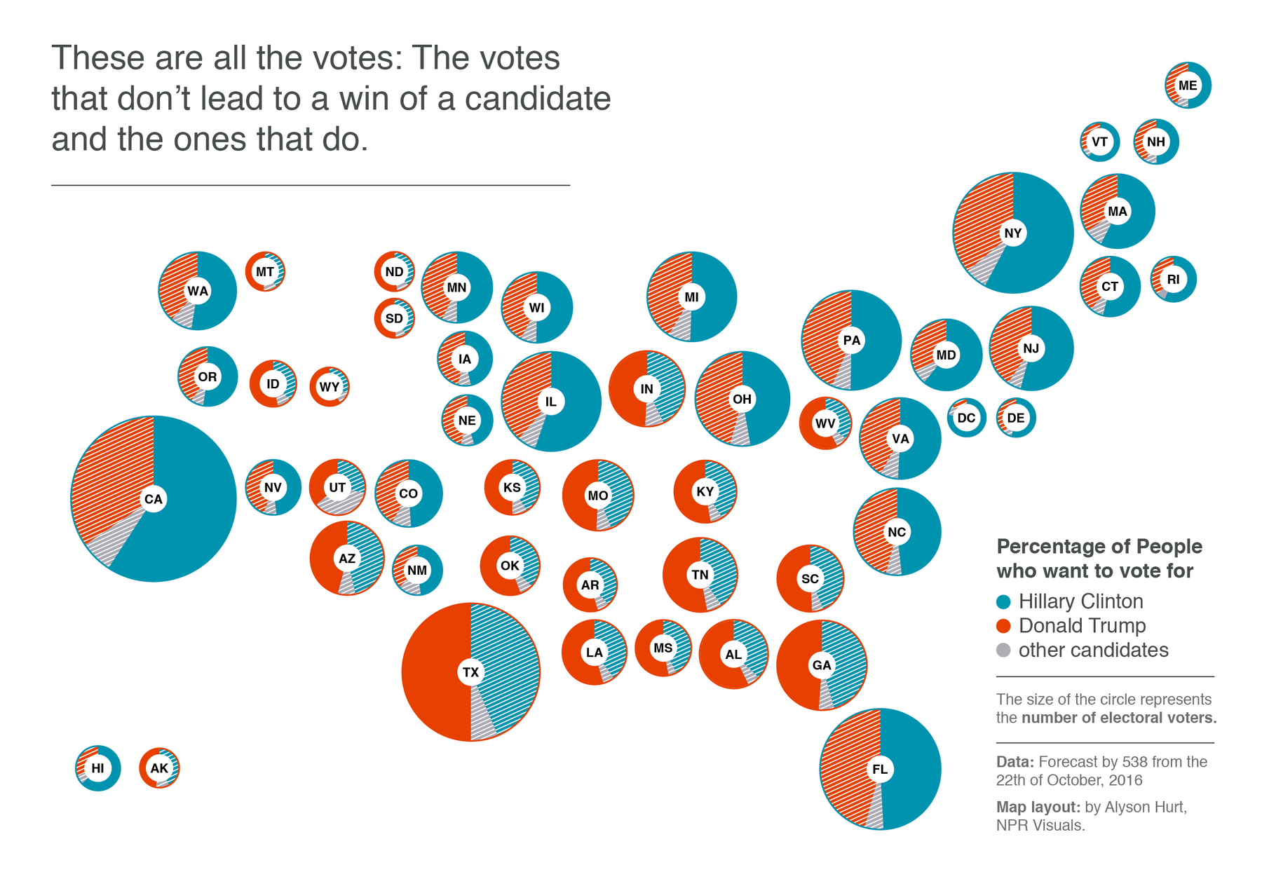
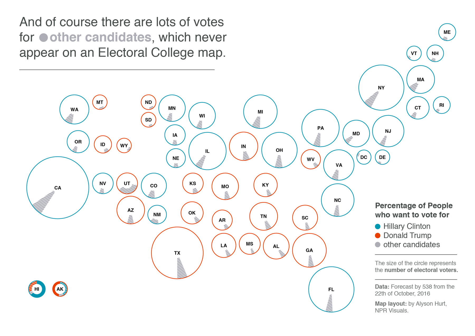
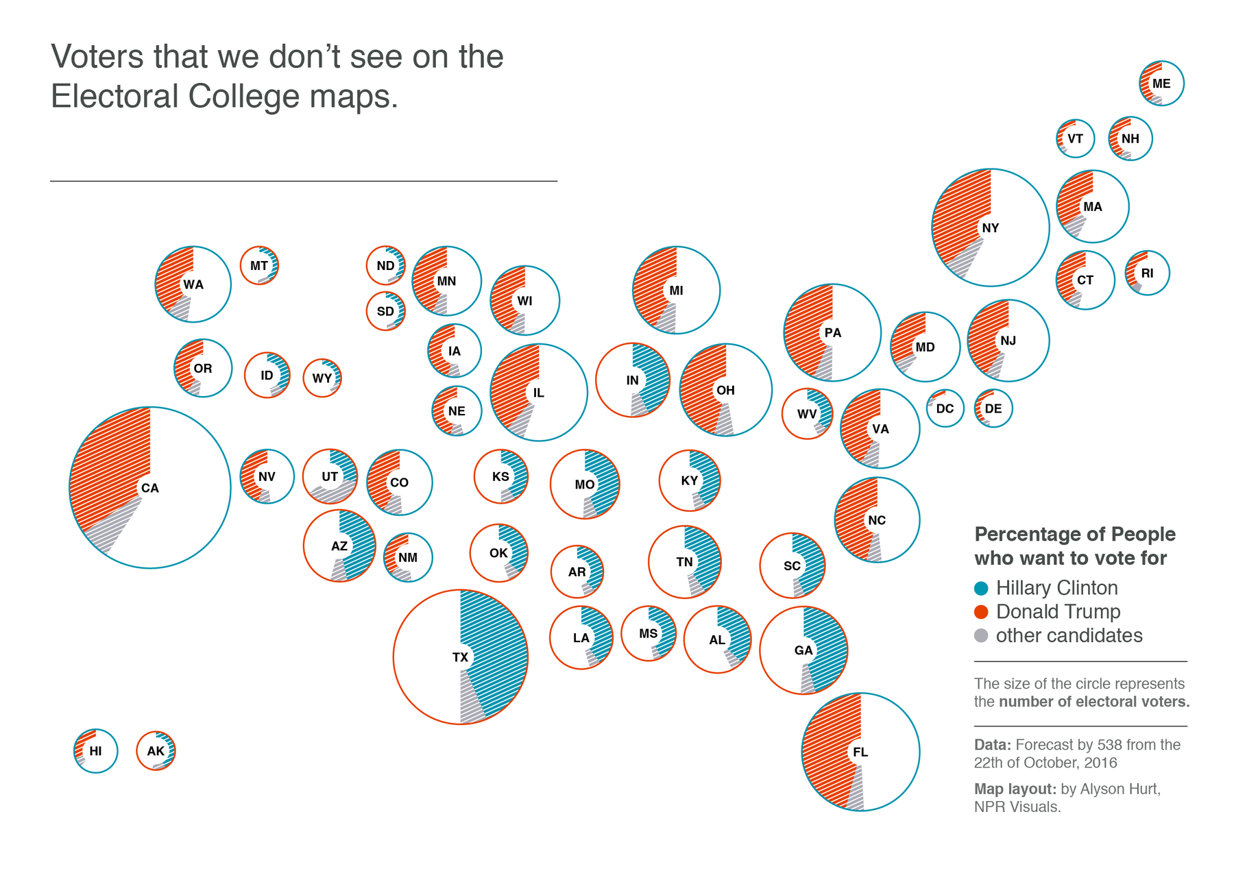
That last map shows what I’m arguing for: A map that doesn’t just show the states colored in by the winner, but that shows ALL votes–even the ones that didn’t lead to the win of a candidate in that state.
2. How we see them
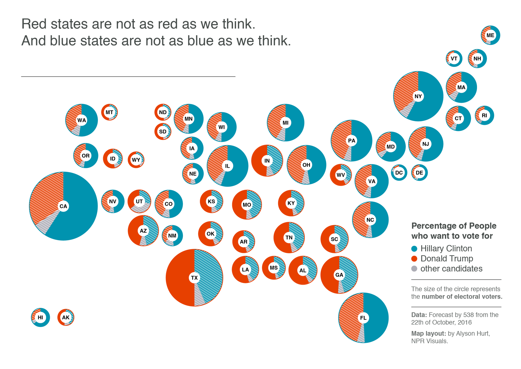
That last map really made me think about stereotypes; about red states and blue states. When I look at New York or California on an electoral college map, I see states in which everybody will vote for Clinton. When I look at Wyoming or Alabama, I see states in which everybody will vote for Trump. On the map, these states are bright blue and bright red. And I’m afraid that these maps can have a huge negative influence on our collective stereotypes.
Turns out, the image of the US is not that simplified as we want it to be. We should be aware that there are lots of Trump voters in the most democratic states, and lots of Clinton voters in the most republican ones. We can’t just put a whole state population in one box and put a red or blue label on it.
Red states are not as red as we think. And blue states are not as blue as we think.
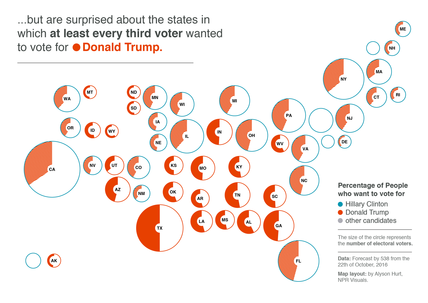
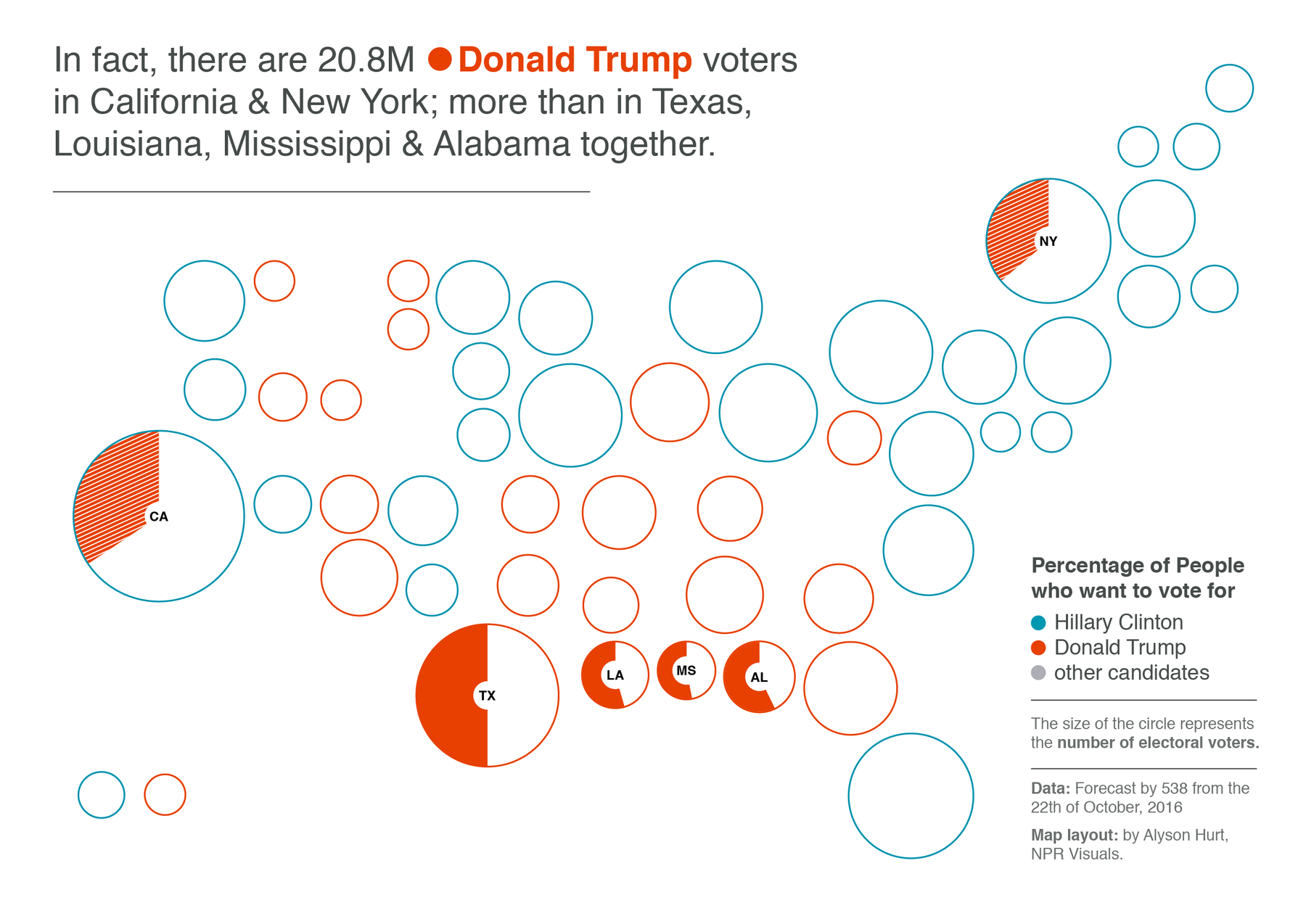
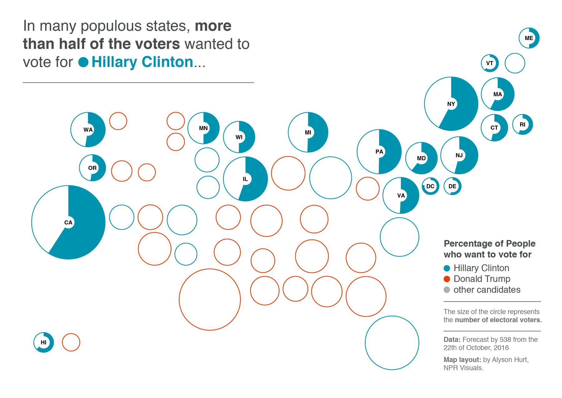
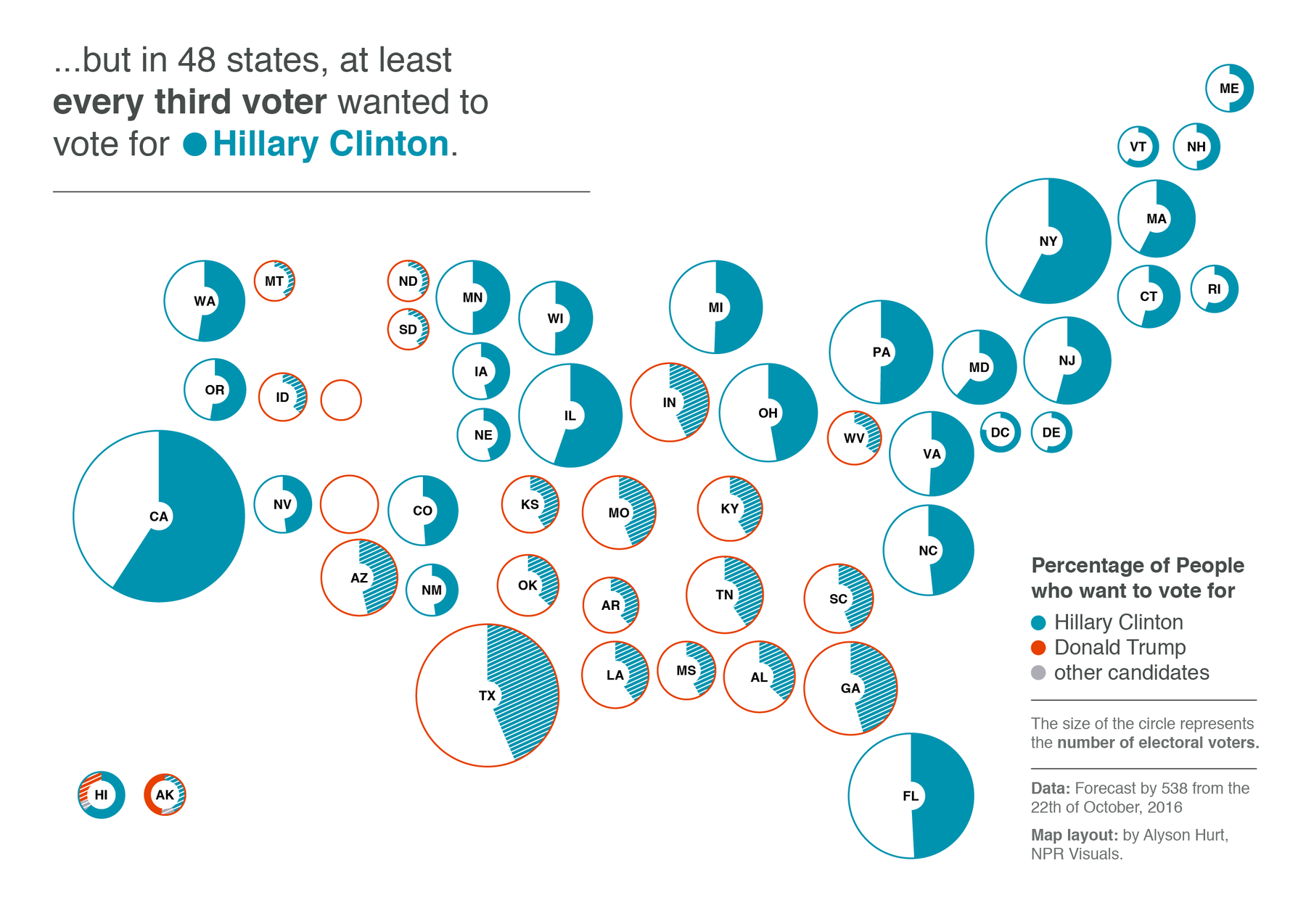
3. How we see ourselves
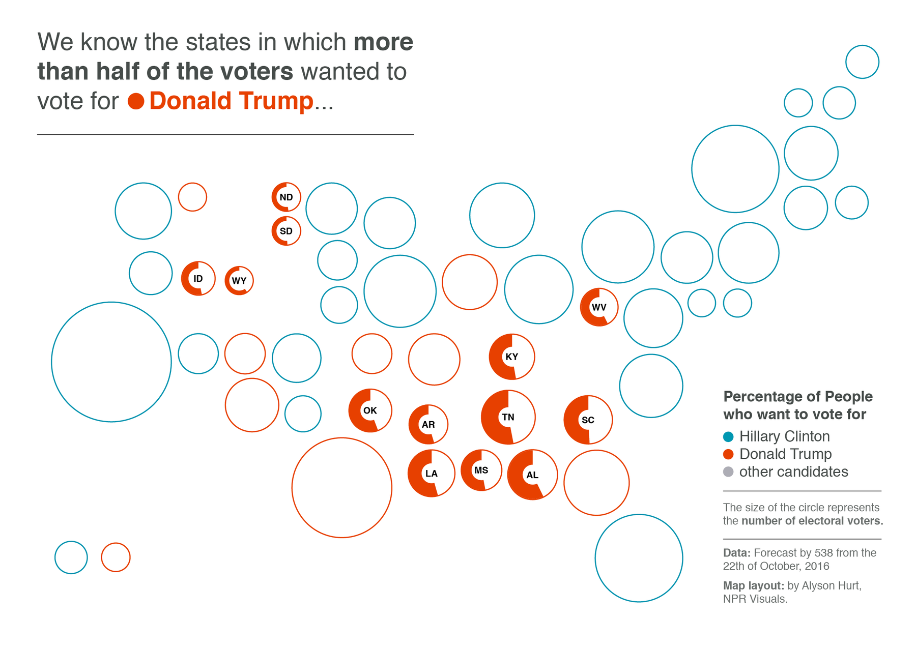
Even more important than working against stereotypes is it that we find ourselves on a map. Imagine being one of the thousands of democratic voters in Utah or one of the millions of Republicans in California. The map ignores you, and has so since decades. “This is blue territory”, cartograms tells me about California. “There is not one Trump voter here. NOT ONE!”
Approximately half of the population can’t find themselves and their vote on an electoral map. Every vote counts, we say. Every vote matters. So why don’t we map every vote?
4. Less surprises
When I showed my popular vote map to a friend a few weeks ago, he said: “Yeah, Lisa, you know, that doesn’t tell me anything.” And maybe that’s a flaw in the design. But maybe it’s also by design. Of course we want to see clear patterns, clear chances of winning, clear dominating colors in cartograms. But US Elections has been traditionally very close, and we should be aware of that. A map of the popular vote can show that there IS no clear predicted winner. And that it’s a really close race, again and again.
Conclusion
Does that mean we should get rid of the electoral college map? Heck no. This map is important – far more important than the popular vote map, because it represents the US election system better than showing the popular vote. In the best case, we should show both: A map with the popular vote, and a map with the electoral votes.

In the best case this can lead to an education about the US election system, can make us aware that stereotypes exist more in our head than in the real world, can let us find ourselves on the map and can show us how close a race really is.
Some disclaimers: First, it’s important to note that I’m coming from a foreigner’s perspective. Maybe I would see things differently if I had grown up in the US, experiencing lots of elections and experiencing far more of the country. Second, my map is not the perfect design. It’s a prototype, that’s built to make a point (also, sorry Maine and Nebraska).
