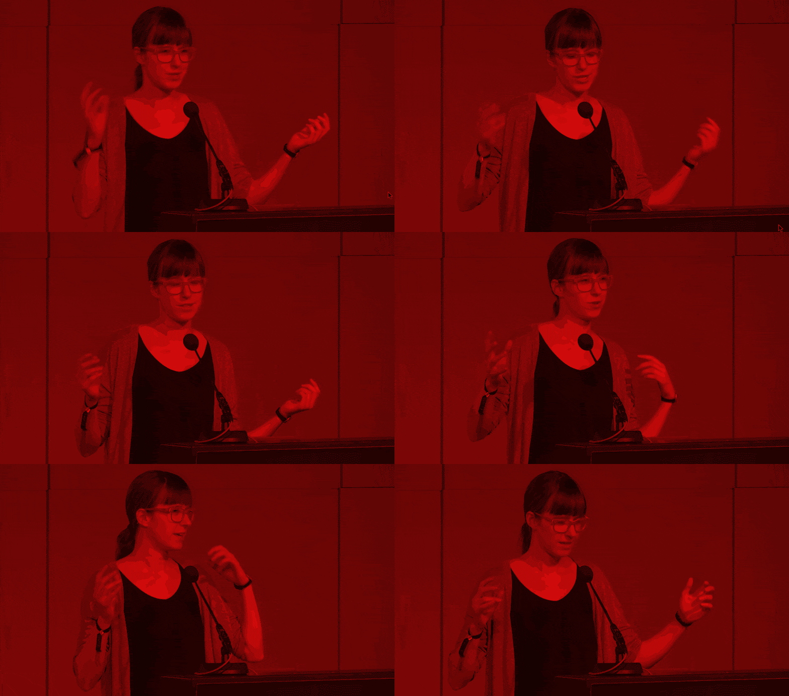
Hi! That’s me giving a talk at the Chaos Communication Congress (also called CCC; also called 33c3 because it was the 33rd CCC and “CCC” consists out of three letters and hackers love abbreviations) at the 27th of December 2016.
I blink a lot. That’s what people do when they’re nervous. People are nervous when something means a lot to them – and the CCC means a lot to me. I love this festival of hacker culture, of arts and weirdness and wonderfulness. Giving a talk there was a huge honour.
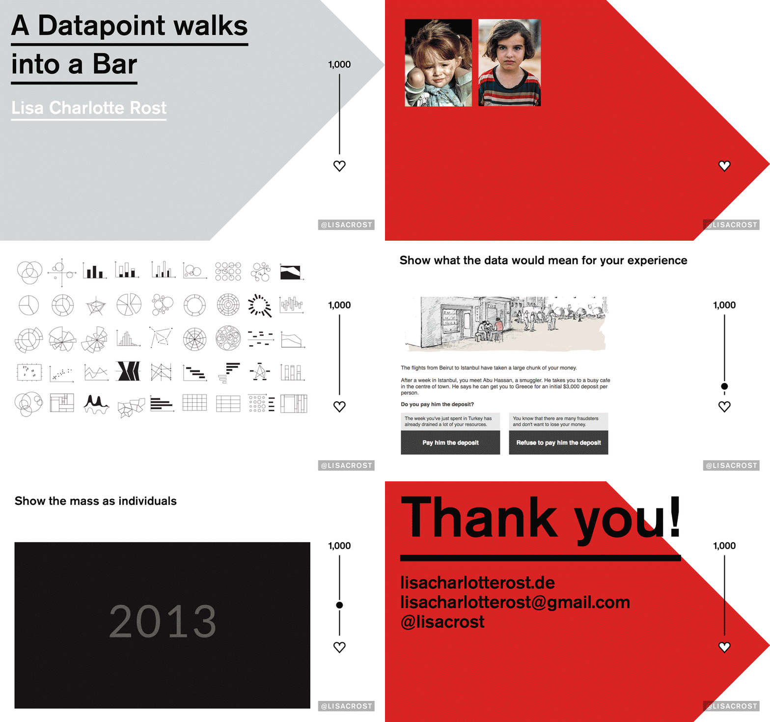
This blog post won’t be a transcript of my talk, but an overview of the questions my talk answered and didn’t answer; and the sources for what I spoke about. My talk can be seen here, on the website of ccc-tv and my slides can be found here:
What I talked about
Mother Teresa said “If I look at the mass I will never act. If I look at the one, I will.” I presented ways that make us act when looking at the mass. First, I talked about our problems to see the individuals when creating data visualizations about huge numbers of people, thanks to our two different modes of thinking:
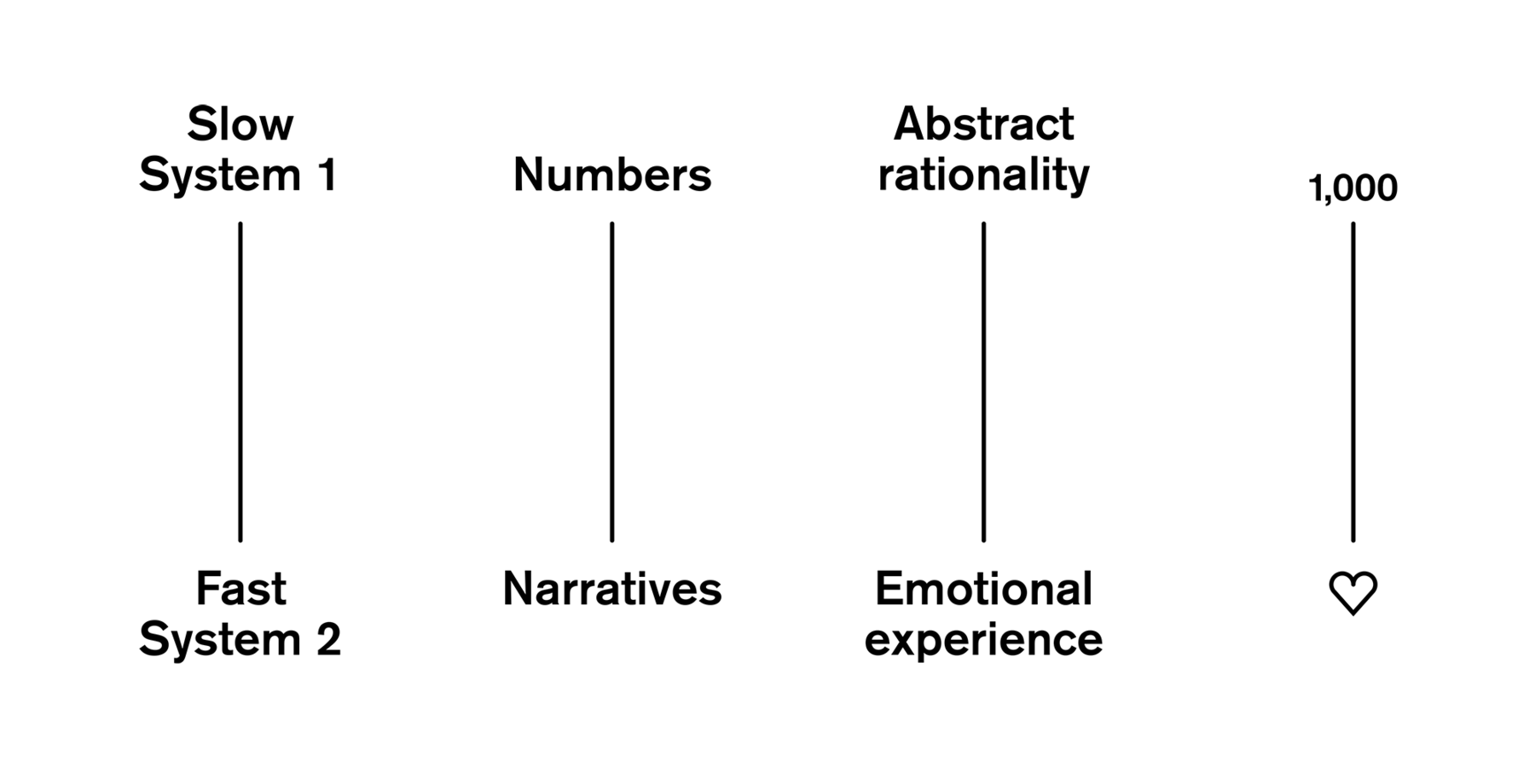
However, we still need to address both modi in fields like news or advocacy: The fast, emotional system to motivate people THAT they should do something (e.g. donating), and the slow, analytical system to help them decide HOW they should do it.
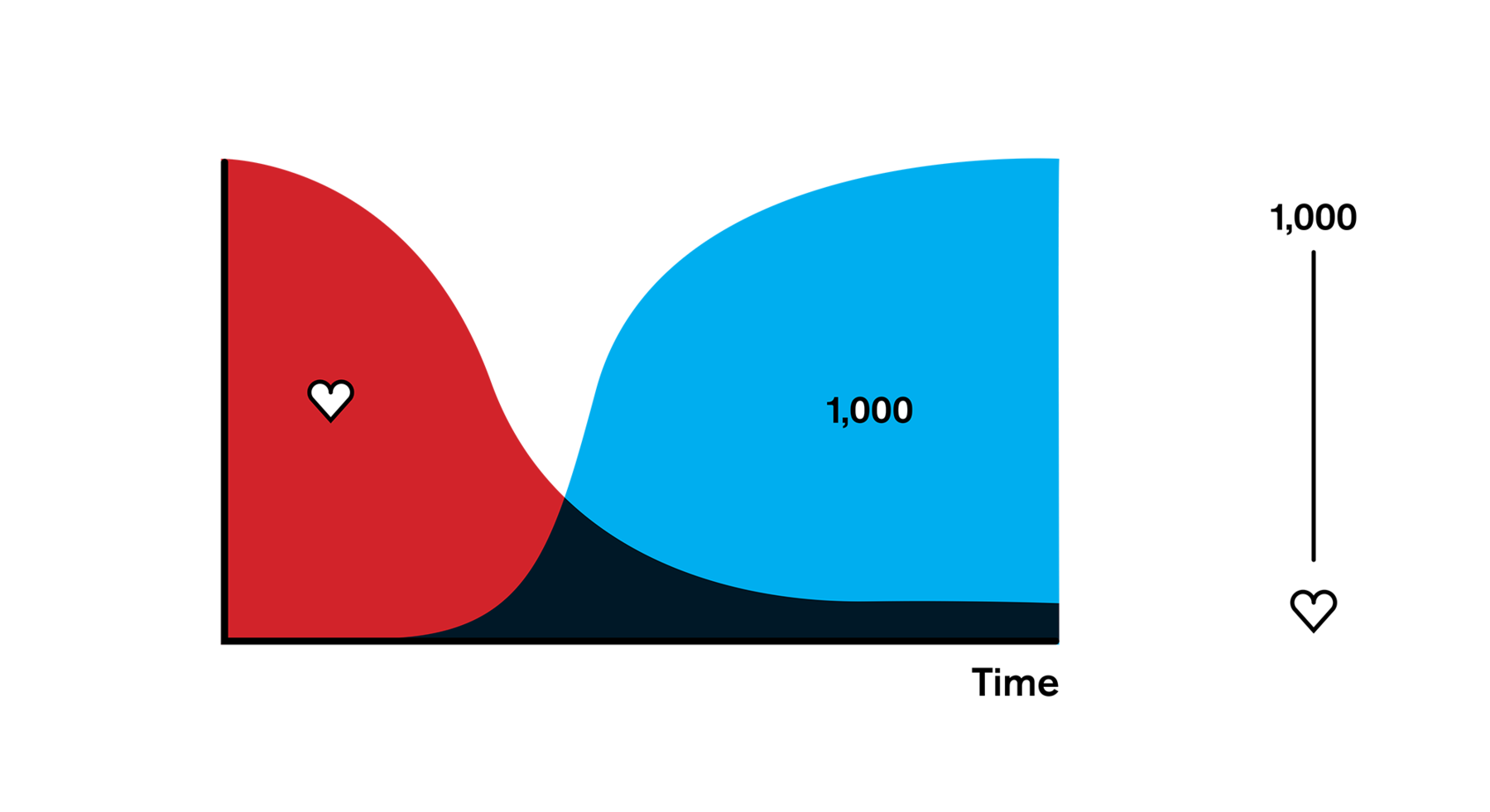
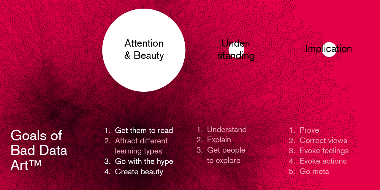
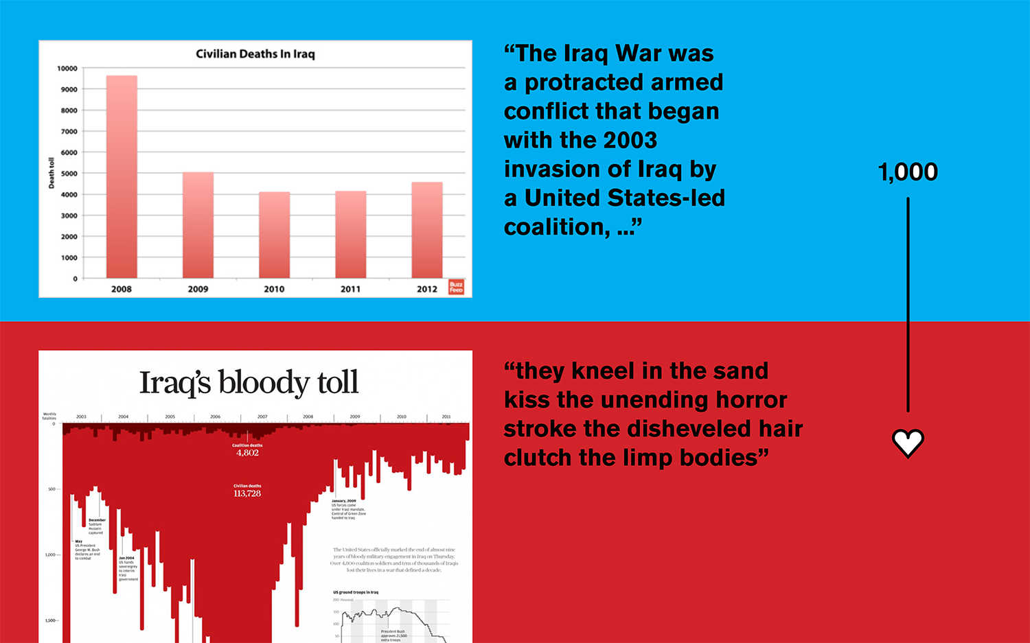
I then talked about how data vis can do both, since it’s a tool like language, that can speak to both modi. I tried to make clear that the right use of tools depends on the goals: Eg in politics or science, we might exclusively want to address the analytical side in us.
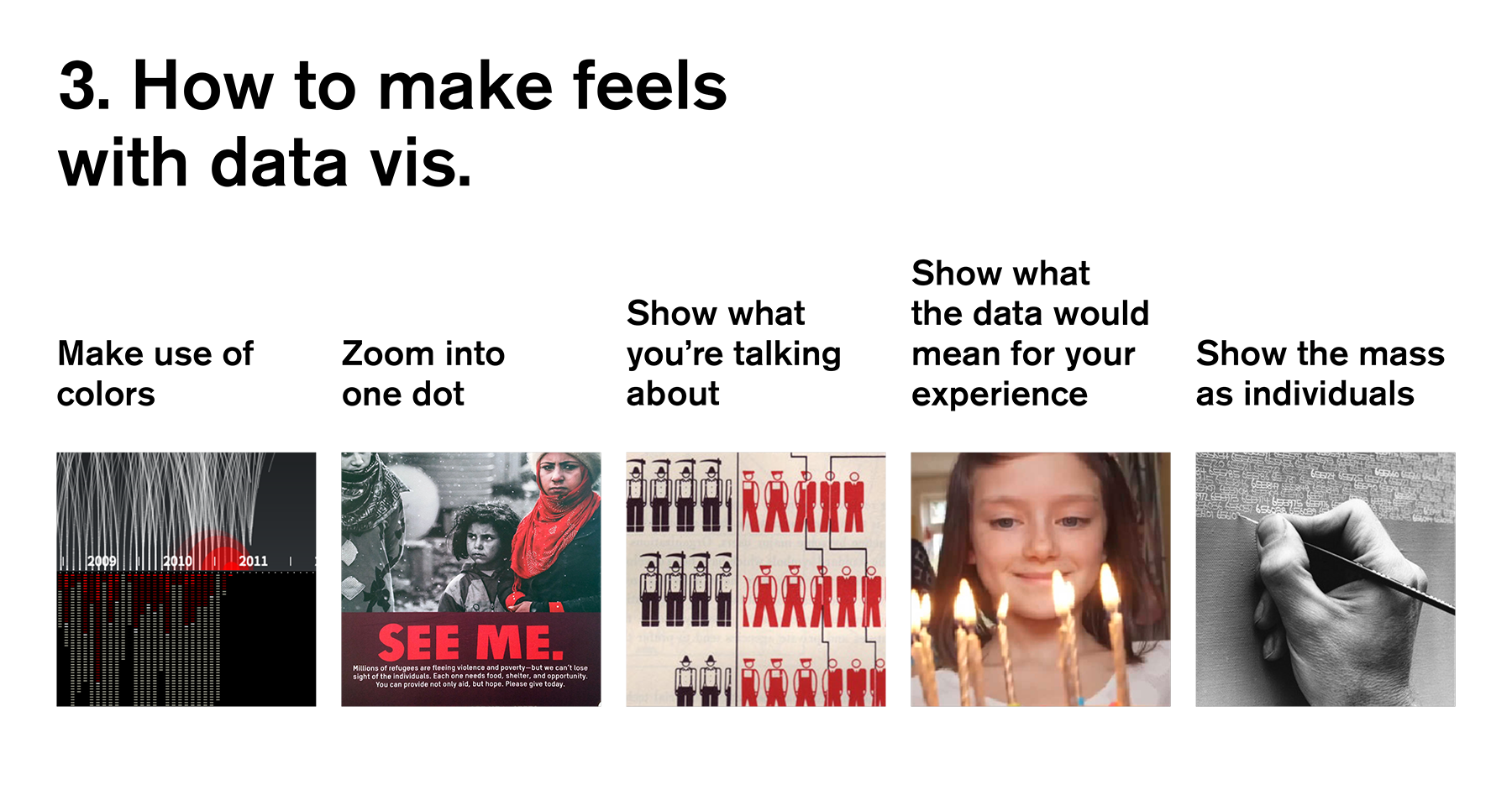
In the second half of the talk, I presented ways to talk to the fast, emotional system with data vis. Personally, I see especially much potential for the data vis scene in the category “Show what the data would mean for your experience”.
In the end, I pointed out that it can be harmful to just evoke emotions. We also need to be responsible enough to help people act upon them.
Questions I didn’t answer in my talk
-
Do these methods I presented actually evoke emotions? Anshul Pandey, Enrico Bertini and Jeremy Boy did some first experiments in this direction, and failed to find any effect of data vis on empathy and donations. I’m looking forward to further research.
-
Is creating empathy with data vis even necessary? Especially in newsrooms, a graphic is often accompanied by an anecdote about an individual. Maybe that combination works well enough? Maybe we want to keep data vis as as very true- and unbiased-looking overview; as a juxtaposition to the anecdotes?
-
“How can we add re-calculation of big numbers into personal, more personal, more emotional numbers in newsroom tools?” That’s a question that Mirko Lorenz asked as a response to my talk, and it’s an excellent one. I have no answer. The easiest solution is certainly to work with colours and to show more dots than bars – but maybe there are better ways?
I’m sure there are more questions. If you know of some, write me an email (lisacharlotterost@gmail.com) or find me on Twitter (@lisacrost).
Sources
I got interested in the topic “Data Vis and empathy” thanks to a great, great Data Stories episode about Statistical Numbing. The research of Paul Slovic blew me away, so I listened to it for a second time and skimmed big parts of Paul and Scott Slovic’s book “Number and Nerves”. Their website “The Arithmetic of Compassion” gives a great overview of the key concepts. I also gained a lot of understanding into how people can deal with smaller bits of information better than with bigger bits from the paper “Small Wins” by Karl E. Weick (thanks to Jan for the tip!).
To learn more about empathy, I read and listen to Paul Bloom. E.g. his famous article “Against Empathy” and an episode of Sam Harris’ podcast on which Bloom was a guest for two very enjoyable hours (thanks to Enrico for the tip!).
To learn about the state of mind regarding the idea to evoke emotions/empathy with data vis, I found the following articles the most helpful:
- “DataViz–The UnEmpathic Art” by Mushon Zer-Aviv, who three months after writing that article hosted the Responsible Data Forum on Data Vis and posted a link list for that event
- “And what do I do now? Using Data visualization for social change” by Steve Lambert, who attended that Responsible Data Forum.
- “Rees & Mushon on DataViz Empathy” episode 31 of the PolicyViz podcast (Thanks, Jon!); also about that Responsible Data Forum.
- Edit 14th of May 2017: In their paper, Jeremy Boy et al looked at anthropomorphizing visualizations as a way to evoke more empathy. Their finding? ”Contrary to our expectations, we consistently find that anthropomorphized data graphics and standard charts have very similar effects on empathy and prosocial behavior.”
- “Empathy and visualization” by Alberto Cairo
- “Art Can Highlight Climate Change, But Where is the Data?” by Amanda Montañez
- “What if the data visualization is actually people?” by Sarah Slobin on SOURCE
- “Connecting with the dots” by Jake Harris on SOURCE
Finally, and like always: Thanks to OpenNews for sending me to the CCC, and thanks to everybody who gave me hints about talks, papers, podcasts and articles about that topic.
Here’s the talk to watch right here, right now:
