Today I answered the question about my target group. I don’t like this question, because as so many design students, we don’t learn to think about our end user. Therefore, this questions appears only in frustating contexts: When your prof is asking you about your target group after the end presentation of your project, for example. And you have to admit that you haven’t thought about it - at all.
And even if you have an idea of the target group, you can’t prove that it exists in the form you imagine it to be - something that really annoys me. Are there any “book-loving 10- to 20-year olds with an intense interest in golfing AND fishing who want to look beyond their horizon”? I bet there are - but it’s a real challenge to find a target group that’s small enough that you can address these people directly, but big enough to actually address SOMEONE. You can only solve this problem with going into the field and actually asking people. But of course, people who are telling you that they would buy your magazine, and people who are actually BUYING it, are two different kind of people.
Still, the question is important and it’s helpful to answer it even on a piece of paper, without any surveys and field studies. I should probably paint a drawing of the ideal target group, personalized in one face, and hang it on my wall above my desk. I mean, you need a target group, you need somebody for whom you’re designing. Even if this is you and “all people who are like I am”.
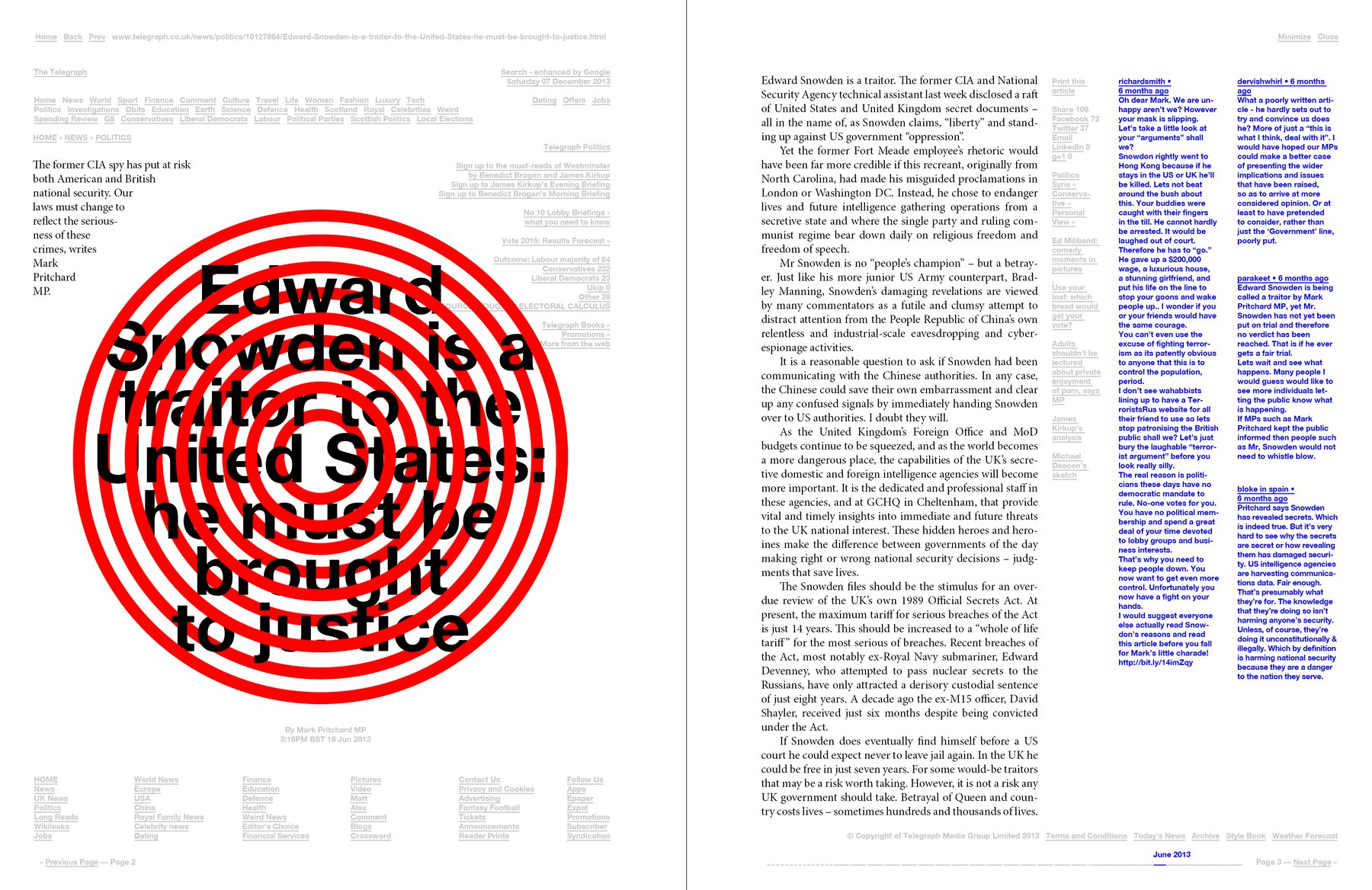
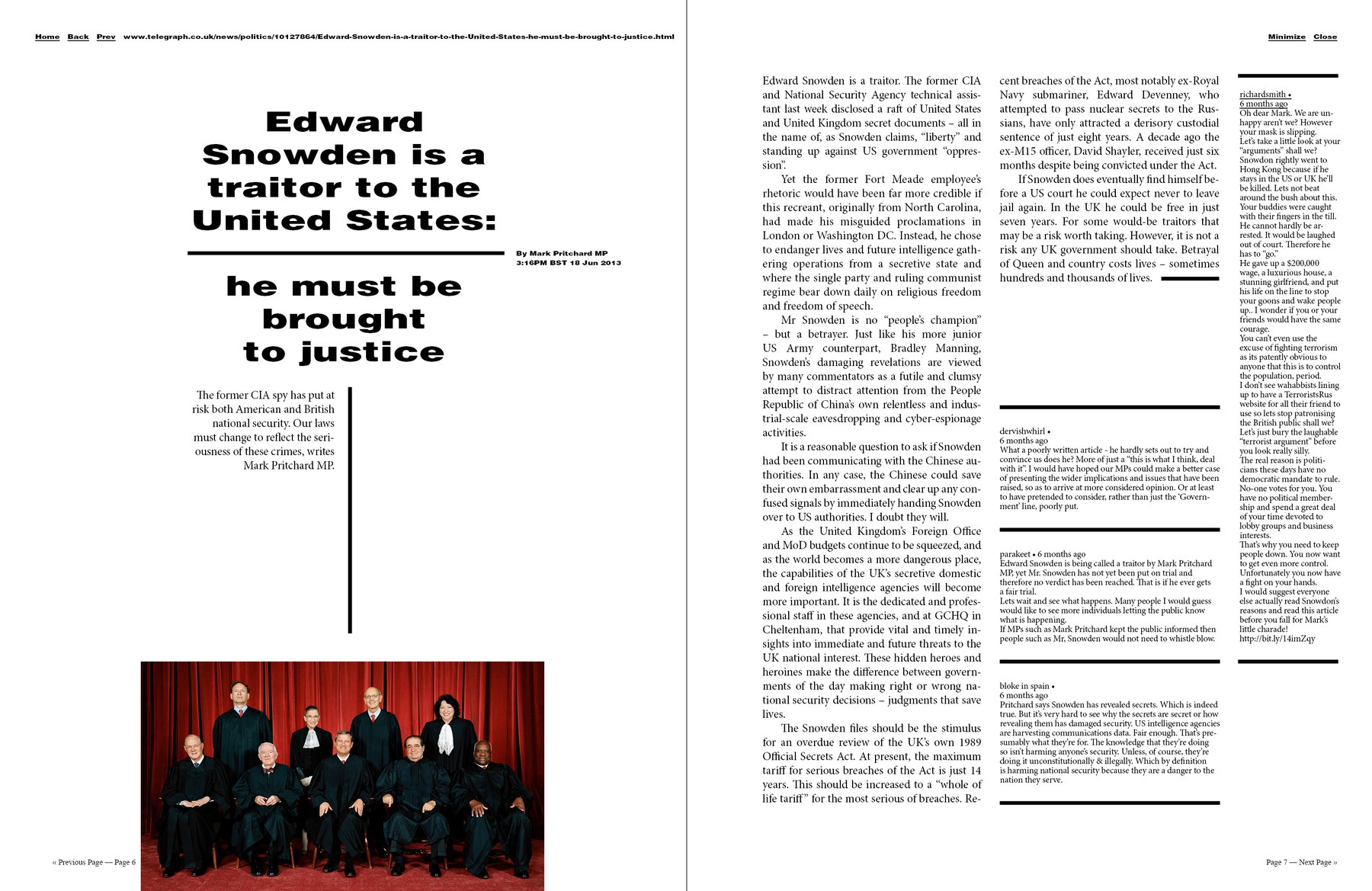
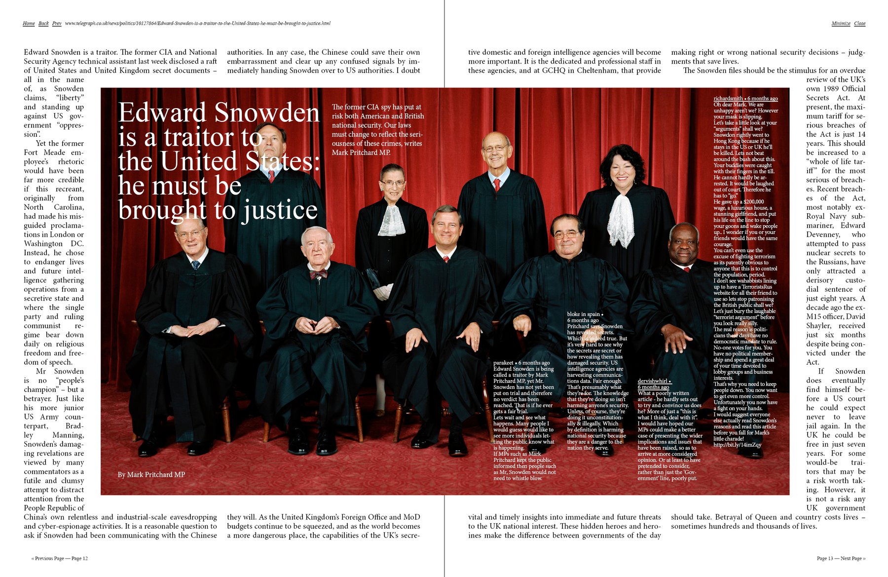
The second thing I did today was more relaxing. It was exactly what I love to do: I did some design options, based on the spread that can be found in my second dotview issue (it’s at the top of all the designs here). First I tried a “Zeit Magazin” approach: A lot of white space, distinctive headline (see my Magazine topology from 3 days ago). Then I did two “trashy” and maybe 032c-like option - which was fun, although I’m always not sure if I even like this kind of style. I also tried an approach with the big picture in the middle, which I found more appealing than I thought I would. The white font on the photo worked better than I expected.
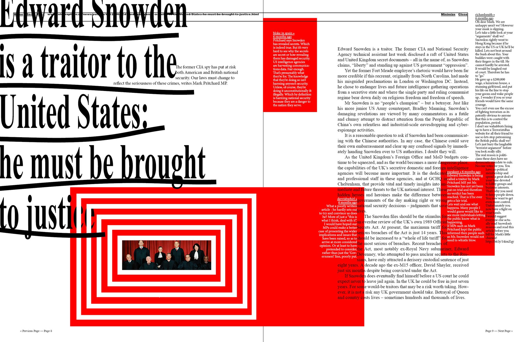
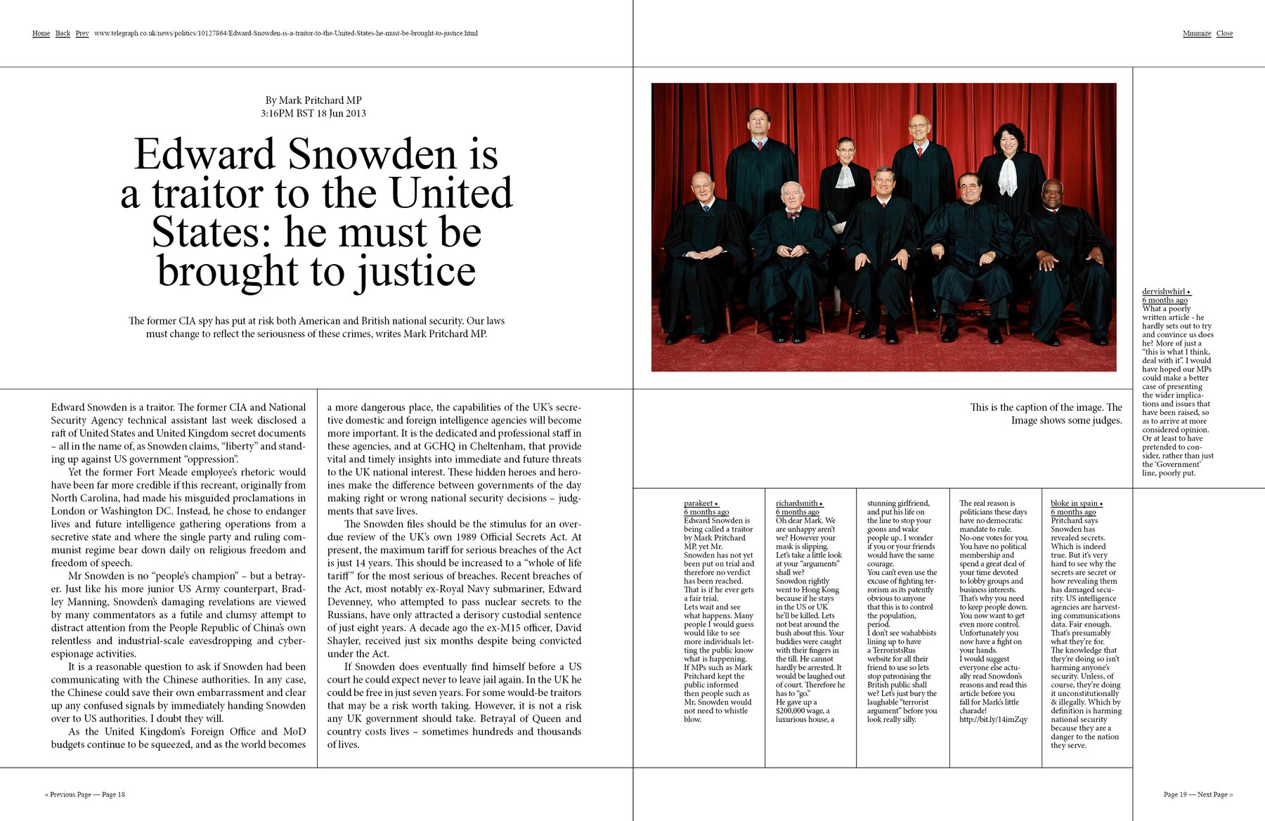
The same happend with the lines in the next draft: I remember that I thought about bringing a lot of lines and borders into my second dotview issue, but that I wasn’t convinced after two, three drafts. But to emphasize the grid with lines satiesfies my love for structure a lot; maybe I should work more with these in the future.
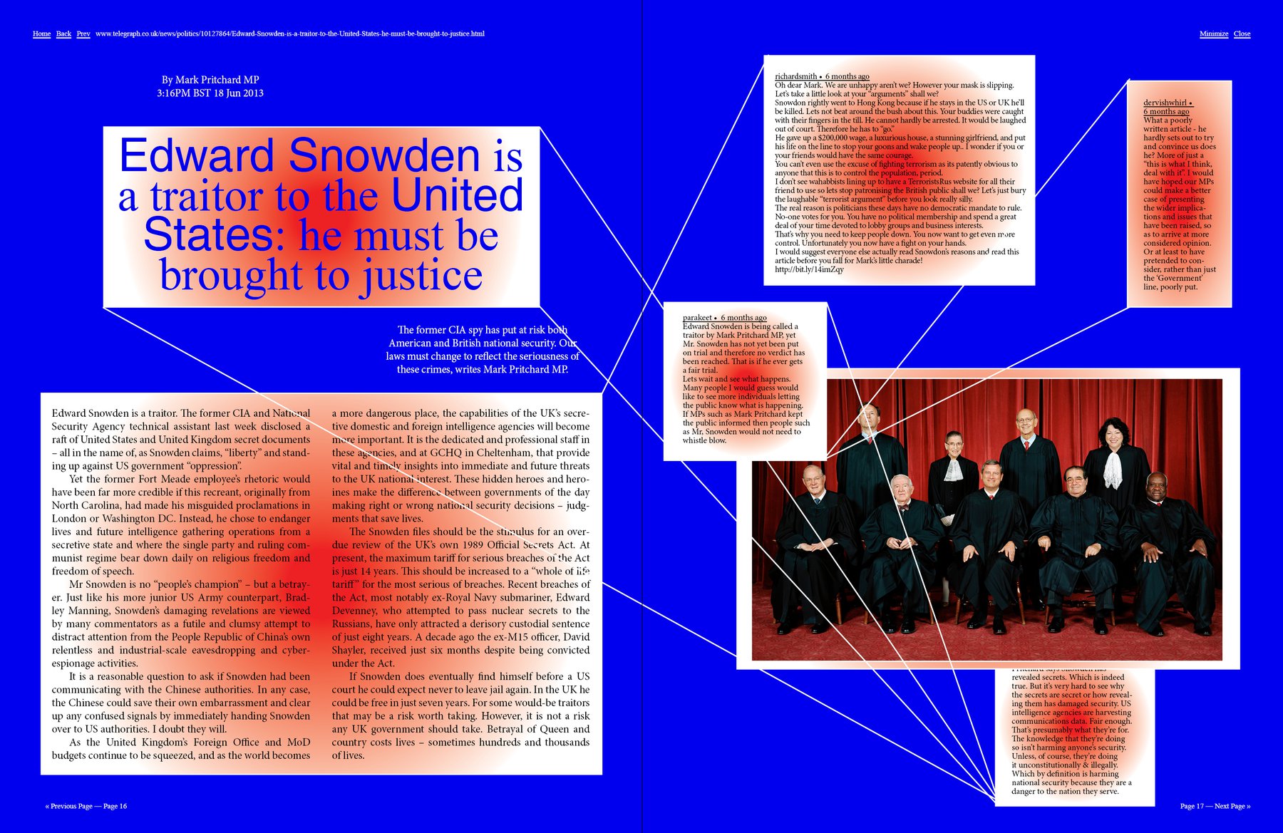
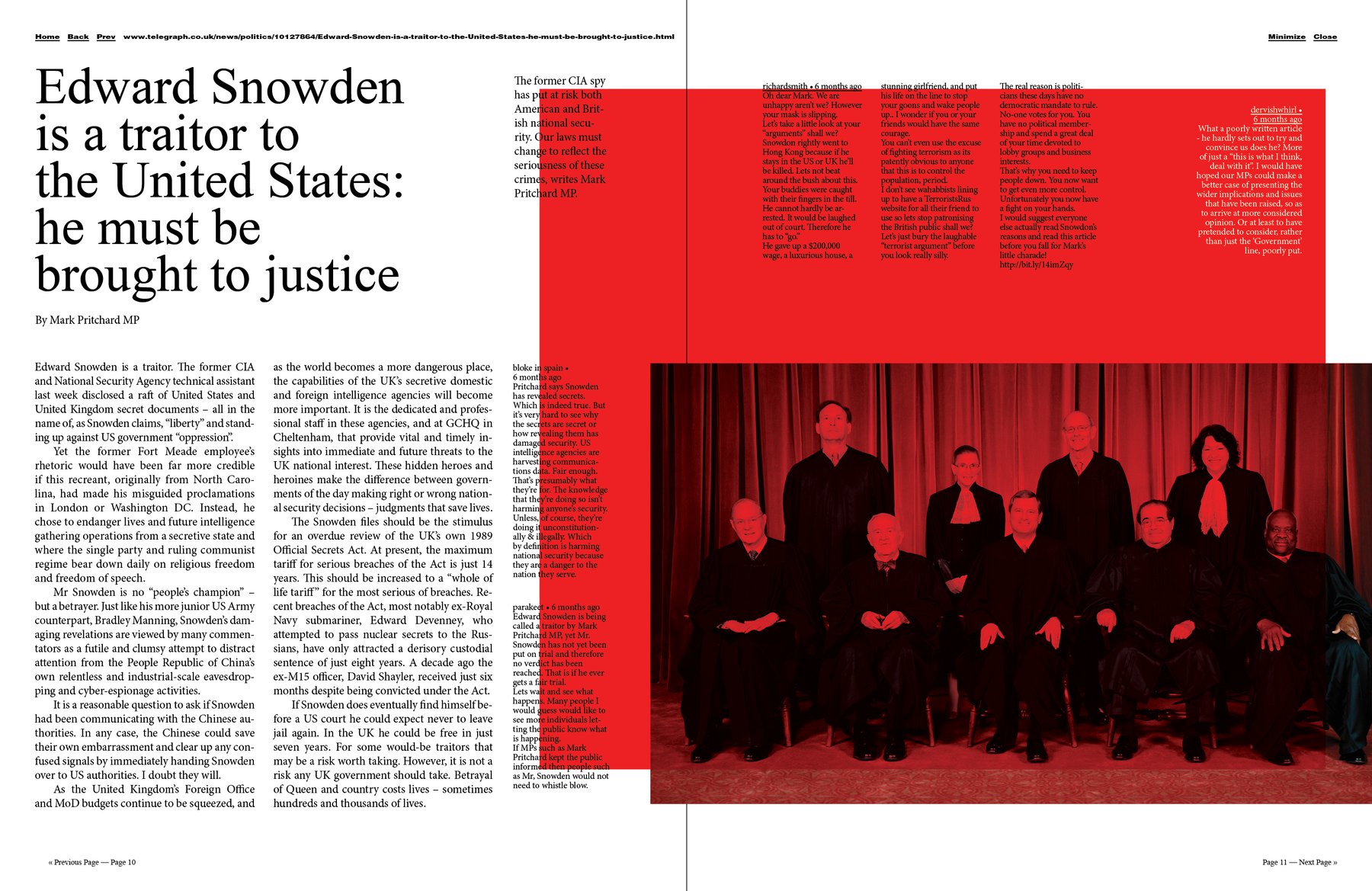
The final option is inspired by fluter and Brand Eins (I talked about them yesterday). I like this simplicity a lot. I also did a draft without the red rectangle; just with the plain white background (but with another layout of the articles); but I like the color highlight here. After designing so many packed magazines, I often feel that I need more “highlights” on my spreads and that they are too “boring” without them. But of course I’m enjoying “empty” magazines like Zeit Magazin or Brand Eins. I used to design very minimalistic, so maybe I just need to rediscover that. Well, sometimes, I guess, Design works like art: You just need to know when you’re finished.