Today is my first day in Weimar; so the first thing I did was going to the library for three hours and having a look at classic books about grids and editorial design. Did I mention that I’m not feeling as comfortable with grids as I feel I should be? Today made me think: “Grids are doable.” And that’s good. Also, I’m looking forward to do the math behind the grid; playing with numbers is always something I enjoy.
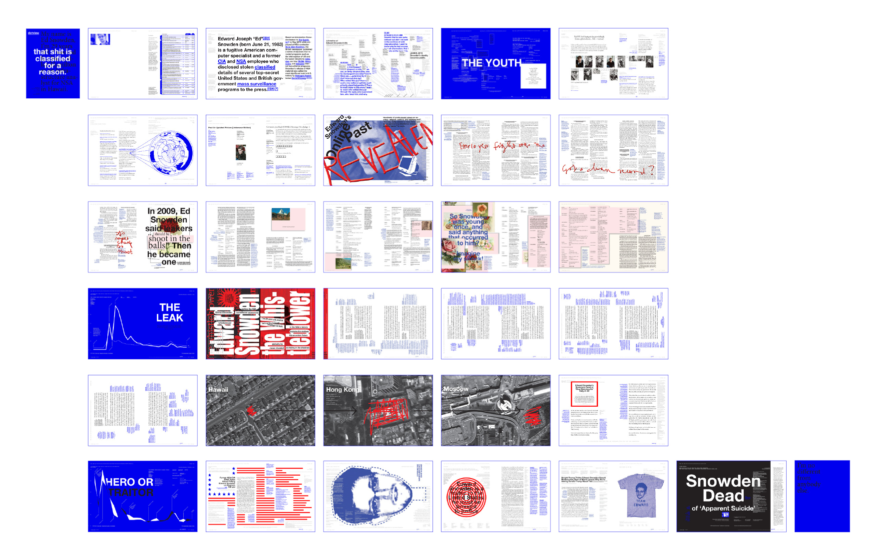
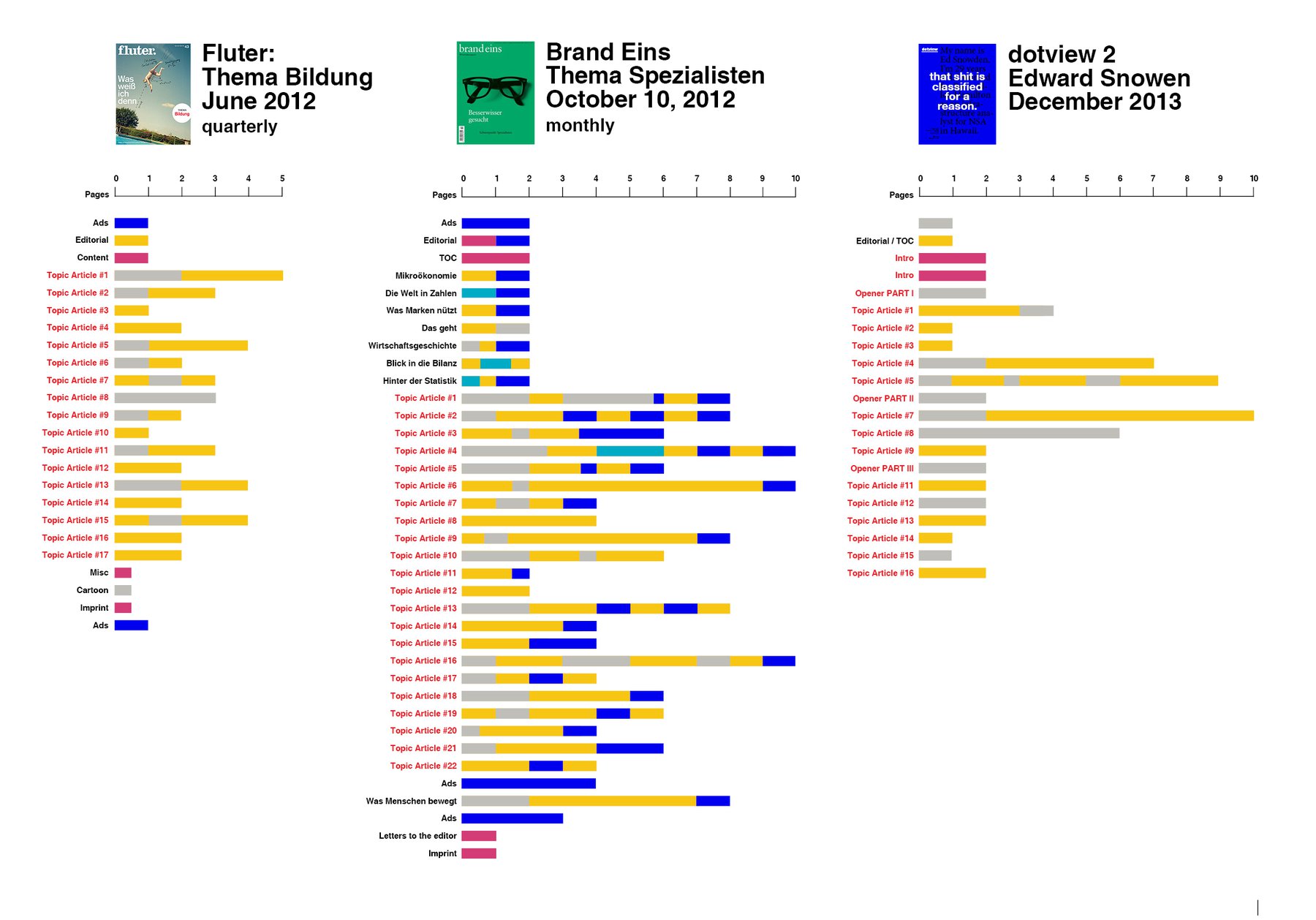
It was threre in the library when I had the over-due idea to extend my analysis of the structure of magazines with the magazine I already designed. Because of course, I had some thoughts about the organisation of articles when I designed the first and second issue of “dotview” - but I wonder: How good is this magazine really when it comes to page structure?
Well, I’m proud to say that it has more contrast (in terms of long and short articles) than the fluter magazine…but there is still room to improve things. I feel like the contrast is too sharp: I have these four very long articles in the middle and a long, boring tail towards the end. I also have barely big images or some other kind of break in my long articles - that’s something I need to improve, too.
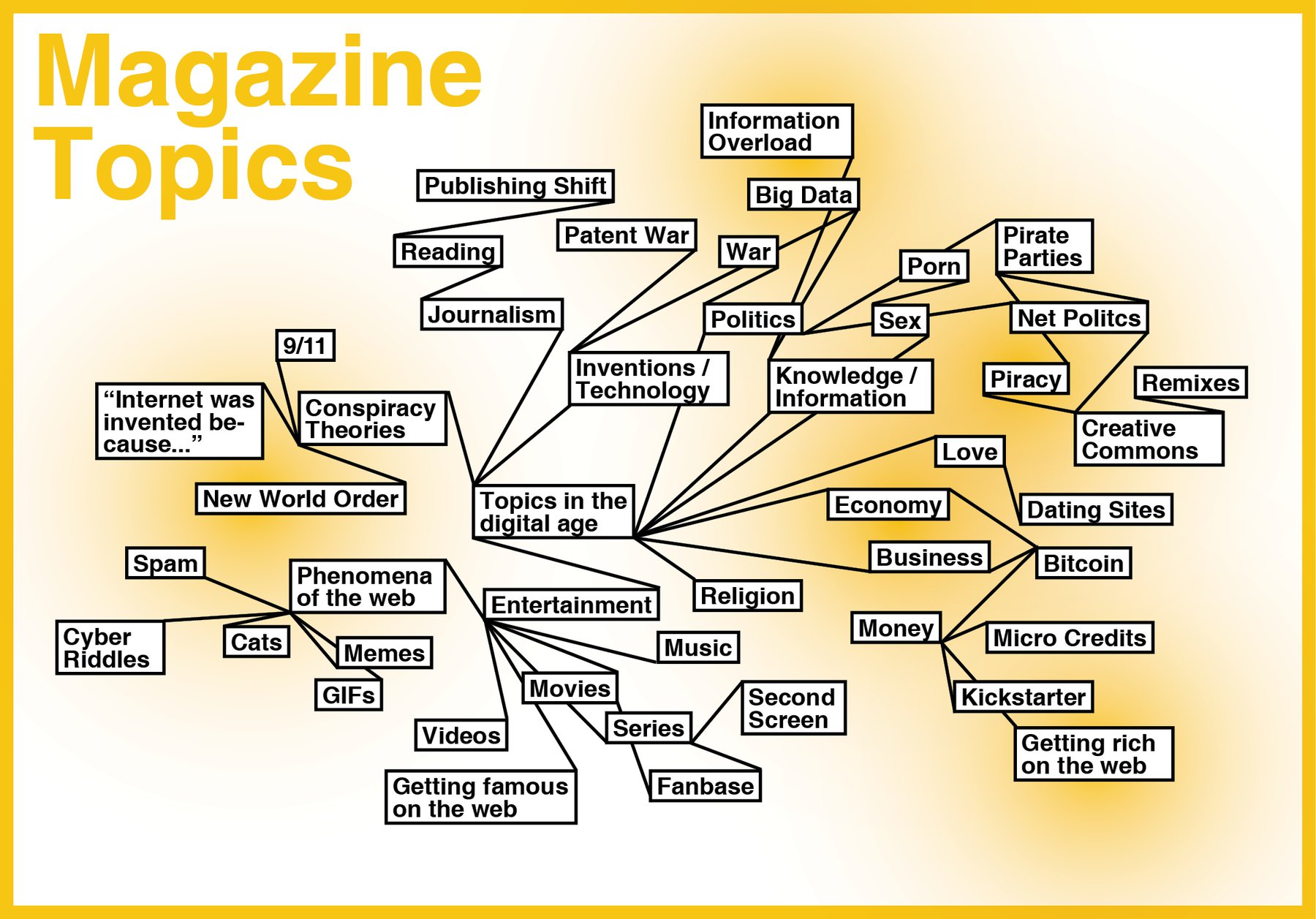
The second thing I did today was also over-due: Thinking about the content of the magazine I will begin designing at the 10th of February (that’s in seven days). I made a mind-map that let me consider to take the economic / politic / financial side of the web (instead of the dark and complex world of conspiracy theories). The content of my magazine should be exiting for me, but above all, it should have potential for visual appealing stuff. Yes, it seems like that’s not hard with gigabytes of gifs, jpgs and mpgs as possible page filler…but I’m especially interested in info graphics, and so I have to ask for good stories to visualize. In my opinion (so far), topics like “Money” or “Piracy” would be qualified for that.