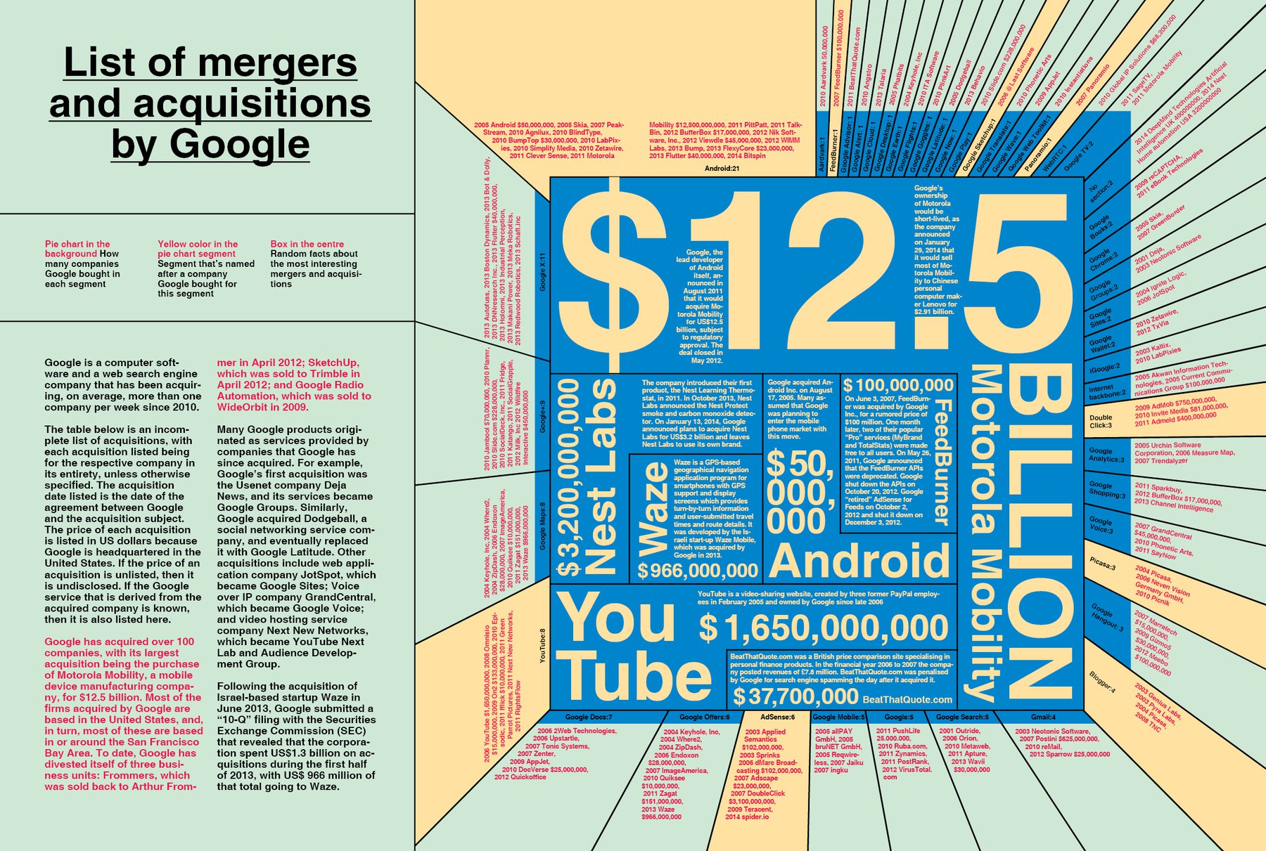
This is a cracy info graphic: It doesn’t say so much, actually, except “Google spent a lot of money on tech startups.” In addition, this graphic is not very consequent in their usage of typo. So - it’s not a good graphic. But somehow I like the look of it, and somehow it fits in the crazyness of the magazine so far.
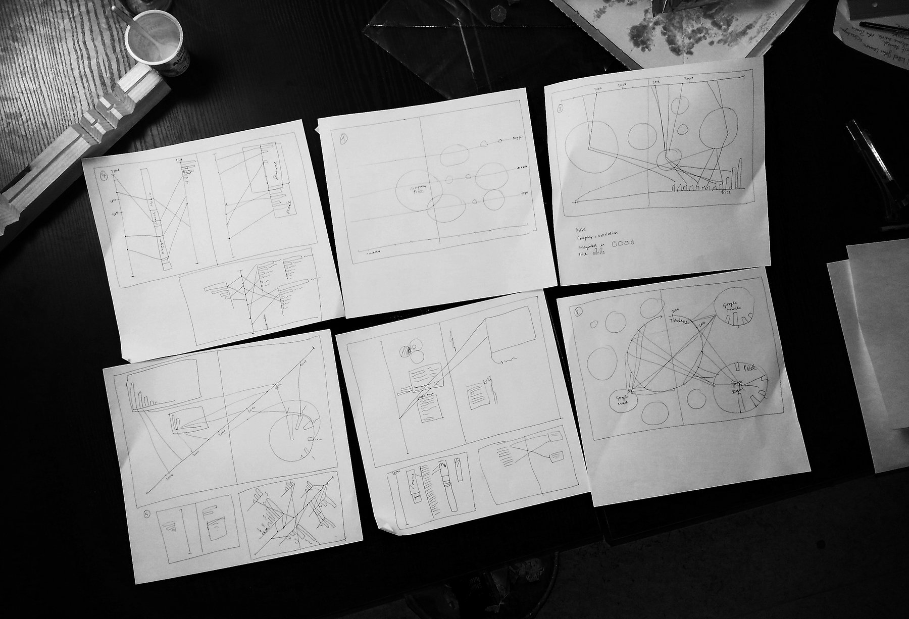
How did I do it? Everything started with drafts. Since I learned from my first video screen recording that I should have the first raw concept before going into the details, I really wanted to think this time about the broad image first. As one can notice, I didn’t use any of the scetched concepts - although some of them would have worked perfectly.
I took the data from Wikipedia, put it into Excel and then wanted to get an overview over the “statements” of the numbers with the Tableau Public software (which I highly recommend). I soon noticed that neither Excel nor Tableau Public translated the dates in the correct order (suddenly, I had startups which were bought by Google in 1905). So I put everything into Google Fusion Tables, and this worked perfectly. I then copied everything back to Excel.
In the meantime I had decided to create a pie chart with all the Google divisions, and I thought this would be the easy part: I put the numbers into Adobe Illustrator and clicked “create pie chart”. Voilà, I thought. It wasn’t voilà at all - but unfortunately I noticed very late that Illustrator didn’t render the numbers right. A lot of the pie “slices” which represented the number “1” were slightly bigger than other parts with the number “1”. I didn’t even know that this was possible: That Illustrator could be wrong. “That’s weird”, I thought, and tried to fix it with changing the pie chart size, changing the stroke etc…nothing helped. So I let Excel do the work (meaning, the pie chart), brought the result into Illustrator to get it ready for InDesign and then, finally, had a perfect pie chart ready for my spread.
The rest was a lot of detail work; and the result is one of my favourite pages in the magazine. I even brought the Google colors into the spread (a little bit pastel, but still).