It’s the last working day of the year for me. I emailed another ten people who had interesting questions in the survey if they’d like to answer some questions in a call in January (three people already replied and scheduled calls 🎉).
I also wrote to Jonatan Hildén. He’s one of the two authors of the excellent Data Visualization Handbook, the maybe most beautiful collection of how to’s in data vis there is. He also filled out the survey and made a great comment on accessibility of colors in it. So I got in touch with him today, and he immediately replied and made me aware of a series of articles on the concept of “high contrast” in data vis by Frank Elavsky.
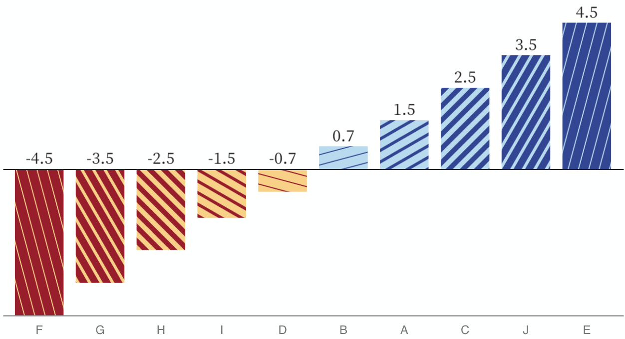
from “Experimenting with ‘No Use of Color Alone’ in Data Visualizations with Sequential, Diverging, and Circular Color Scales” by Frank Elavsky
Now, Frank is a known figure in the world of what he calls “chartability”. If you research “accessibility in data vis” for two hours, you’ll stumble upon Frank. That said, I didn’t know his article series, and just read through them. It’s fascinating to see his articles, and to see the implications of what happens when you apply the WCAG 2 to data vis.
Jonathan also pointed me towards the paper “Modeling Color Difference for Visualization Design” by Danielle Albers Szafir; and I discovered this contrast introduction, and this little tool by Connor Gramazio. I haven’t quite understood it yet, but I will. In January. After some nice vacations.
Quote of the day: “My hope is that High Contrast will someday become listed as one of those ‘well known data-viz rules’ that we all have heard of and have many tools for.” – Frank Elavasky