I was SO close to finishing not just the “fitting colors”, but also the “Design for insight and readability” chapter today. (Should the topic of sentiment and color psychology go into a chapter about readability? Maybe, maybe not. To be decided. For now, it’s in there.)
But then the Israeli data vis conference ISVIS 2022 turned out to be more interesting for me than I anticipated, and I spent more time than anticipated watching these super interesting talks. The first one was by Amanda Cox, and of course, if there’s a talk by Amanda Cox, I watch it.
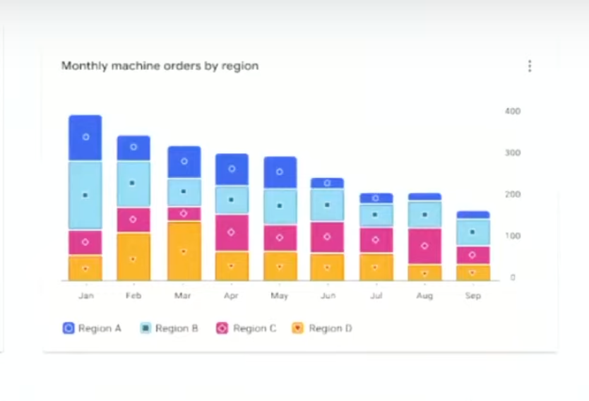
There were really interesting other talks, too, like one by Kent Eisenhuth called “It’s Data Accessibility, Not Data Visualization”. He works at Google and, among others, tried to prove that colors in visualizations can be WCAG-compliant and beautiful. You can see this on the blurry screenshot below, in which his team used a lot of strokes, white margins between the stacked parts, and – I had not seen this before – little icons in the stacked parts as an extra indicator for the category:
Very interesting indeed.
And something else has happened this week which I missed until today: Leonardo, a color tool for data vis designers, added color scales as a feature: sequential, diverging, and qualitative ones. Leonardo isn’t the easiest-to-use tool out there for any of these scales; it definitely has a learning curve. But also a lot of interesting views and color spaces. I like how users can pick categorical colors (with certain color differences, WCAG compliant, colorblind-safe, etc.) and then see which other colors will also fit by clicking “Cycle safe color options”:
Anyway – I’m looking forward to finishing the really big “fitting colors” chapter next week! Until then, I hope you enjoy your weekend 👋