At more than one point during writing my Master’s Thesis I thought about the whole »showing your work« thing. I’ve always had a website; since I was 14 years old or so. I was fascinated by webdesign and what you can do with HTML and CSS. I put my illustrations, some texts and photographies on different blogs and designed them. But never ever came anybody across these blog – and actually, I didn’t expect this to happen. I wanted to have a website just because it was a nice way of presenting my works – for me. I still like this aspect: Seeing your work on your website or Behance profile makes it look differently.
But of course, nowadays you want the attention. You want the acknowledgement and a lot of clicks on your »Appreciate it!« button. I think a lot of people use this as a nice and quite addictive (and therefore, at some point sadly disappointing) way to boost their self-confidence; but a lot of people also think they »need« to do it because »everybody does it« and they will have »advantages« (whatsoever) when they’re applying for a job. In my opinion, that’s not so true, especially not for employer (it’s another story for freelancer). However, bringing my work out there was still one of the best aspects of my Master’s Thesis. But why? What are the advantages? What did I learn?
Get feedback through numbers
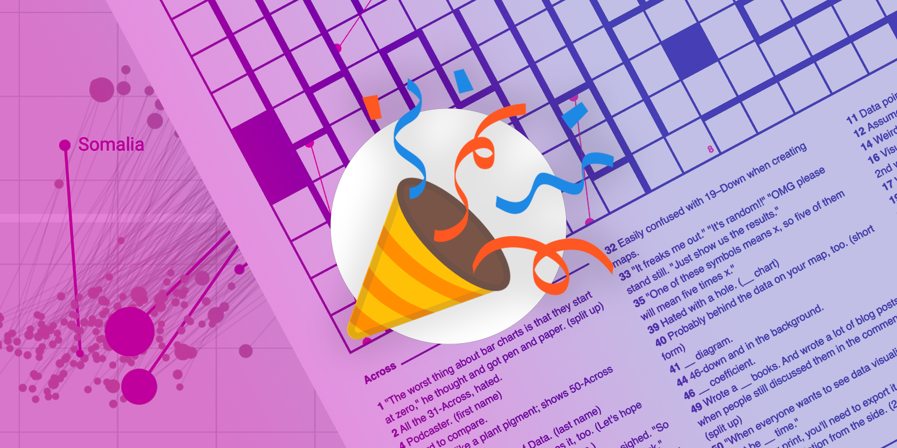
Behance is great in showing you what »good« (or let’s say: widely appreciated) design actually is just through the amount of views and appreciations you get on a project. You can learn from that. So I uploaded six projects to Behance, among others the super big information design project »What we’ve known« I designed in Oxford during my exchange semester, and the internship documentation of my time at the Bloomberg Businessweek. I designed the latter one in maybe 10 days: One spread every three to four hours. The typography is just bad. The magazine has no magazine-like structure or flow at all. In the information graphic, however, I put a lot of energy and consideration. And surprise: The numbers show that apparently a lot more people on Behance like the Bloomberg Internship Documentation more than the info graphic.
Decide between form and function
Well, what does this tell me? First, it tells me that the preview pics on Behance and every other similar platform are so small and the attention span of the viewer is so short that it just doesn’t matter if you have high-end kerning. That the »big picture«, the quickly seen concept, is much more important than details. And it demonstrates very nicely that Behance is not the best place to show magazine design: Nobody sees the structure. All the Behance user can see, are images.
Discovering this, I felt like (magazine) designers have to decide: Do they want to produce quick, nice, Behance-worthy magazine spreads; »images« that work well in their portfolio and convince the viewer quickly? Or do they want to learn how to make »real« magazines and spending their time with thinking about the flow and articles instead of the design? The best design, of course, combines both – but it speaks for itself how many quick designs are out there, highly praised.
Outside appreciations lead to inside appreciation
Although I still doubted that Behance was right, it helped me to appreciate my own work. Suddenly I saw some beauty in the Internship Documentation that I haven’t seen before. (I bet that would have happened to any other project, too.)
Why I didn’t see its shine before? I designed it in ten days and I didn’t think that something I made in ten days can be good enough. That’s DISPROVED. In fact, I’ve seen results from 5-hours-workshop published in design magazines. In my opinion it’s all about intellectual preparation. I prepared this magazine in my mind a lot. There were eight weeks time between the internship and the date on which I started to design the documentation for it. And during the 3-month-internship (at Bloomberg) itself I already started to think about the end product. So when I said that I needed 10 days to design the magazine with 64 pages, all I did was bringing the layouts, texts and info graphics from my mind on paper.
After designing so many hours, days, weeks or even months on a project you can loose your »fresh view« – personally, it’s hard for me to judge this work in comparison with other works anymore (another reason why I like short projects so, SO much more). In the end you don’t even think anymore that you created something special. Hearing what positive things other people have to say about your work can you help to see your work in a new light.
Somebody will like it
I wondered: Will there be positive thing to say about my work? Because nobody of my peers told me: »Wow, it’s so good, I bet people would publish it on their website!« What I’ve learned from that: I shouldn’t listen so often to my own opinion or the one from my close enviroment (friends, class mates), but let people from far away decide if they like my stuff or not. There are so, so many magazines, blogs and other platforms on the world – eventually, somebody will like it. Maybe the secret of good design is that it increases the critical mass of people who can potentially find it likeable. But even »bad« design works: There is a »taste niche« for everything and everybody.
Push it. Push it hard.
But you have to find this niche, because it doesn’t find you (normally). When I was young and dumb, I thought: »If somebody find my work on my website and likes it, they will tell the world.« Well, that was naive, incredibly naive. I didn’t expect that the whole world suddenly says: »OMG I LOVE IT!!!!«, but maybe I expected that somebody would say: »Hey look, I found this designer by coincidence – she’s not so bad!« Coincidence! Ladies and Gentleman, I proudly present one of the biggest mistakes in the thinking of a designer or artist. It goes like this: »Some day, somebody will discover me. I just have to wait.« I hope I will never think like this again, not even subconsciously (like I did it in this case). I think it’s right to say: Everybody has to push in the beginning; but the more you are just average with your design, the more you have to push. And you ARE average, because they are hundreds of designer who are better than you. Which isn’t a problem. They can’t design day and night. And design blogs need something to blog about. And design magazines need something to write about. And what I’ve learned in the last three days: Design blogs and magazines are likely to publish something that’s not as good as your work – just because you didn’t push, but the other designer did. If they don’t know you, they can’t publish you. I learned: There’s no harm in letting the world know that you can do nice designs, too. And the worst case is….that they don’t publish you. And nobody ever knows that you tried.
I asked Novum magazine to publish my Internship documentation, and never ever came an answer back. But I asked IDPure, and now my first dotview magazine has a spread in their magazine. In addition, I wrote Alec Dudson from Intern Magazine, who even posted an article about my internship documentation on their website (I’ve never been called »a rising star« and of course it’s music to my ears. This really made my day back then!). Two months later, Alec asked me to design a spread for his magazine.
Get rewarded with conversations
Bringing my work out there also let to get invited as a speaker at Facing Pages, an independent magazine conference in Arnhem, the Netherlands. That’s why I’m bringing my work out there: In the end, I don’t want attention; I want the conversation. That’s the nicest part. When people come and talk to you about your work and you respond and talk about their work and you get some new insights out of the conversation. I was fortunate enough to get this often during my Master’s Thesis process.
