So, Choropleth maps. Lots of fun. It’s amazing that this simple map has such a complicated name. It’s also amazing how many complicated tools you sometimes have to use to build such a simple map (OpenStreetMaps → Overpass-Turbo → Excel → qGis → Color-Brewer/chroma.js → TileMill). Only after you’ve gotten into shapefiles, geo-jsons, joining data and qGis styling modes, you’re allowed to look at something awesome.
Actually, wait a second. Let’s have a look at these styling modes in more detail. Because once you’ve understood them, they are fantastic to separate your data into intervals. And to understand them was the goal of this graphic I built:
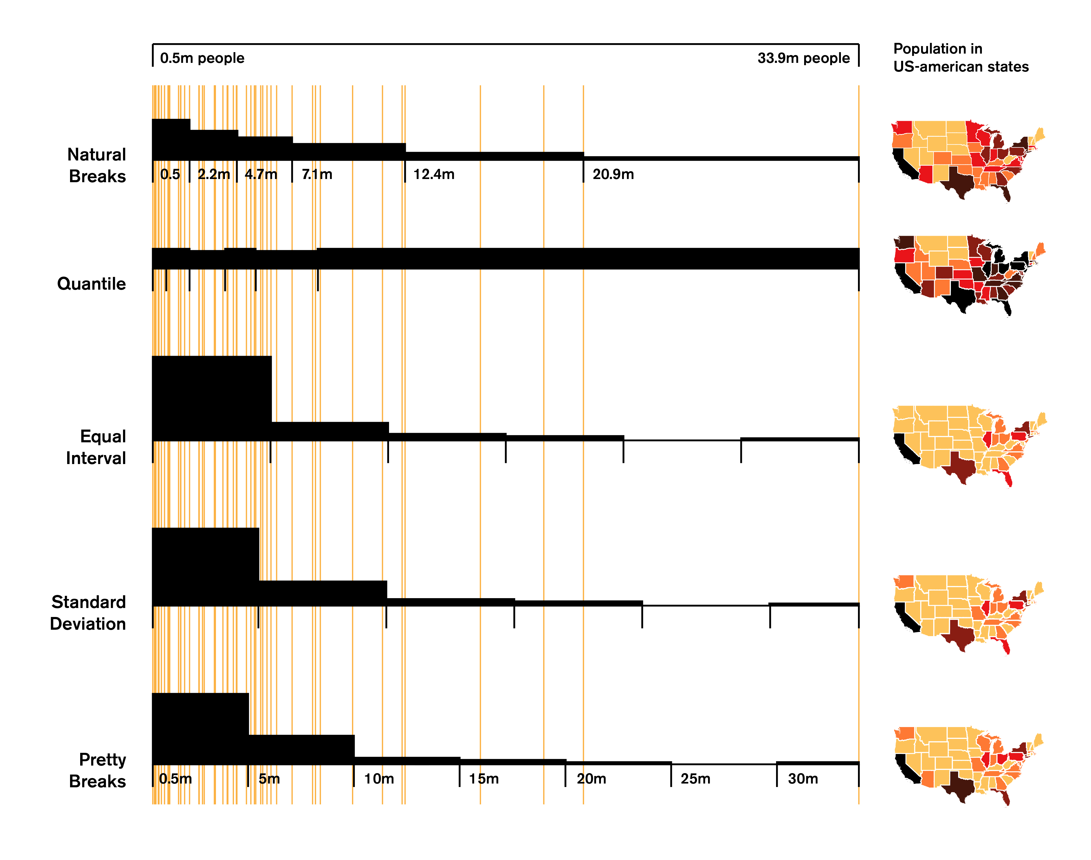
What can we see here? The orange lines are the population data of each of the 52 US-states (the outlier with almost 34 million people is California). On the right, you can see a map of the US with, well, almost all states (sorry, Alaska and Hawaii). But not every number is a color – there are only six different colors. The big challenge –and the goal the qGis styling modes want to achieve– is to put our population numbers in these color intervals so that it makes the most sense. The bar charts on the left indicates how many data points are in which interval (as a histogram). qGis offers five different styling modes, which are exceptionally well explained in this exceptionally good and long tutorial: Click. I’ll try to explain these modes differently, but definitely check out this tutorial, too.
What are our options?
 Equal interval: This is the most obvious option: We just cut the difference between the lowest and the heighest data point in equal pieces. Our data ranges from 0.5m to 33.9m, and if we cut this length in six cake pieces, each of them is approx. 5.6m big. Yummy.
Too bad that 38 out of our 52 data points happen to have less than 5.6m citizens. And as we can see in my graphic, the fifth interval does not have any data points at all. Well, that’s a bummer. Let’s try the other fairly obvious option then:
 Quantile: If we can’t cut the data span, how about cutting the data points itself? We have 52 of them, and 52 divided by six pieces is 8.7; so we just begin a new interval after every eight or nine new points. As you can see in the histogram, the distribution is extremely equal – but that also results in a tiny number range at the beginning. Maybe we can create a compromise?
 Natural Breaks: This styling mode is working yeah for our data. Personally, I’m really impressed by what qGis did there: This mode is communicating nicely that we have indeed lots of states with relatively low population (so qGis puts more data points in the first interval than the Quantile mode). But it also shows well that there are only a few outliers at the top of the scale, so qGis puts only a few data points in the last interval and makes it longer than in the Equal interval mode. The result is a map that shows these outliers better.
But what other modes are there? First, the more complicated one:
 Standard Deviation: The standard deviation measures how much in average all the data points differ from the mean/average of these datapoints. The mean of our population data is 5.5m; meaning, in each state live 5.5 million people on average. Our standard deviation is 6.05m (click here to learn how to calculate it; or type in STDEVP as your Excel formula). That is a high number. Because of our extreme outliers (California, you bastard), it’s actually higher than our mean. But that shouldn’t confuse us – all we need to know it that qGis tries to fit in as many “6.05m”-intervals as possible, beginning from the mean. So, yes, the second interval starts at 5.5m; than it goes up in 6.05m-steps.
 Pretty Breaks: Now the easiest mode! Pretty Breaks makes intervals based on round numbers (500,000 – 1,000,000 – 1,500,000 – etc. etc.). That is so stupid, that this mode wasn’t able to create six intervals with my numbers, but needed to create seven. When the distribution is very equal, it does have a legitimation, though.
If you want to play with the data yourself, go to this Google Spreadsheet: Click. On the second sheet you will find all the data for each styling mode. The source for the population data is Wikipedia.
Edit January 13th, 2015: Daniel Kirsch recreated this graph in R – great post, go check it out!
