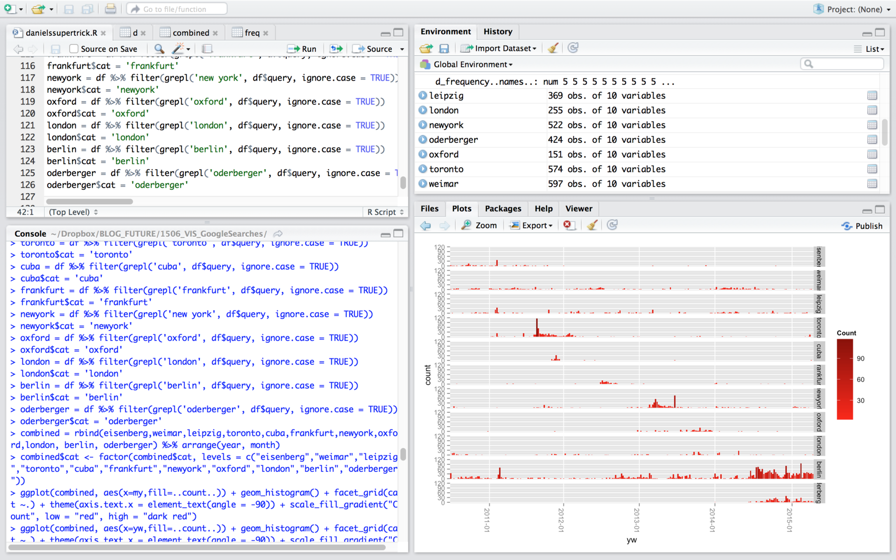
In the past few days (7.24 hours according to my time-tracking app, but that doesn’t include the endless hours of googling for solutions), I used my Google Search History visualization Project to get a little bit more into R. The project was perfect for that: I found that from all my vis apps, only Tableau was able to give me histograms for time series (meaning, it could count my queries in bins of days, weeks, months, years). But Tableau doesn’t let you export SVGs/PDFs in its free version. R, however, is free and a pro in histograms and PDF export. So I thought I give R a try to rebuild my Tableau visualizations. First I’ll talk a little bit about the difference between R and ggplot2 regarding histograms, then I’ll get into small multiples with ggplot2. All of that shouldn’t be considered as a tutorial. I am still learning. There are certainly better ways to do all of that. If you know one: Message me!
R vs. ggplot2
R & ggplot2. Hm. I tried both for a few hours and came to a conclusion which is true for lots of tool comparisons: One of them is easy and weak: native R. The other one is difficult and powerful: ggplot2.
Ladies and Gentlemen, I proudly present, the easiness of R:
hist(subset(d$date, grepl("berlin",
d$query,ignore.case = TRUE)),
breaks="weeks", freq=TRUE)
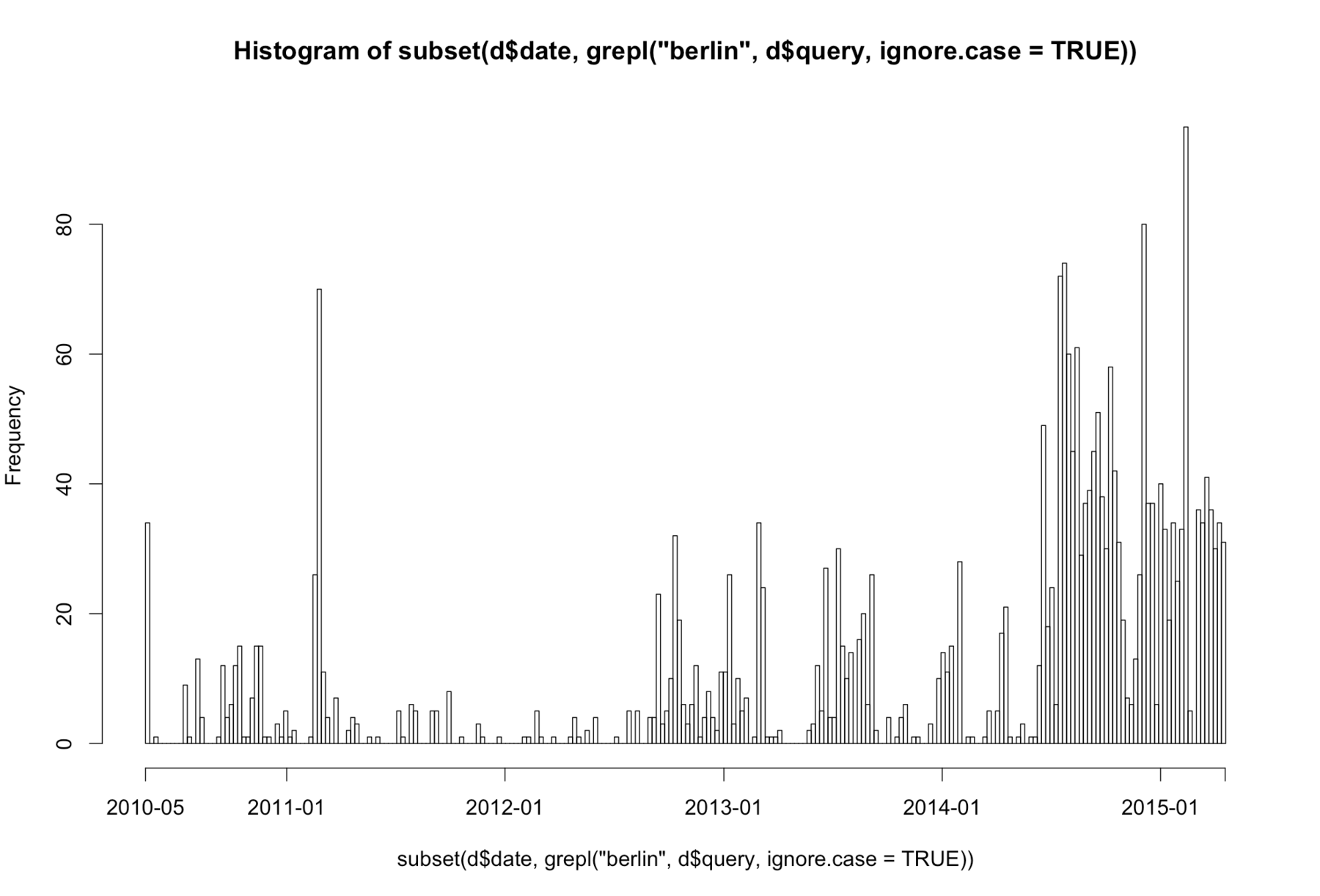
Uh, code. What does it do? Thanks to this one line, R builds a histogram with my date-data (they look like “2015-09-20 16:39:29”). It automatically puts these dates into week-bins (“2015-30”, “2015-31” etc.), and then it counts the number of dates in each bin. But we filter our dates a little bit: R only puts them in bins when it can find the word “berlin” or “BERLIN” or “Berlin” etc. in the query-data that belongs to the date-data.
It’s yeah, isn’t it? And it looks like this (ok, you’re right: It’s ugly. But no worries, you can always export PDFs from R and can edit them in Illustrator):
Now: Introducing the powerful ggplot2, a vis library for R. ggplot2 can do stuff like small multiples of which the little native R can be just jealous of. But with this great power comes great responsibility…um, I mean, a steep learning curve. And it might be because of this steep learning curve, or because nobody else posted a similar problem on the Internet yet, or maybe ggplot2 just doesn’t have it because of reasons: I couldn’t find a way to do a grep filter directly in the command for the plot. It bothers me. ggplot2 should be able to do that. If somebody knows something, let me know!
So instead of directly filtering the shown data for my plot, I need to filter my data first and then I can lot the new data frame (=table). And instead of letting R automatically calculate the week-bins, I need to calculate them myself:
#calculating weeks. Format will be: "2015-30"
df$time = as.POSIXct(df$date, format="%Y/%m/%d %H:%M:%S")
df$yw = df$time %>%
  format("%Y-%V")

#filtering query data
berlin = df %>%
  filter(grepl('berlin', df$query, ignore.case = TRUE))

#finally: plotting!
ggplot(berlin, aes(x=yw)) +
  geom_histogram()
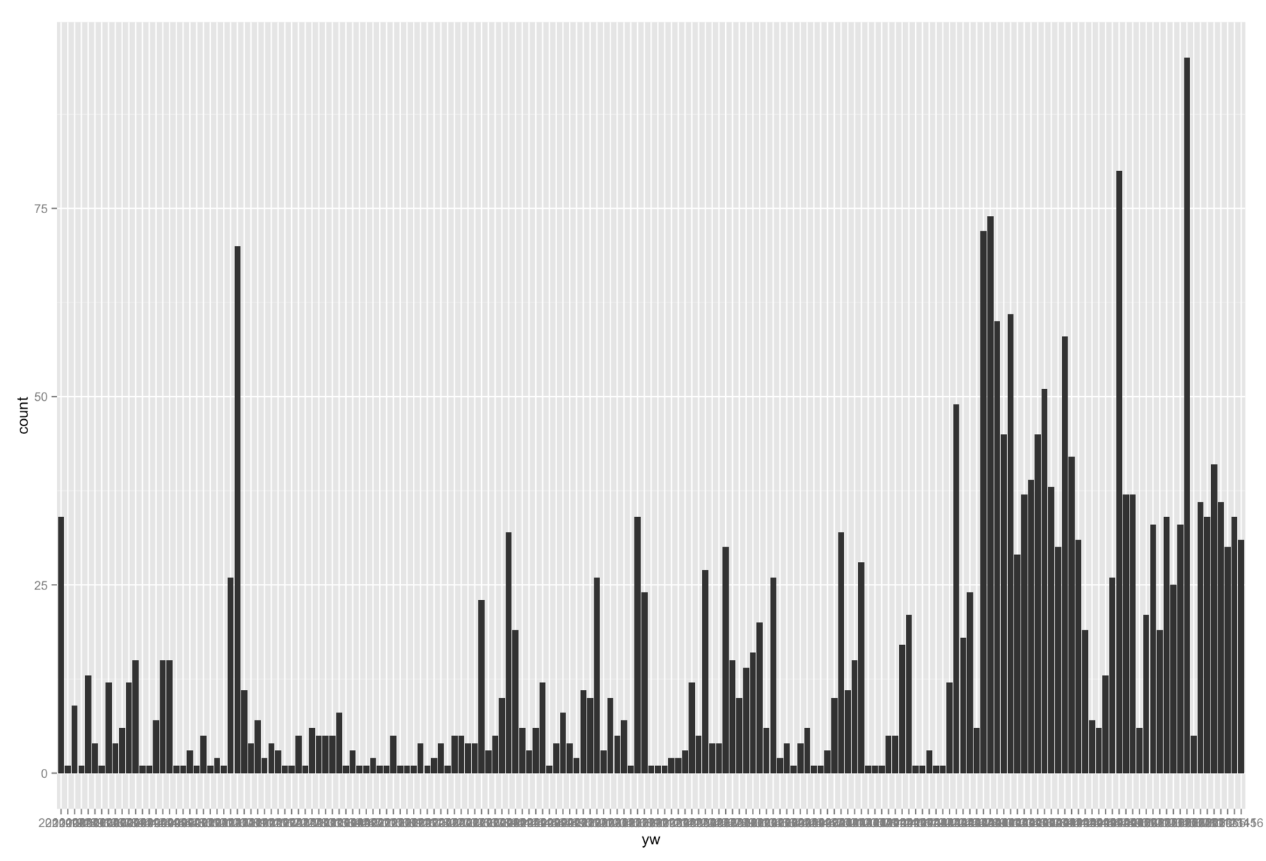
It does look more beautiful – but that’s the least it can do to convince me that this approach is better:
Small Multiples with the ggplot2 library in R
But of course, as soon as you want to do more advanced visualizations, ggplot2 has its legitimation. Let’s get back to that “power” of ggplot2 I was mentioning earlier: small multiples (and lots of other nice stuff) are possible. With some great help from the great Daniel Kirsch (let’s not kid ourselves, he wrote 90% of the code), I rebuild the small multiples chart of locations I googled, which I posted in the original analysis. It looks like that:
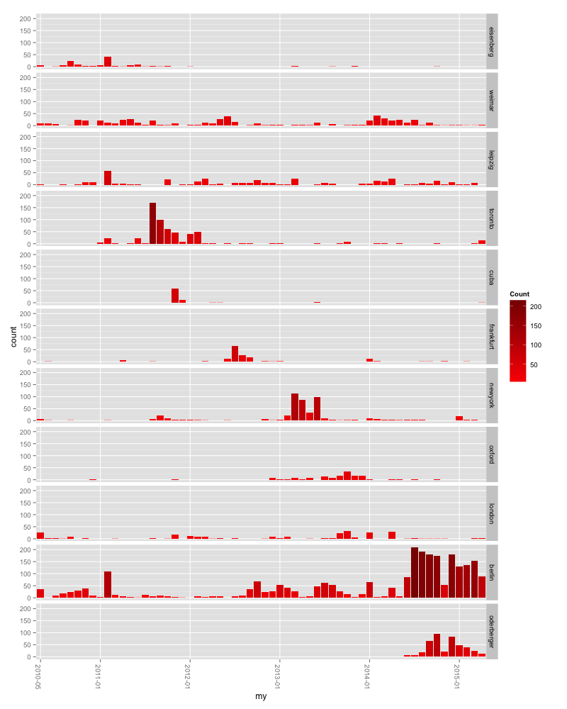
And this is the code for it: First, we do the same thing we’ve done while building the first filtered ggplot2 histogram: We grep all of our queries and write the filtered result in a new data frame. Because we have more than one filtered data frame at the end, we merge them all to one data frame. And after deciding which city will be plotted after which, we plot the histogram. facet_grid(cat ~.) is responsible for the small-multiple-effect: cat is the new column we gave our data. Here’s the full thing:
#filtering query data, writing the filtered data into a new table and writing a new column with the name of the filtered city.
london = df %>%
  filter(grepl('london', df$query, ignore.case = TRUE))
london$cat = 'london'
berlin = df %>%
  filter(grepl('berlin', df$query, ignore.case = TRUE))
berlin$cat = 'berlin'
#....etc.

## bring all tables with the filtered data together.
combined =
  rbind(eisenberg, weimar, leipzig, toronto, cuba, frankfurt, newyork, oxford, london, berlin, oderberger) %>%
  arrange(year, month)

## decide about the order of elements in the final plot
combined$cat <- factor(combined$cat, levels = c("eisenberg","weimar","leipzig","toronto","cuba","frankfurt","newyork","oxford","london","berlin","oderberger"))

#plott the small multiples:
ggplot(combined, aes(x=my,fill=..count..)) +
  geom_histogram() +
  facet_grid(cat ~.) +
  theme(axis.text.x = element_text(angle = -90)) +
  scale_fill_gradient("Count", low = "red", high = "dark red") + scale_x_discrete(breaks=c("2010-05","2011-01","2012-01","2013-01","2014-01","2015-01"))
The previous blog post (click here or scroll down!) will be about text analysis in R – something that I really liked doing and that I want to get more into. Numbers are fairly easy to handle: You can calculate medians and averages and standard deviations and can get all these numbers that tell you something about your original numbers. But text is…blurry. It doesn’t seem as easily manageable as cold numbers. Text mining solves that.
