Edit: This post got translated into Japanese. I also published an updated version of this blogpost in 2018 for Datawrapper. Find it here.
A few days ago, I approached my Twitter followers with a request to help me in an urgent matter: “Can somebody tell me how to get better with color?,” I wrote. “ My color decisions are awful.” Thanks to a retweet by Scott Murray I got a lot of replies with links to websites and tools. They were awesome. And I want to share them with you, annotated with my own thoughts about them. Here you go:
Why color?
First, watch this video about why color decisions are important and how to mix colors. I’ll sum up the main reasons to use colors here: Color is important because (a) it lets you set the mood and (b) color lets you guide the viewer’s eye, draw attention to something and therefore tell a story.
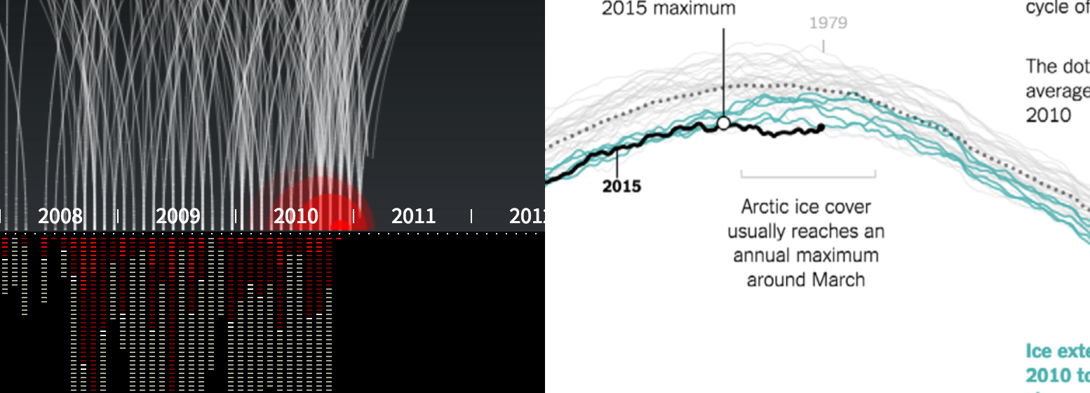
Both aspects are important for data visualizations. For example, the mood is set very nicely in Pitch Interactive’s “Out of Sight, Out of Mind”. The red drops make you almost see the blood spread. And color in data vis is often used to set highlights, a very important tool to guide the viever’s eye. I often told my students “Grey is your best friend in data vis”, referring to that great article by Andy Kirk.
So how should you choose colors for your project? I think in data vis, there are two challenges regarding color: Sequential/diverging data and qualitative data. To explain them: Sequential/diverging data is data that progresses from low to high and therefore requires gradients. Qualitative data are categories and require colors which scream: “I’m by myself and have nothing do to with all these other colors here!”
The challenges for these two use cases are different ones. If you work with gradients, your main concern is that the differences between your steps are high enough. Meaning, you want your reader to clearly differentiate between a light green and a …lighter green. In the next section of this post, I will introduce tools which try to solve this problem.
When working with qualitative data, your mission is to find colors which go well together and attract the reader’s eye. This problem is typical in graphic design circles, so tools in this area are very popular. I will mention some of them in the second part, called “Color Compositions”.
1. Data Vis Gradients
ColorBrewer 2.0 NEEDS to be mentioned first. It’s a classic. THE color tool of color tools for every ambitious data vis designer. It’s not only a tool: While making your choices, it also teaches you about the best use of color in data vis. If you haven’t yet, click on the question marks and read these wonderful explanations.
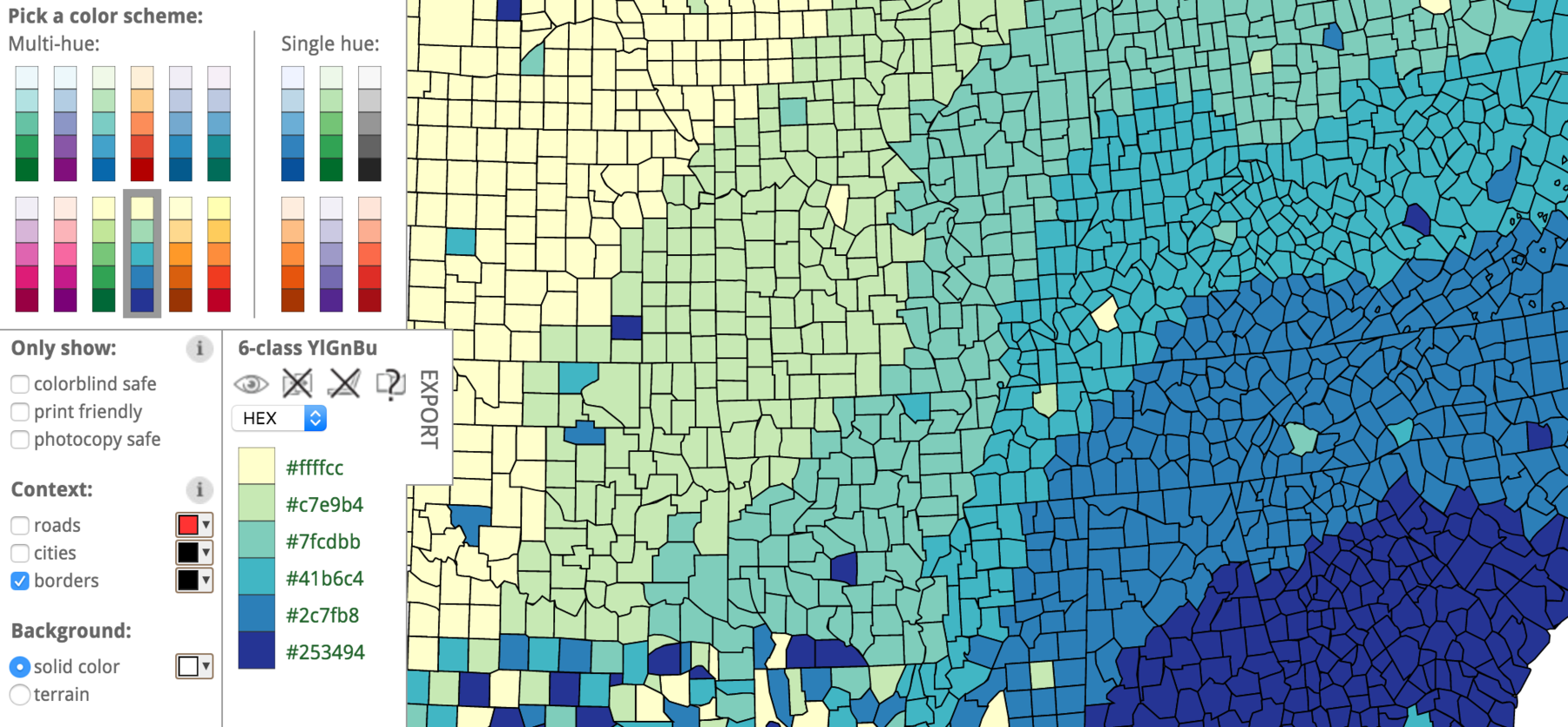
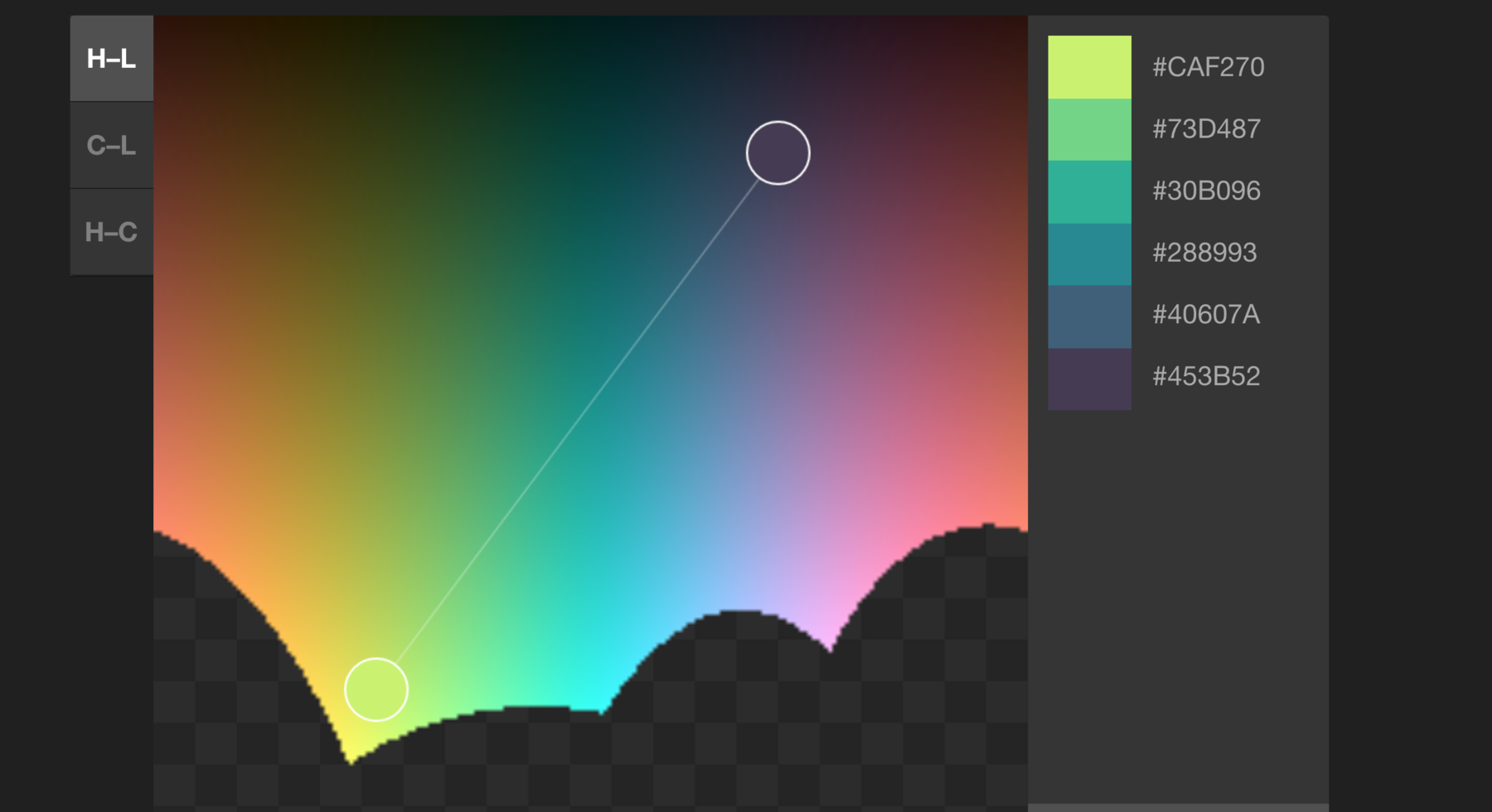
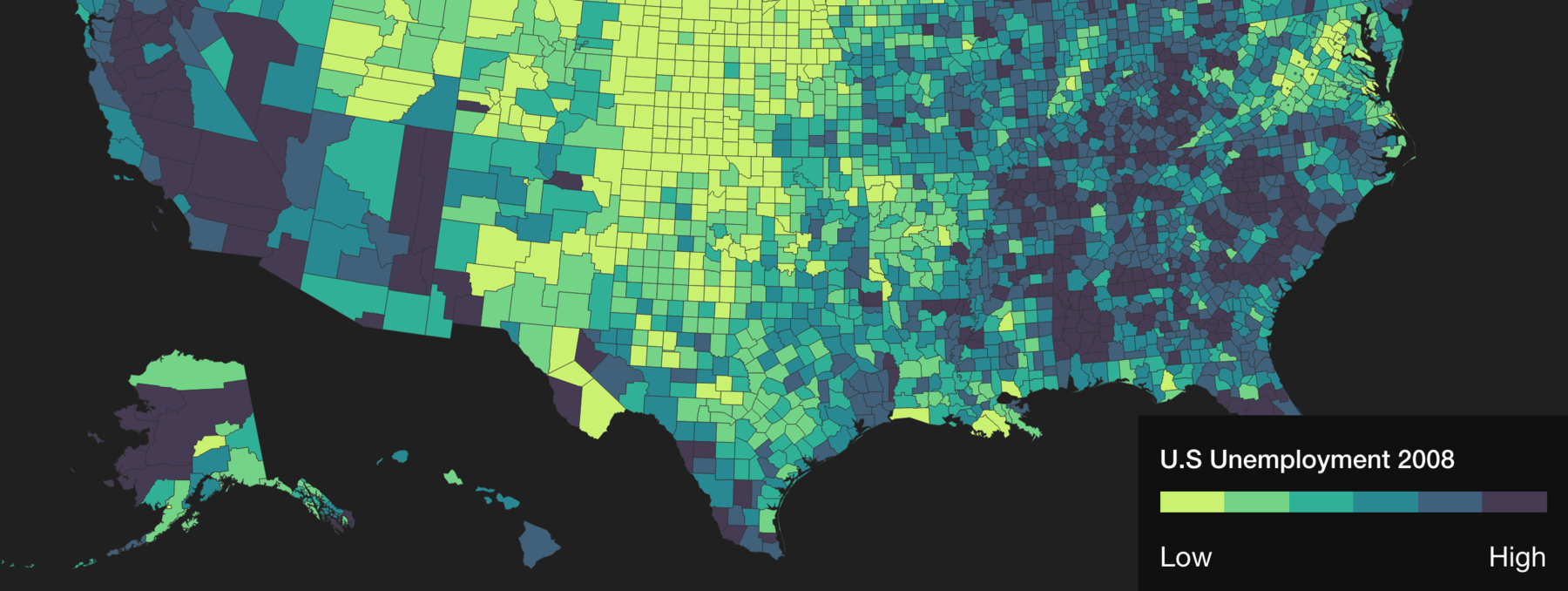
Another tool that’s not only really helpful, but also makes me understand color better, is “Colorpicker for data” by Tristen Brown. Here you can not only choose gradients, but invent millions of them yourself. Don’t miss the “Visualized” button at the top, to show a choropleth map of your gradient. Too bad the map is not on the same page as the color picker, but hey, better than nothing.
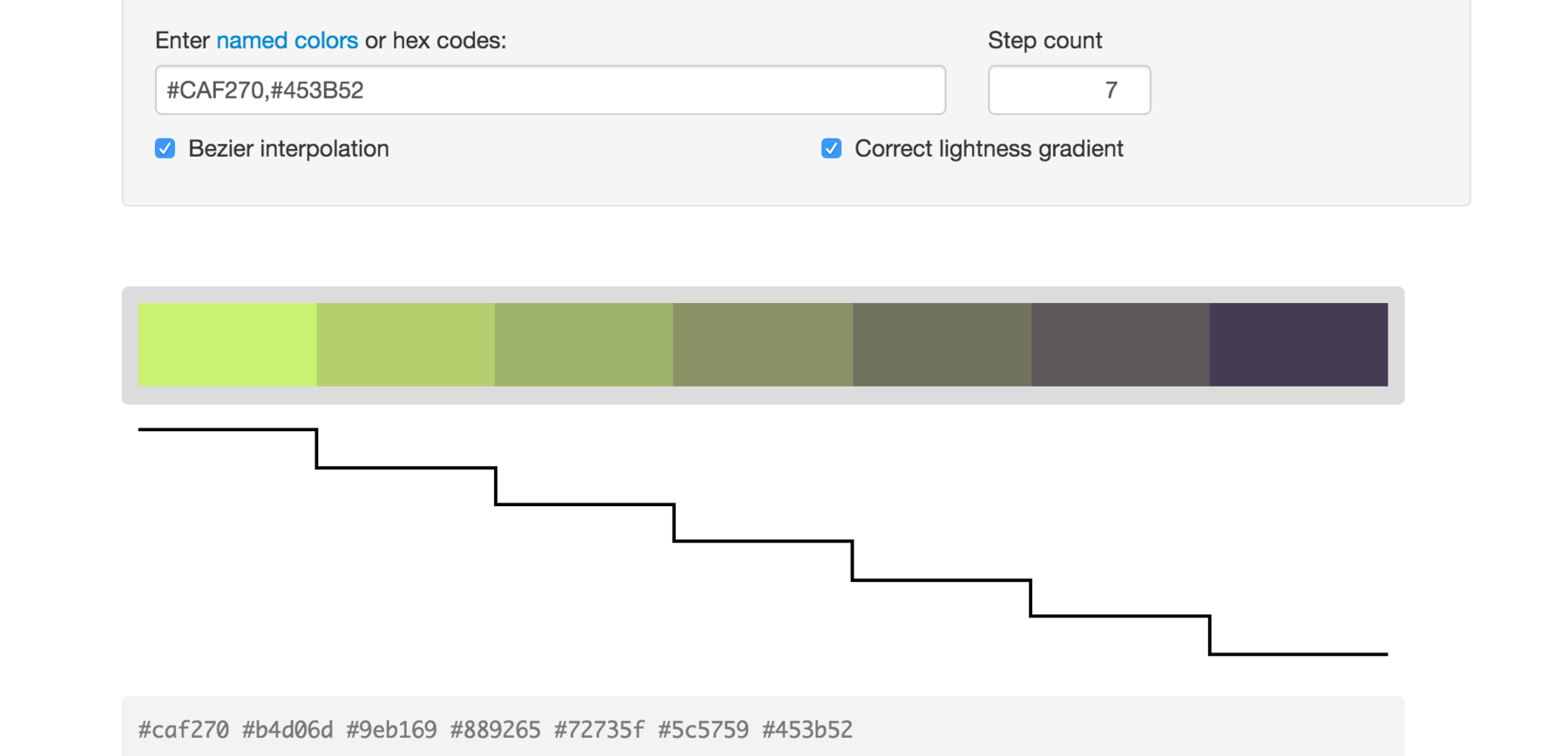
Gregor Aisch’s Chroma.js Color Scale Helper doesn’t only show you the gradients, but helps you to find the ones with the biggest difference between the steps. With showing you actual steps. This little tool is the one I use the most often. If you’re interested in the background: Gregor also wrote a nice explanation of this tool.
If you feel like you mastered all these tools and need more, I want hue will be your choice. It promises “color for data scientists” and is actually so complicated that it offers Tutorials. Definitely not the most understandable tool for beginners and I feel it’s overkill for my needs (correct me if I’m wrong). The emoticons as grades for the differentiation of the colors are a nice touch, though:
2a. Color Compositions - Learn from the Masters
After covering the gradients, let’s move on to Color Palettes. When I asked my question on Twitter, three people recommended me painters, so I feel like there is some demand to cover them. To be honest: I appreciate the old masters, and as a Bauhaus University alumna I see the special something you can get from Albers, Itten and Co. (As an ex Weimar resident I can also see the delight one can get from Goethe’s Theory of Color.) But…you know…their available colors were different. Who knows what they would have thought of with bright neon green. That said, I’m sure we can still learn a lot from their writings about color composition.
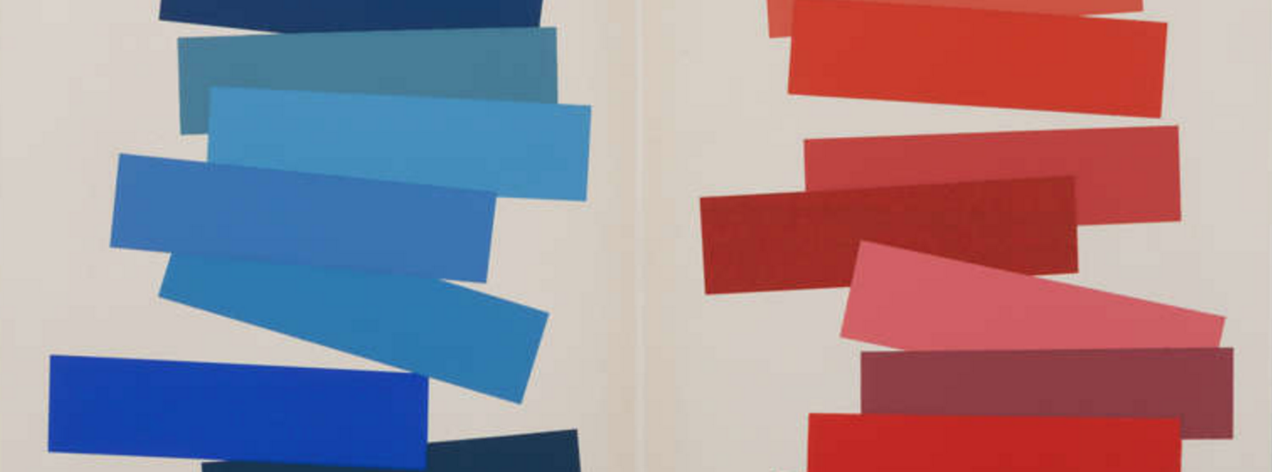
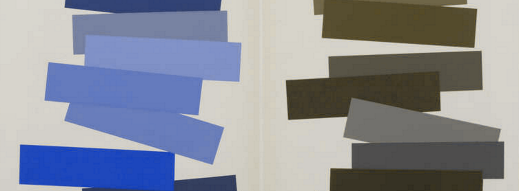
Let’s start with Josef Albers and his “Interaction of Color” book. He had important stuff to say, eg: “In visual perception a color is almost never seen as it really is — as it physically is.” And his color compositions are beautiful indeed:
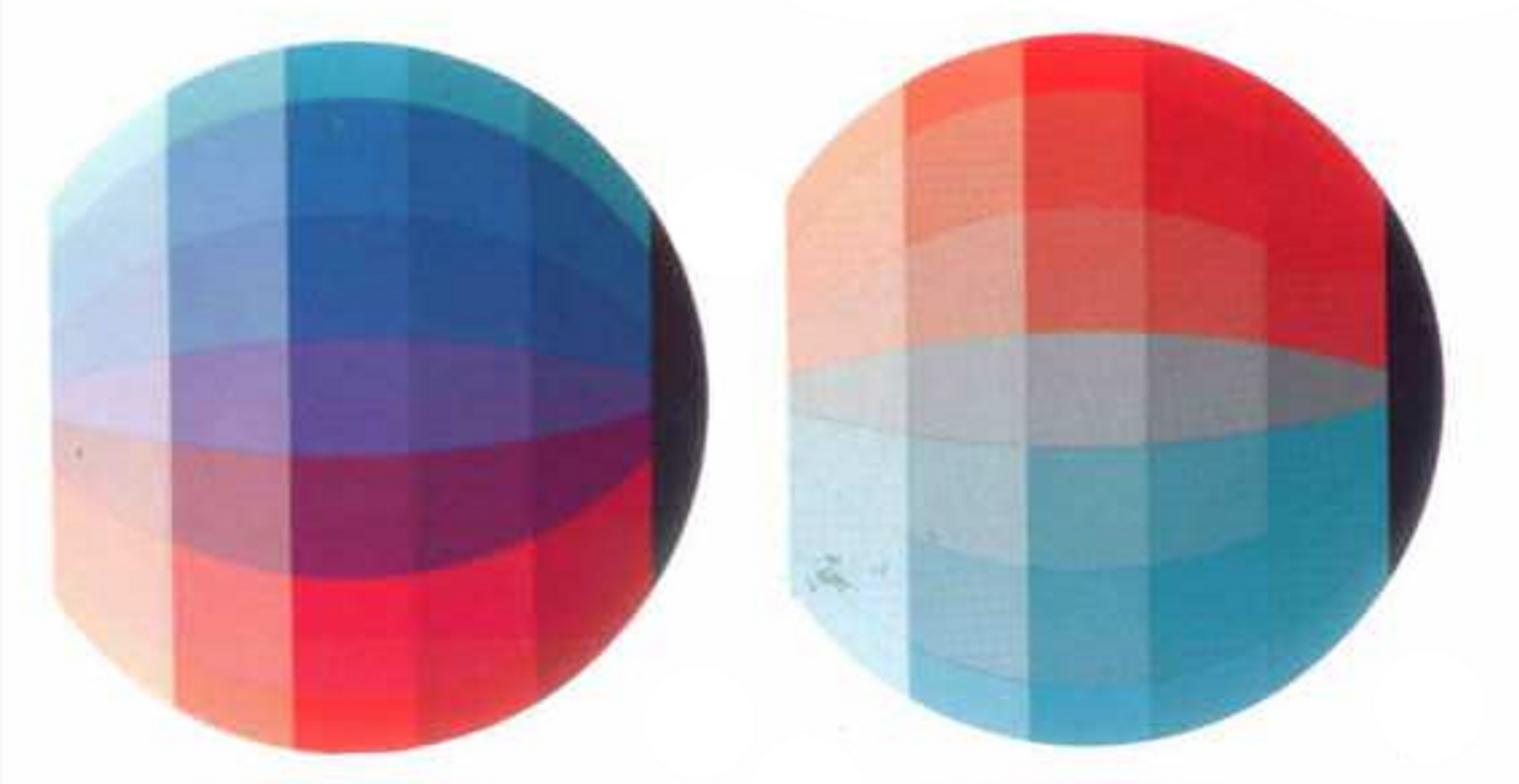
Another Bauhaus-Star (and the teacher of Albers at the Bauhaus): The crazy Johannes Itten and his book “The Art of Color”. He’s most famous for his color spheres, in which he showed colors and there hues:
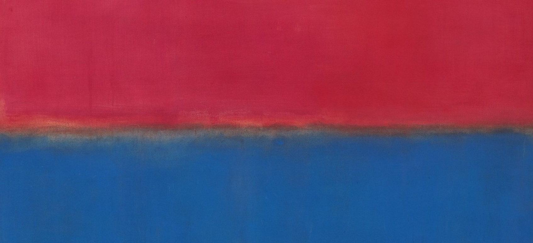
Of course I need to mention THE color hero: the American painter Mark Rothko, who is famous for his huge portraits of colors. Fun fact: Rothko famously said “If you are only moved by color relationships, you are missing the point. I am interested in expressing the big emotions”. I’m not sure if I understand that, since the color relationships definitely help in expressing these big emotions:
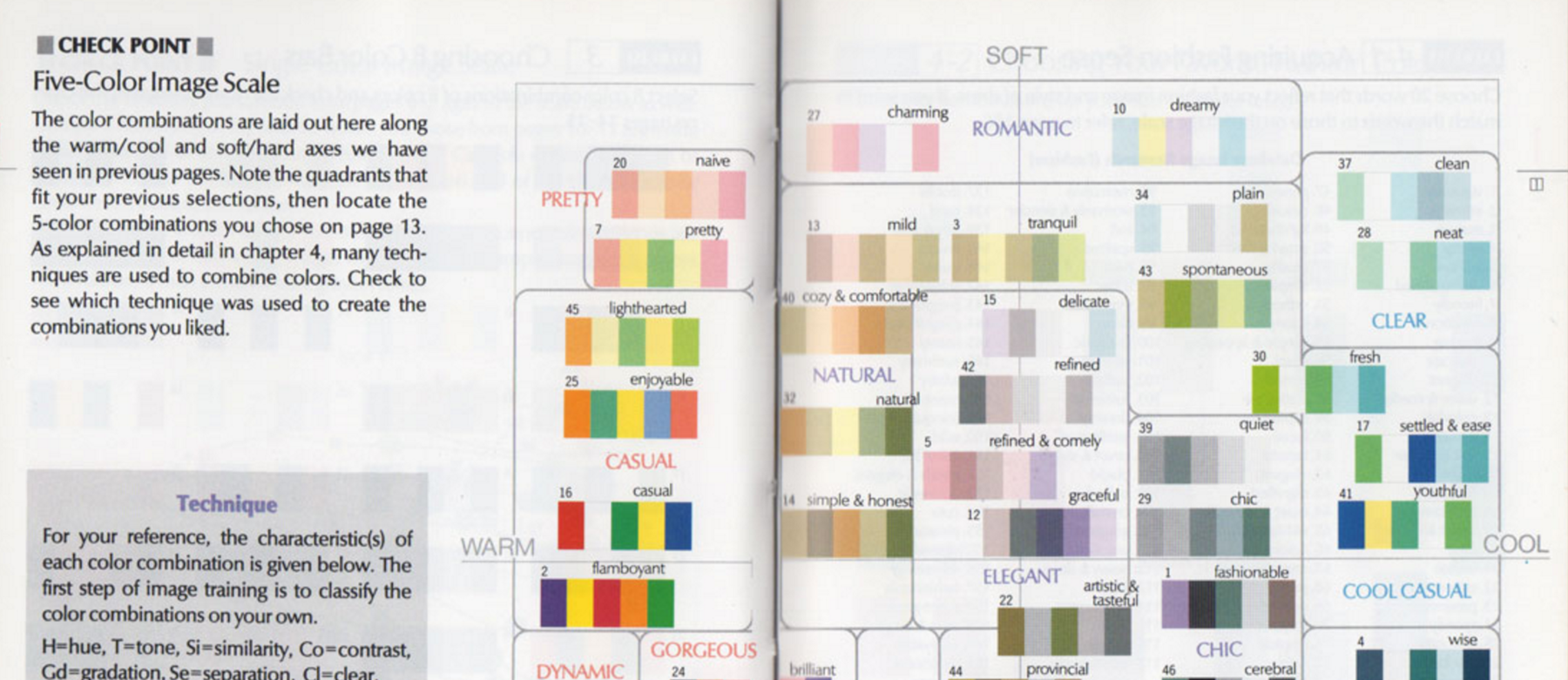
(Apropos Emotions: A fun book seems to be Colorist by Shigenobu Kobayashi who works in the field of “color psychology” and tries to “demystify color aesthetics”.)
Coming slowly back to the present day: The website ColorLisa lets you see the color palettes of artists, which is a nice idea. But the execution is so poor that I want to leave the page quickly:

2b. Color Compositions - Learn from the Movies
Let’s move from art to a more pop-culture relevant phenomenon: Movies. Master of storytelling, this medium knows how to use color to set highlights, lead your eye, set the mood and make you feel delighted.
General color palettes with colors from movie stills can be found at
Film Palettes and especially Movies in Color. The Colors of Motion has a more artistic approach and shows the colors of all frames of a movie. Not sure if that can actually be helpful, but it’s definitely interesting.
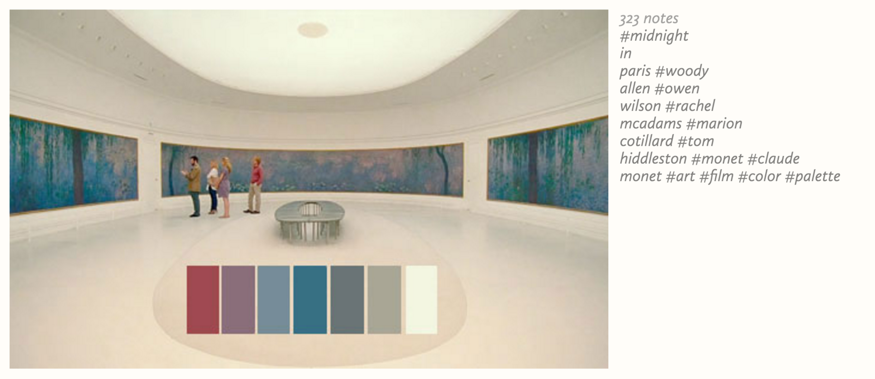
Some dude who works especially well with colors is Wes Anderson. The Wes Anderson Palettes is kind of legendary. Inspired by this blog, there is even an R library for Wes Anderson Color Palettes.
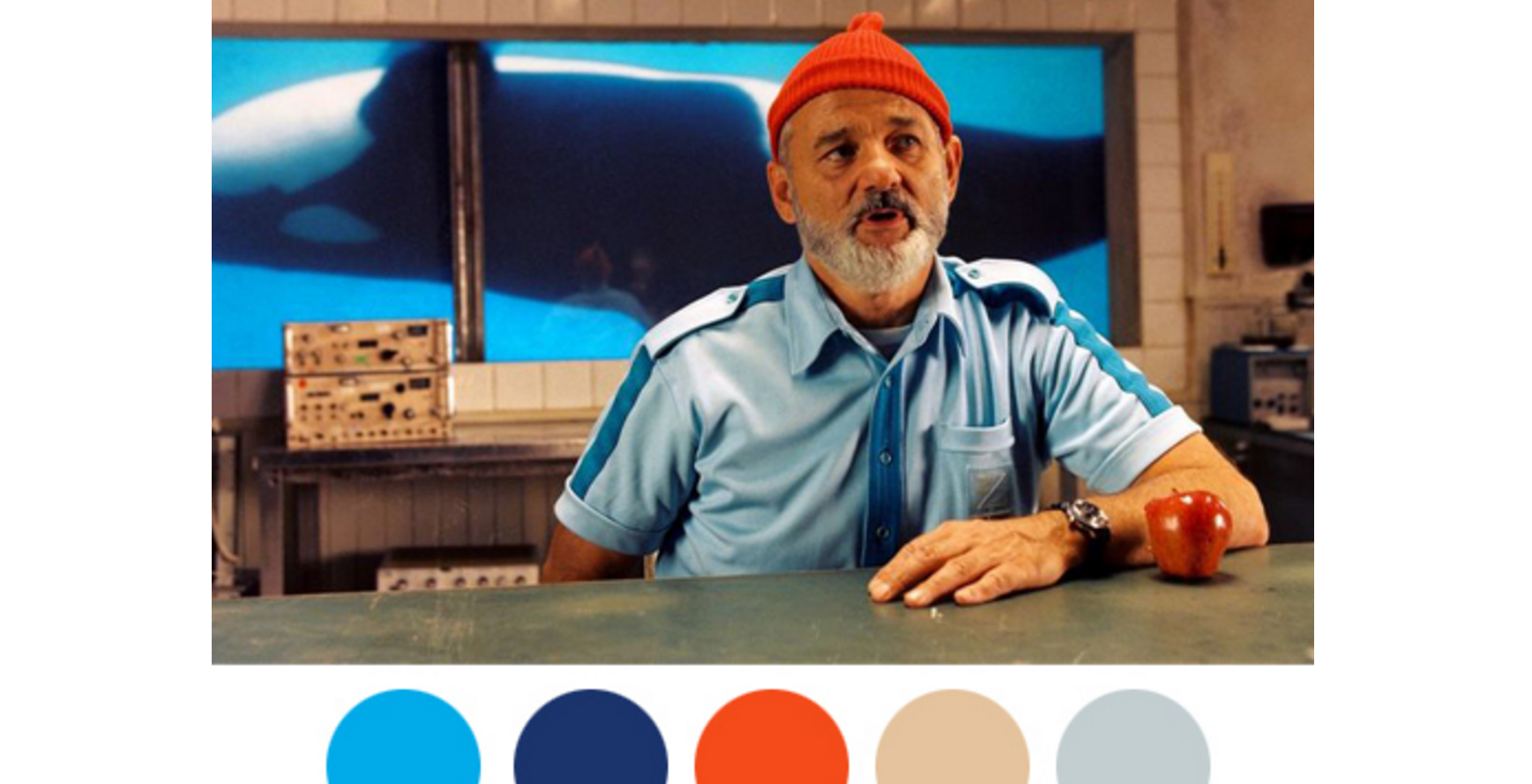
If you want to examine the colors of your own movie stills or other images you have, tools like DeGraeve can help. You can upload a photo and automatically create a color palette. As you can see, this palette will turn out far less saturated than you “see” the colors.

Because of that, it might be helpful to create a palette of the colors as you “see” them in photos or movie stills. An automated approach or color pickers won’t help you much with that; it will always look more grey-ish than the colors appear. Bill Hart-Davidson suggests to use photos of tropical fish as a basis for color palettes, and I can see how this might work very well. That said, tools like DeGraeve are definitely still helpful for art or graphic design work.
2c. Color Compositions - Learn from Others
There are so, so many color palette collections.
ColorHunt, ColourLovers, Coolors, LOLcolors
and of course Adober Color CC are just examples for the wide range of collections that color lovers around the globe created to get their fix. If you want it especially digital and sleek, the color palette for the Material Design by Google will make you happy:
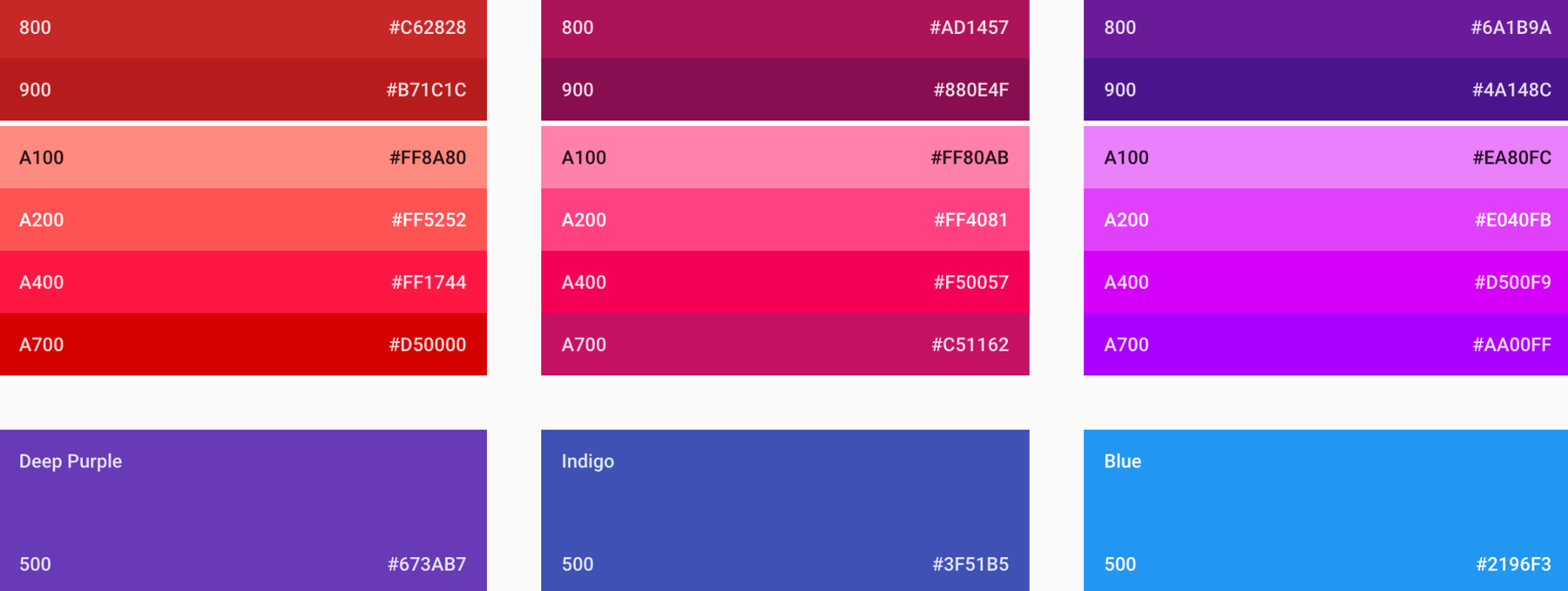
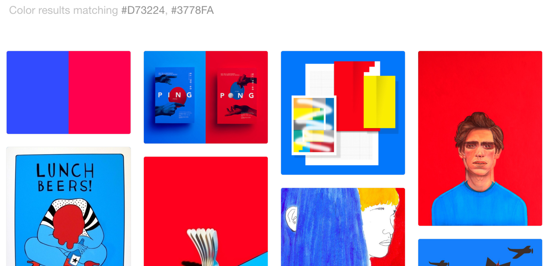
But how are all thee color palettes used in practice? The color searching options from Designspiration and Dribble can answer these questions. Their biggest use case for me: You can get inspiration for additional colors which go well with your existing palette. Personally, I prefer Designspiration for that: I’m a fan of this website anyway, and it lets you not only search for one, but multiple colors.
It’s also a great idea to get inspired in a bigger sense: Go to museums and galleries. Look at art. Look at other data visualizations. Or look at blogs from people who are enthusiastic about color, for example The Colorist.
2d. Color Compositions - Create them yourself
Smashing Magazine provides a good introduction to create your very first color palette yourself. I especially like the idea of “creating harmonious grays” with overlaying some very raw grays with your main color. I’ve never thought about it, but it makes a lot of sense to make your color palette feel more harmonious.
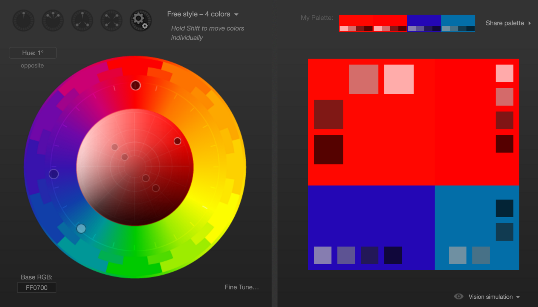
The Smashing Magazine introduction also make use of Paletton, the more advanced version of Adobe Color CC. If you know what you’re doing, this tool can help a lot:
3. Color Blindness
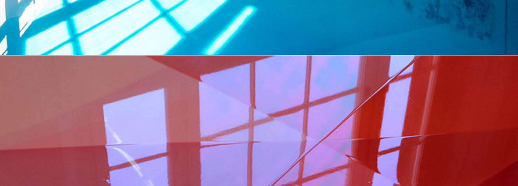
You found awesome colors to use? SWEET. Now make sure that they fulfill their purpose and can be distinguished by colorblind people as well! The conventional wisdom is that the difference between red and blue is hard to tell for colorblind people – but that really depends on the shades of red and blue, as you can see on the image. A browser extension like Spectrum or an app like Sim Daltonism can simulate the colors as seen by people with different color blindnesses. There is also the R library “viridis”, which beautiful color palettes work especially well for colorblind people.
4. Fuuuuuuun with Colors
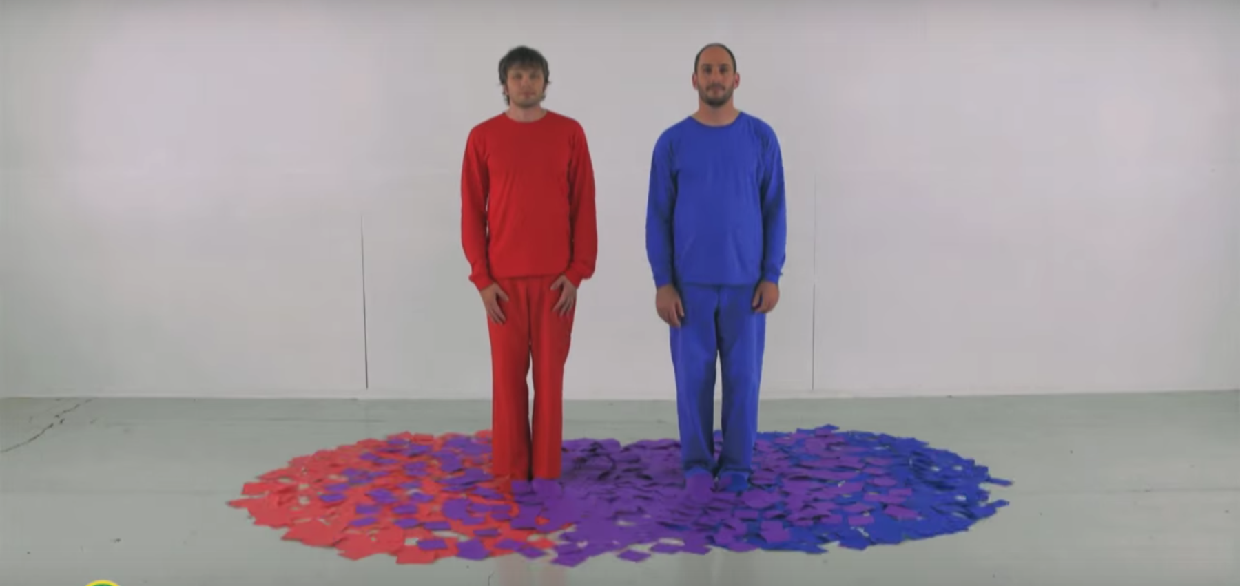
Ok, after all that work, let’s watch a Sesame Street Video by the fabulous OK GO peeps:
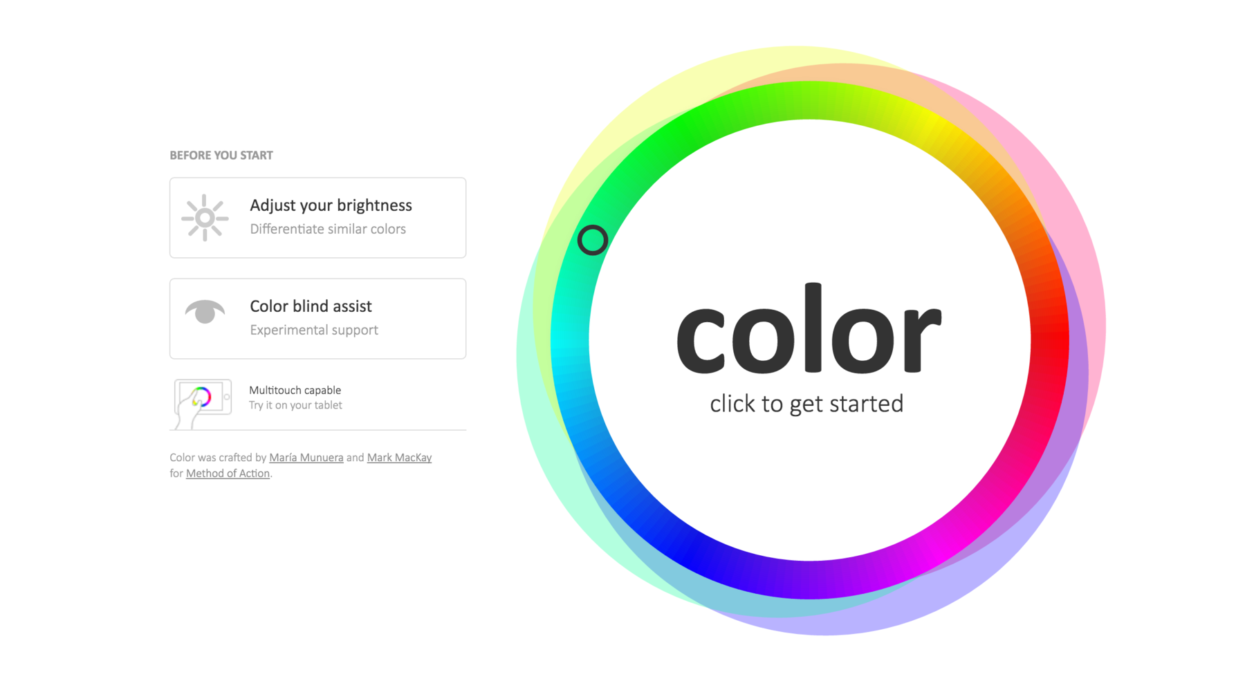
You’ve done that? Ok, then let’s play a game. It’s called Color (good name) (do you know that feeling when you’ve heard a word for so many time that it looses its meaning..) and is a little bit more addicting than I thought it is. Your goal is to match colors. Go:
Thanks to all the people who replied to my tweet and helped me discover these treats! I definitely feel more comfortable around colors now. Also, let me know if you know tools or websites that can’t be missed in this blog post! Find me on Twitter or write me an email: lisacharlotterost@gmail.com
