This is the transcript of a lightning talk, given at the 16th of June 2016 at the Information+ conference in Vancouver.
Goals are great. Only if we have a goal we can move towards it. And journalism has all sorts of shiny goals: It wants to be the guardian of society, a mirror of the world, create a better world and help people in their daily lives.
But journalism also likes eyeballs. And the way to attention is not always the same as the way to creating a better world. The way to attention is mostly NEWS, showing THAT something happened.
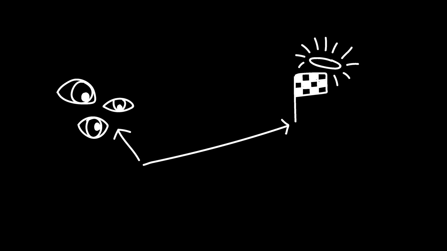
Why do news work so well? Because we are all drawn to novelty, like moths to the light. New equals important in our heads.

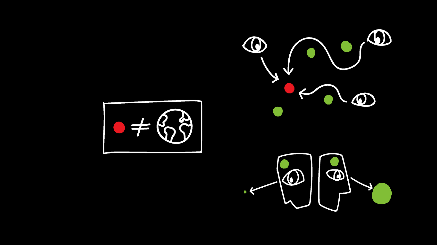
That’s why journalism talk so much about these dots – and blows them up. News sites tell us about these dots with different kinds of media: Text, video, photos, and, of course, information visualization. They all have their advantages and show the same dots from different perspectives. They enhance the dots and make them memorisable.
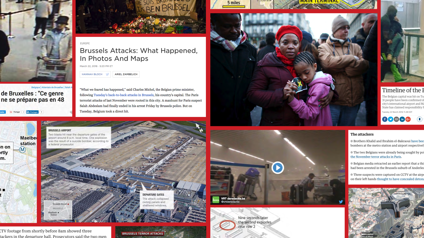
But I see that as problematic. First, these dots don’t represent the world – something that would be needed to get to these high goals journalism has. Instead of bringing a better understanding of the world, these dots lead to unjustified emotions and beliefs in our heads. One reason for that is the fact that bad things resonate more with us then positive ones. “If it bleeds, it leads.” If an event is bad, we may perceive it as more common.
But even if we report positive news, they don’t lead to a better understanding of the world. We all blow up unlikely events in our heads and think they are more common than they actually are, like plane crashes and lottery wins. On the other hand, very likely events are underestimated in our heads.
We also blow up terrorism in our heads. 400 of 1000 US adults worry that someone in their family will become a victim of terrorism, according to a survey by YouGov last December. 40% of US adults! I find that incredible sad. This irrational fear is built up through news coverage, but useless for navigating the world.
What I would like to see is even more examples of bigger pictures. Of comparing and setting things in context. That’s the actual super power of data visualization in journalism - not creating locator maps for news events.
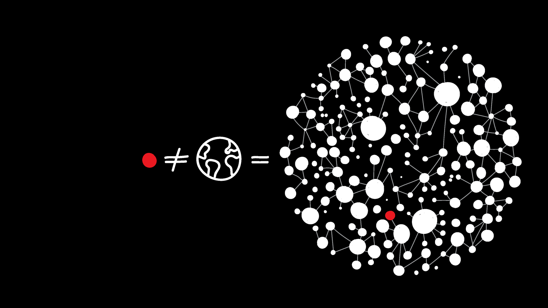
We can show that one dot is actually part of a decreasing trend, like the Huffington Post did with terrorism in Europe after the Brussels attacks. Another example is Our World in Data by Hans Roser, who here shows that poverty is going down dramatically when seen over two centuries. And there’s “Früher war alles schlechter”, a weekly column in the German magazine DER SPIEGEL. One of my designs for this colum shows, for example, that there are way less plane crashes nowadays than 45 years ago.
Or we can show that a dot is actually an outlier. For example, the Los Angeles Times created a simulator that lets you experience how unlikely it really is to win in the lottery. That’s a great example of fighting against the hope that we, too, could easily be the lucky winners. That hope gets mostly fueled by the lottery industry and advertisement – but also by showing the lottery winner on newspaper covers on the next day.
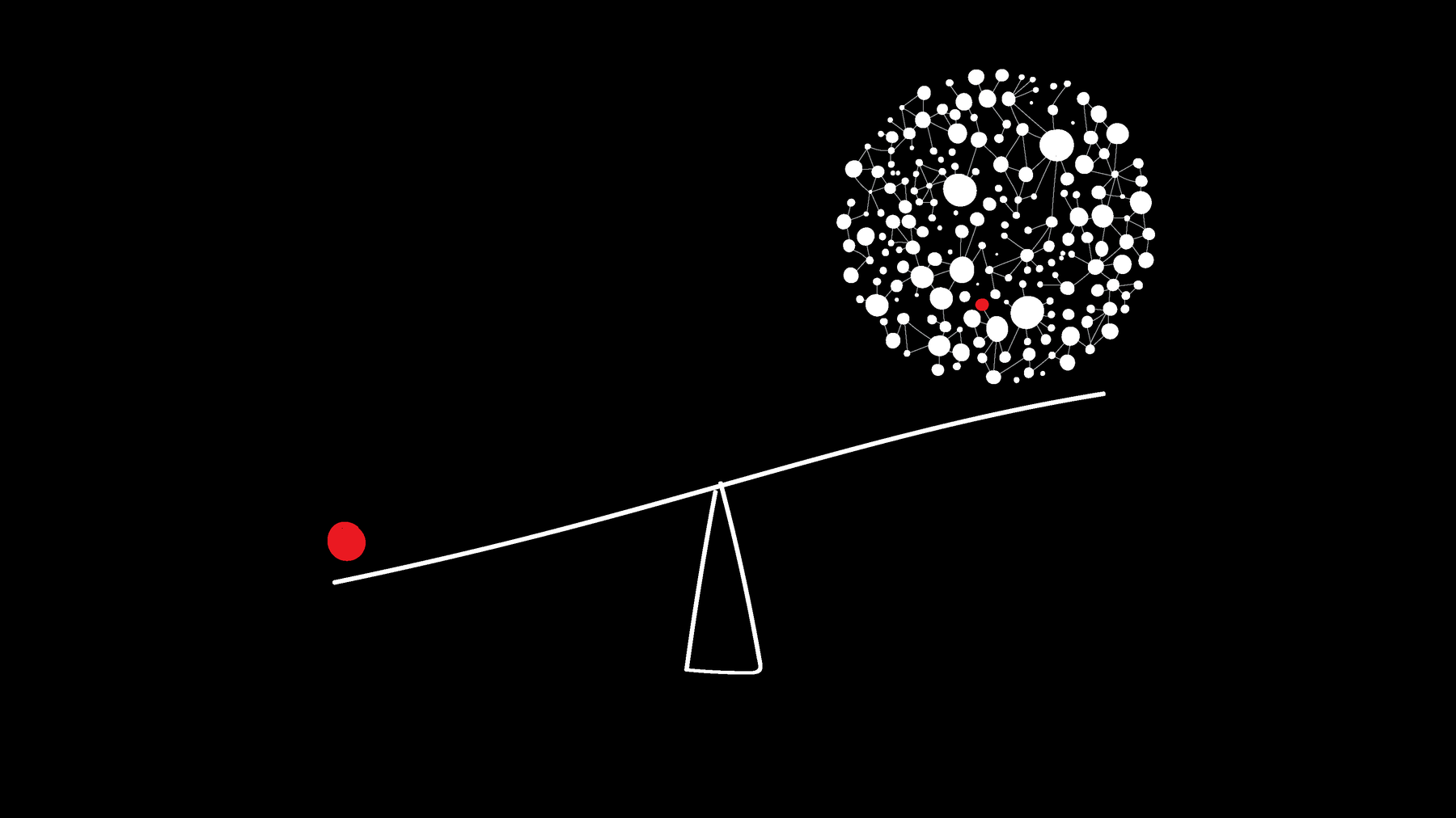
Dots still have their place. To know about the dots makes sense for the fields we are working in or the ones we are personally invested in. And we still need news to serve as examples for the bigger picture. We want to get up and down the ladder of abstraction. But I’m arguing for more balance. But I think it’s crucial in journalism to ask ourselves more and more: With which information can my audience navigate this world better? Which informations will build useful beliefs?
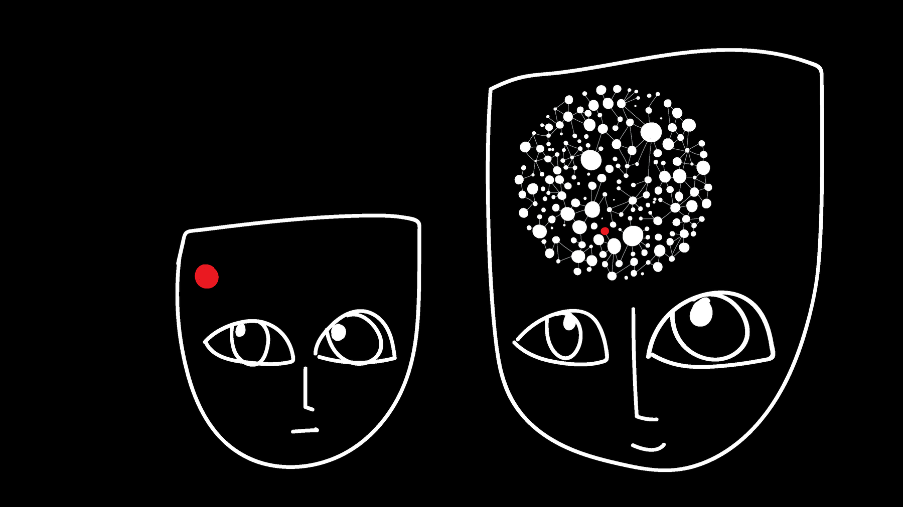
Data Visualization can help with that. It’s an important tool for destroying useless believes and creating useful ones, and we should use it as such. Setting things in context can bring journalism closer to its actual goals. It can bring journalism closer to answering the question “In which kind of world do we live?” than answering “What’s new?” can bring us.
