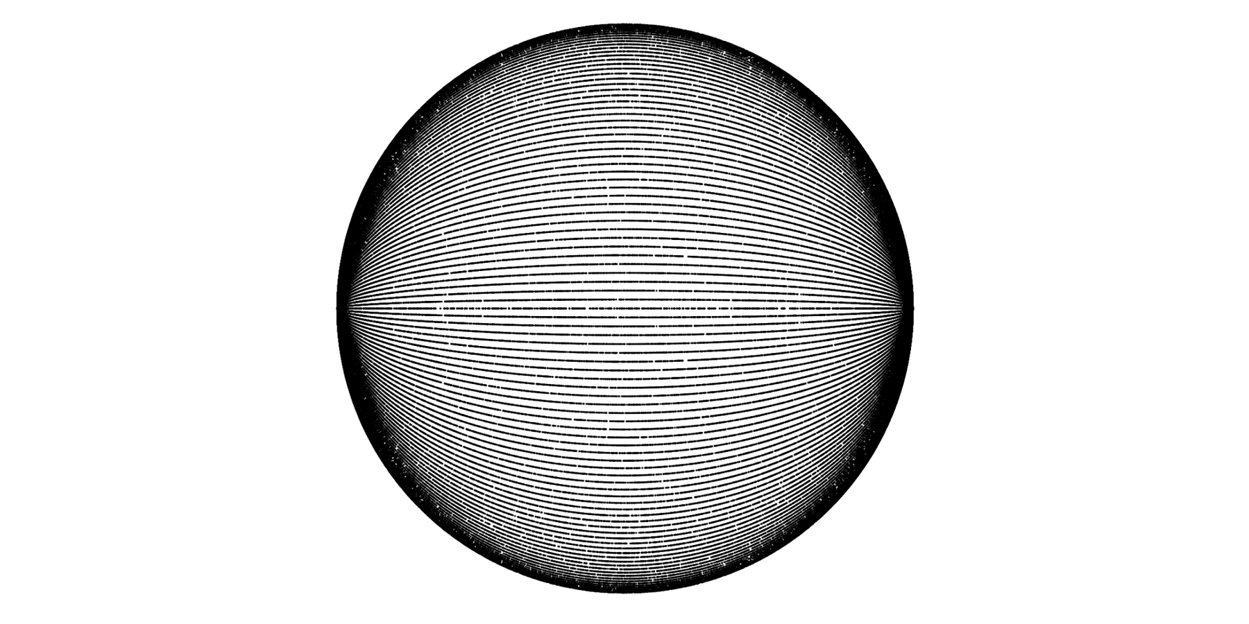
Yesterday afternoon I worked on a small project: I got rid of these annoying things called longitudes and just showed the latitudes of cities and continent borders on a graphic. I published it on Twitter and got TONS of feedback. Some people said that the cities are an odd selection, they wanted to know why I picked Paris over Rome, and some wanted a “‘add your city to this chart’ function”. Well, I’m not a fan of that. But I did extend on the original graphic a little bit, to do more justice to more cities.

I might add some other versions in the future. Maarten Lamrechts said he “Would like to see one with South flipped upwards, y-axis starting at 0”, and that seems like a great idea. And both DDNNNDLNIF and Kavya Sukumar mentioned that they would love to see a version with longitudes. I think that the latitudes are more interesting (because harder to compare on a map) than the longitudes, but it’s worth a try.
If somebody wants to tweak these versions etc, go ahead. It’s all Creative Commons (BY-NC-SA). Here is the data I used for this graphic; pulled from geonames.org. It contains the ten biggest cities for each country.
Also, if you enjoyed this kind of map, check out this map by Eric Odenheimer and by his work inspired maps by the Washington Post, and a by THEIR work inspired map by Andy Woodruff.
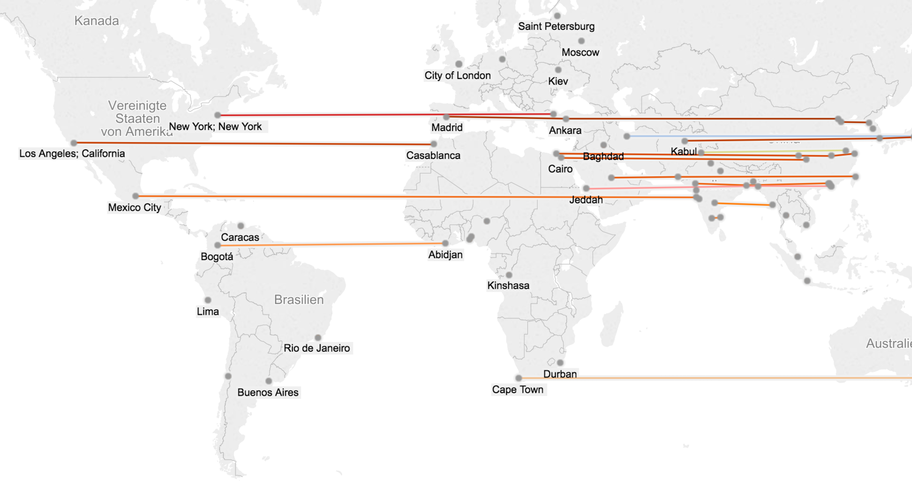
Edit: Devdutta Bhosale recreated the same idea in Tableau, but on an actual map. And you can compare cities on similar longitudes in his version as well. Thanks, Devdutta!
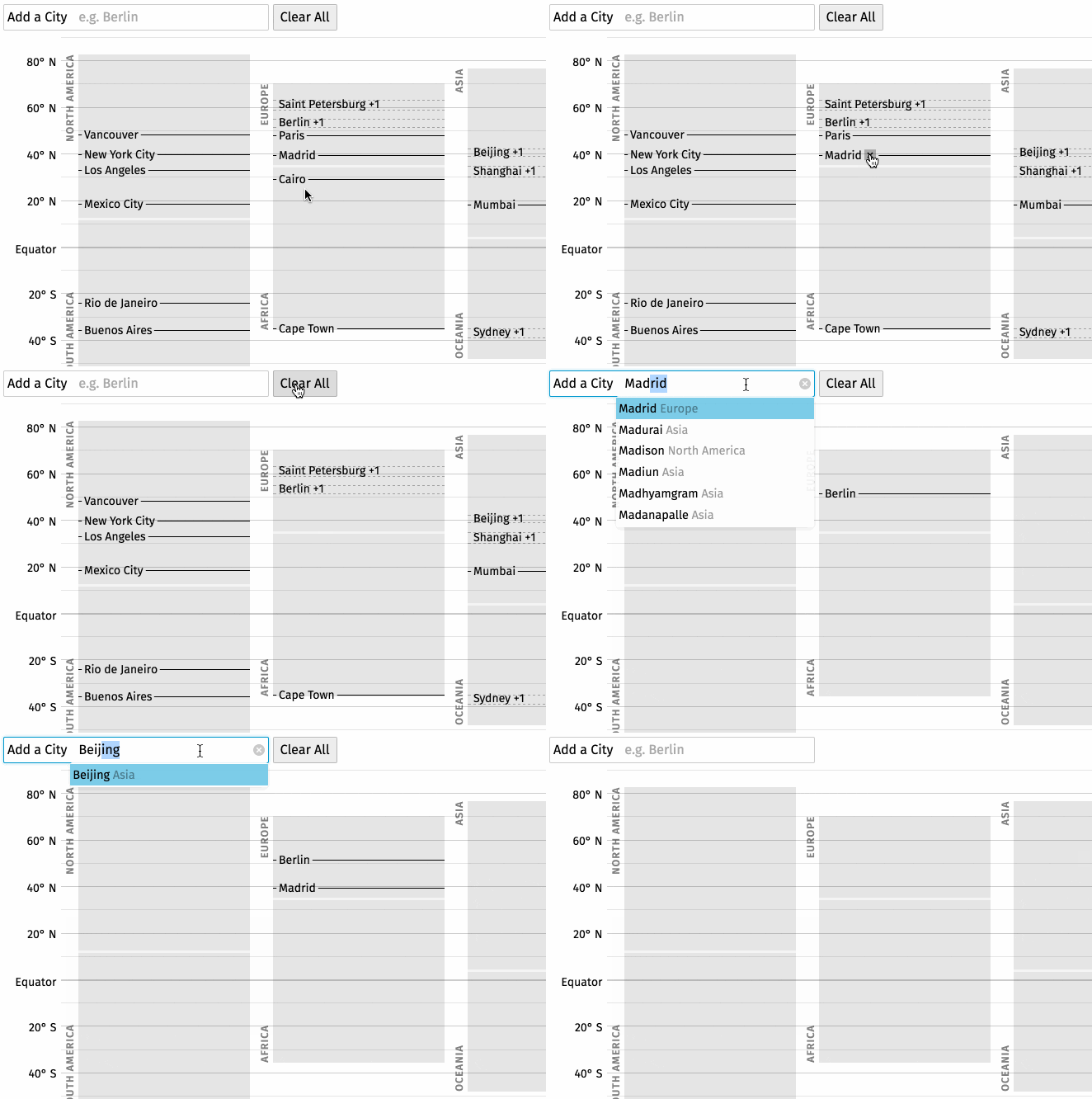
Edit2: Philipp Bock recreated the same idea with React and Redux, and you can search for cities and add all ones you want to / have lived in / have a personal relationship to. Thanks, Philipp!
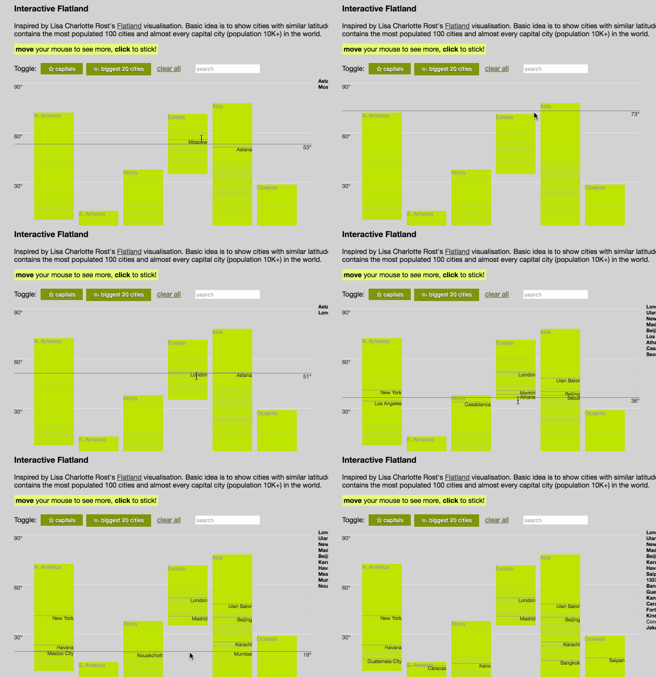
…and Djam Saidmuradov built a d3 Version which shows you the capitals, the 20 biggest cities and also lets you search for cities. Thanks, Djam!
