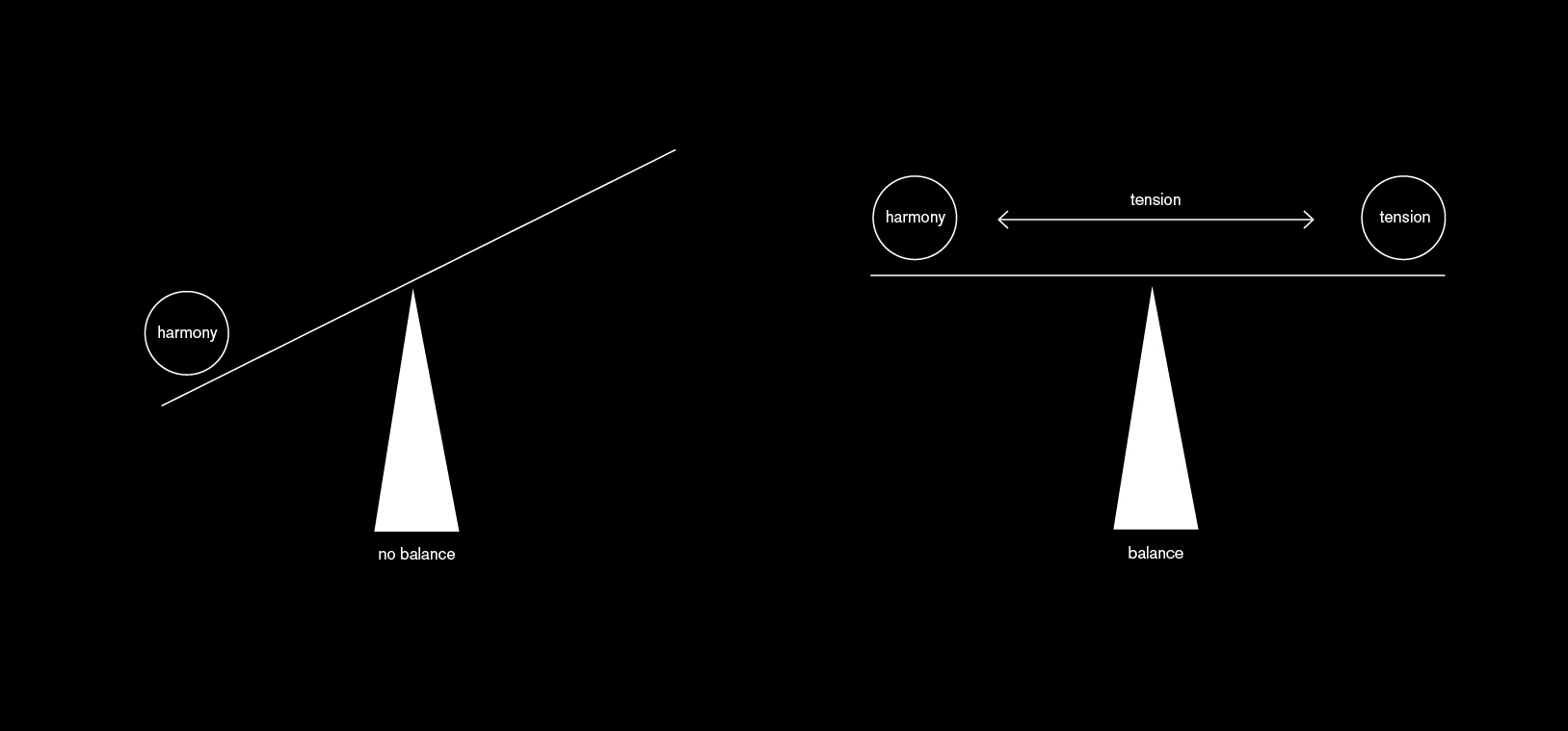
Harmony! What is harmony? I thought I know that – but then I had an inspiring conversation with my friend M. This conversation went like this:
L: I like harmony. If somebody talks a lot in a conversation, then I’m talking only a little bit. If somebody likes to talk less, I talk more. I’m always striving for balance.
M: I noticed that. If somebody has a strong opinion, you always have the opinion on the other side of the scale.
L: That’s true. I like to think in scales or axises. And I feel like the scale topples when everybody is on the same page.
M: But that’s not harmony.
L: It’s not?
M: You’re creating arguments with this attitude. Harmony means exactly that everybody IS on the same page, not the opposite.
I found that super interesting. Especially, because my friend M. really designs according to her definition of harmony: Everything on her pages exists beautifully in coexistence with every other element.
I, however, try to find contrasts. I try to use super thin and super thick lines on the same page. Bold elements and delicate ones. A lot of white space and a lot of complexity. My understanding of harmony changes the way I am designing.
