Ok, here’s where I have to tell a little secret: I copy; shamelessly. I think one of the best works I’ve ever designed before this master’s thesis was copied, too. I’m speaking about the documentation of my internship at Bloomberg Businessweek. Why do I think it turned out so amazing? Because I designed this documentation after my super inspiring time at Bloomberg. I sucked up their design and their attitude, let it float through my brain and then spit it on paper. With other words: I copied.
But do I feel bad? Do I feel like I don’t make enough of an effort to design? No, I don’t (anymore). I had to notice, »there is nothing new under the sun«-like, that so, SO many individual design ideas are already out there. I used to try hard to come up with a design idea in long days and weeks and months – only to notice afterward that my so genius design idea was already implemented in at least one other design piece. I saw the same pattern with my friends.
And then I thought: »Screw it. Just get to know more designs, early – and then have a wild range from which you can copy and combine, according to your content. If you have a really new idea on the way, even better. But don’t force it.« I’m sure this works only so long in my career, but that’s what I try now: I have a library of possibilities in my head, get samples out if I need them (meaning, if they fit to the task I’m working on), copy or transform and combine them.
Elements of Creativity
Transforming. Copying. Combining. According to Kirby Ferguson, these are the three pillars of every invention. Ferguson is the author of the great video documentation »Everything is a Remix«, in which he explains pop-culture phenomena, like songs, movies or technological product that have been copied and combined in the past.
Morphological Matrix
The creativity model that emphasizes the »combining« aspect the most is the Morphological Matrix. It’s just a table, but it’s the visual model that amazes me the most (and that Karl Gerstner used as a way to choose typefaces).
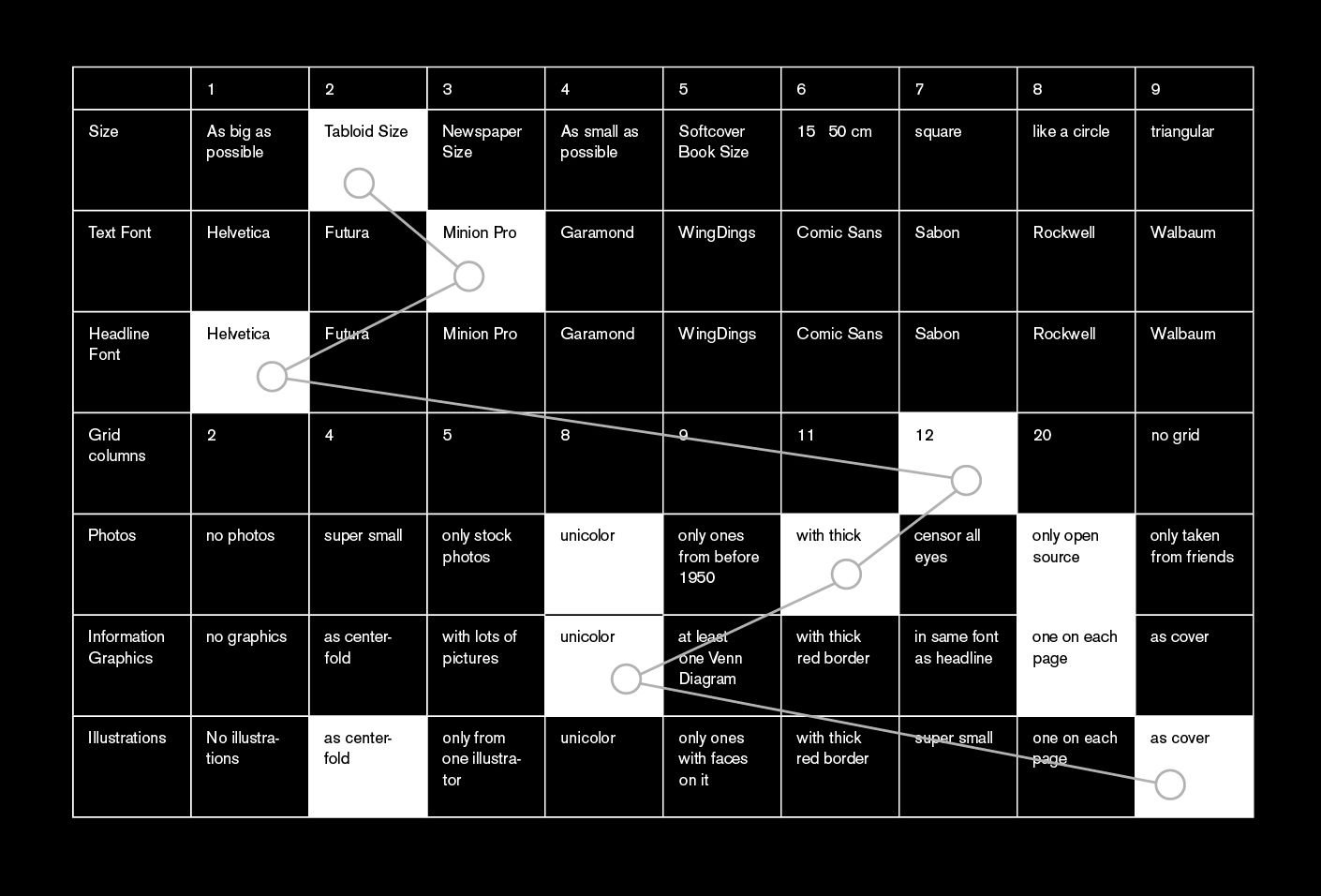
How does it work? In the first column, we write down the parameters of a product we want to generate ideas for, in this case »magazine size«, »text font« or »photos«. In the first row, we simply put increasing numbers. In the body of the table, we then generate ideas for each number. Of course we can write only seven numbers, but we can also set the goal to find at least 30 or 40 ideas for each parameter. Maybe the best thing about the Morphological Matrix is that it forces you to think about options for your parameter. The more specific the parameter (like »source of photos« instead of just »photos«), the more difficult it is to find ideas.
After filling all the rows with ideas, the combining begins: We select one idea from each row so that we have one parameter for each characteristic of our product. And the possibilities are huge. In our example, we have seven parameter and nine columns for ideas, so that we write down only 63 ideas. But after combining them, we have 97, so 4,782,969 possible ideas. 4.8 million ideas sound like a lot – and we’ve only written down seven ideas for each parameter. It sounds like there are enough ideas on this planet for everyone, even if we »just« combine and don’t come up with anything new.
In terms of graphic design and depending on the chosen parameter, the number of possibilities is even higher – because it’s an option to choose more than one idea per row. For example, the photos in my magazine will be unicolor with a thick red border and only from open sources. Even if my parameter would be »sources for photos«, I could choose more than one option, e.g. »stock photos« and »open sources«.
Maybe you wonder: Will such a tool make us to better designers? I doubt that. But it’s an argument for copying, and I like copying. When I speak about an »idea library« in my head, I hope it works like this. The Morphological Matrix lets us understand how we think and how we come up with »innovation«, but without all the magic and muse around it. And maybe in the end, if we understand what we do, we can extend the doing, too.
Combining both
Because I like the Morphological Matrix and Fergunsons elements of creativity, I thought it’s actually possible to combine both (see what I did here? Combine is the third element of creativity):
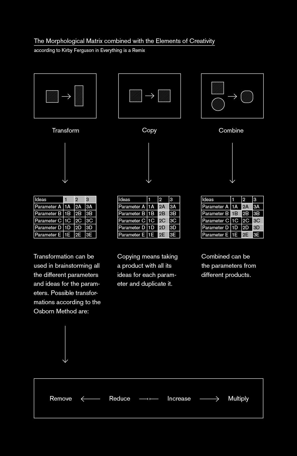
We use the element Copy to have a look at all the ideas that are already used by other projects – we then copy these ideas into one of our columns. To think of new ideas, we use the element Transform. For that we can also use other creativity techniques like the Osborn Method, which suggests removing, reducing, increasing and multiplying as forms of transformation. For example: Regarding a grid, we can increase the number of columns; for fonts, we can reduce the number of used typefaces or the year of their creation. Afterward, we combine the different ideas like shown in the explanation of the Morphological Matrix.
